
Paragraphs
Paragraphs in English are interesting things, because they aren’t really anything at all.
That’s not the way they started out, of course, as we can see by the word “paragraph” itself, from the Greek “paragraphos,” which means “beside the writing.”
Back in ancient times, parchment, a type of very thin leather used for writing with ink, or smoothed slabs of stone for carving, was so terribly expensive that they crammed as many words into the lines as they could after allowing wide margins for notes on the text. In fact, they didn’t even put spaces between words, if one could figure out where the word boundaries were by contextual clues. soasentencemightlooklikethisandaparagraphwasjustthesame, one unbroken sequence of letters. The reader was expected to figure out the meaning of the text by sounding out the words, just like children learning to read do even today.
The distinction between capital and lowercase forms of letters had yet to be invented, so there were no clues in the text as to how the text was to be spoken, or indeed understood. Everything, in that irritating phrase so popular in mathematics texts, was left as an exercise for the reader.
Gradually, however, a system of little marks that could be inserted in or near the text became popular, amongst the first of which was the hypodiastole, a little mark that looked something like a comma, but was only added to the last letter before the word boundary when it might be ambiguous. So the English letters, “aniceman,” might separate either into “an ice man” or “a nice man,” and so would require a single hypodiastole to distinguish the two possibilities, here picked out in red to make it slightly easier to notice: “an⸒iceman.” Since the last two words were not ambiguous, they didn’t bother with a mark.
Note that the hypodiastole was only indicated in red in the previous example to make it a little easier to pick out when seen in some fonts, since we’re not used to looking underneath letters for clues, which is where it ought to appear, but some fonts place it below and off to one side, looking something like a comma. Here it is again, in black, but with an extra indication in blue where a letter ought to be: ⧫⸒ is really tiny — easy to overlook — and was often used beneath the last character rather than between the ambiguous words, because they didn’t have the habit of thinking that words ought to be separated. Like the zero in mathematics, the space within text, empty space, was a huge invention that required a whole new way of looking at things, of seeing, in fact, that “nothing” was real, and had value. Note that some Greek fonts place the hypodiastole way off to the side, so it looks more like a modern comma, which isn't really how it started out, but there you are. This is something more like it should look: aņiceman.
Even with this sort of basic help added in as a sort of afterthought, a mass of crowded text could be confusing, so they eventually made a special mark beside the text to indicate important changes in thought or focus, although the words themselves were left to run on until the speaker ran out of breath.
Originally, in Greek texts, the mark was just a sort of long dash at the beginning of the new thought, like this: ⸏ Eventually, they decided that a simple line wasn’t distinctive enough, so they added a little fork at one end or the other, like this: ⸐ or like this: ⸑ Well, since this mark was beside the writing, usually — but not always — in the margin, but wasn’t really writing by itself, since it had no actual meaning, other than that a change of subject had occurred, the Greeks called it a paragraphos, which means “beside the writing” in the wacky Greek language they insist upon speaking rather than English, as everyone ought do. If you can't see the actual symbol, here's something like it: Greek Paragraph.
And in fact, because writing systems are astonishingly slow to change, we still see a remnant of the paragraphos in some typographical styles used for dialogue in French and a few other languages, as well as by James Joyce — who lived in France for quite some time, and thought it was a good idea — the quote dash, which can be used within a block of text, just as in antiquity, albeit with slightly restricted scope:
― Quel est, dit Candide, ce gros cochon qui me disait tant de mal de la piá¨ce oá¹ j'ai tant pleuré et des acteurs qui m'ont fait tant de plaisir ? ― C'est un mal vivant, répondit l'abbé, qui gagne sa vie á dire du mal de toutes les piá¨ces et de tous les livres ; il hait quiconque réussit, comme les eunuques haíssent les jouissants : c'est un de ces serpents de la littérature qui se nourrissent de fange et de venin ; c'est un folliculaire. ― Qu'appelez-vous folliculaire ? dit Candide. ― C'est, dit l'abbé, un faiseur de feuilles, un Fréron. »
This quotation style is often seen indented in separate paragraphs as well, sometimes with line spacing closed up:
― Quel est, dit Candide, ce gros cochon qui me disait tant de mal de la piá¨ce oá¹ j'ai tant pleuré et des acteurs qui m'ont fait tant de plaisir ?
― C'est un mal vivant, répondit l'abbé, qui gagne sa vie á dire du mal de toutes les piá¨ces et de tous les livres ; il hait quiconque réussit, comme les eunuques haíssent les jouissants : c'est un de ces serpents de la littérature qui se nourrissent de fange et de venin ; c'est un folliculaire.
― Qu'appelez-vous folliculaire ? dit Candide.
― C'est, dit l'abbé, un faiseur de feuilles, un Fréron. »
The reason for this is that the compressed form violates English rules for marking paragraphs, and the same rules apply generally in many other languages, so the style is particularly irritating to decipher for those not intimately familiar with this telegraphic method of indicating dialogue, exacerbated by the parallel habit of including attributions, such as ‘said Candide’ and ‘said the Abbot’ in the preceding text without separating them from the dialogue itself, a relic of the days when everything was left as an exercise for the reader.
Things went along just swimmingly for a thousand years or so, during which time some scribal genius invented spaces, which caused the hypodiastole to fall into disuse — which may be why a similar symbol, the comma, eventually became used to indicate changes of breath or tone that can alter the meaning of words slightly — but the notion of marking a change of subject hadn’t changed much, other than that many European scribes changed the ancient symbol to be more decorative and distinctive, thriftily moving the line above the initial word instead of off to one side in the margin, and adding a bit of fatness to the fork in the line, resulting in a mark very similar to our modern Paragraph Mark, the “Pilcrow: ¶”
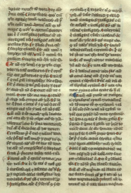
That's a little too small to see clearly, although it’s quite clear that the only division in the text is to separate it into parallel ‘newspaper’ columns. so here's an enlarged portion of the same page. This paragraph indication happens to be at the beginning of line, but doesn't have to be, and was lettered in red by the original scribe to make it easy to see, since paragraph marks were somewhat innovative at the time, and some early quality control specialists were upset by the waste of valuable space on the parchment. So they were often treated as decorative elements, a convention already familiar to most of us if we've seen pictures of a medieval text.
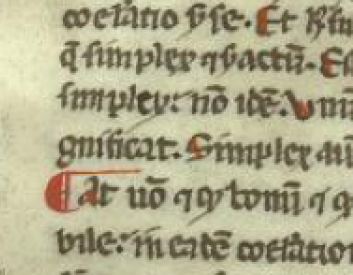
It's fairly easy to see that this version of our modern pilcrow has retained some qualities of the ancient paragraphos as well, since it has an extended line trailing off to the right, but thriftily placed on top of the lettering. Eventually, the horizontal line was eliminated, because it was difficult to arrange once print came along, and the double vertical line at the right of the symbol was extended downward to make it look like a fairly normal capital letter and we have the modern paragraph symbol: 
In fairly recent times, we discarded the symbol entirely in ordinary text, and substituted the great invention that gave us separate words: empty space.
This has several advantages:
- The human eye is very quick to notice space, so it's actually easier for us to notice emptiness than it is to decipher special symbols, which is an aid to comprehension and ease of use. The particular style of space used in this short list is often used for lists, and bumps out the first line instead of indenting, and uses a special symbol to attract your attention with another visual helper. The lack of vertical space, on the other hand, helps to indicate that the list is a single entity, and should be viewed as a whole.
- It decreases the number of letters and symbols needed in ordinary writing. A glance at any computer keyboard will demonstrate how crowded it is, so much so that we already have to memorise special combinations of keystrokes to easily enter certain letters, like the accented characters in many European languages. Why have more?
- It's a very flexible system, with two main variants:
The first variation is the one we use by default on almost every page of text you see on almost every web site, space between paragraphs. Looking up and down this page will offer beaucoup examples, except in the block immediately below:
The other variation is found in cheap paperback books, in newspapers, and in pages typed on old-fashioned typewriters, the indented first line, as illustrated here.
Chose one or the other. Using both is a sort of affectation, something like dotting one's "i's" with little hearts or drawing smiley faces in the text.
The reason one sees it in less expensive media is that it minimises blank space on the page, leaving just enough that our eyes can see it. While paper is much less expensive than parchment was, we print more books, so saving four pages per book if one prints five thousand of them can make a bean-counter's eyes light up. Or perhaps that's merely a steely glint.
With either variation, don't use too much. Exaggerated indentations can cause unfortunate visual interactions with trailing spaces at the end of previous paragraphs, and they interfere with our reading habits, because our brains know where they expect every line to start, so if they have to search for the real beginning it will annoy us, if only subconsciously.
The default setting for web pages is the first variant, line-spacing, and the other, first-line indents, is difficult to arrange, and requires the use of Cascading Style Sheets (CSS), which in our case we have not got.
This inevitably means that elaborate efforts to circumvent the Web conventions usually wind up looking… not so good. Best to avoid them entirely and save all that effort, which only serves to make the page look worse in any case.
There's another reason not to use first-line indents as well; staring at computer screens is hard on the eyes, because unless we're reading this on a Kindle, or other “electronic paper” reading device, we're staring directly into a light source, which we're not well-designed to do. Lots of white space makes it easier for our eyes to cope, and electronic space is essentially free, so there are exactly zero reasons to conserve it and ample reasons to use it liberally, within the limitations of our eyes and brains.
In English, we use paragraphs for every single arc of thought or action, and individuals by definition all have their own separate thoughts and actions, so deserve their own paragraphs.
A good paragraph is usually a short paragraph, unless you happen to be Marcel Proust, so if your paragraphs wind up as huge unbroken blocks of text, you're quite likely doing something wrong.
If two people appear in a single paragraph, that's probably a mistake as well, either in presentation — failing to indicate a paragraph when it ought to appear — or construction — jamming together words that ought not to appear together, because they belong to separate thoughts, actions, or people.
If you see close quotes immediately followed by open quotes, it's always a mistake, although it may not be the only one:
“Hi, Becky!” “Hi, Tom!” “Are you going to the mall,” he said. “No, I have to wash my hair.”
Because there are two speakers in the above example, and they alternate speaking, there are necessarily four paragraphs.
“Hi, Becky!”
“Hi, Tom!”
“Are you going to the mall,” he said.
“No, I have to wash my hair.”
There's a third variation, seen far too often in pages written in Word Processing programmes like Microsoft word, no space at all, except whatever space shows up accidentally at the end of the line, like this:
This is a short paragraph.
This is a longer paragraph.
This is the longest of all.*
This is very short.
This is somewhat longer.
* It has more letters.
Physiologically, this is all wrong, and places a terrible burden on the reader, since the eye has no way of picking out the beginning of any paragraph without asking the reader to take out a ruler and use it to line up the end of one line with the beginning of the next. Because these lines are short, it's somewhat easier, but if I said that there were only two paragraphs in a very narrow column, how could you tell?
It's also hostile to persons using screen reader software, since most such software for the disabled is even more dependent on real white space to separate paragraphs, and will turn the page into mush if real space is not present.

Another problem lies in the fact that font sizes and screen widths are flexible on the Web, and stories may be viewed on anything from fifty-six inch HD monitors to tiny little cellphones, so the author has exactly zero control over where the line will break. If the ends of lines at the edge of the page can't readily be distinguished from the ends of lines in paragraphs, the reader has a logical puzzle to figure out in addition to following the story line, which is rude.
It's also a burden on the site editors, who will eventually stumble (literally) across the malformed page and either fix it or send the author a note about the problem.
Because of the way Drupal — the "content management system" which runs BC — works, having no space between paragraphs can also break the display of your story entirely, causing it to be invisible, despite having what looks like lots of words in it.
Use space wisely, but use it. Six thousand years of human ingenuity created the carefully-crafted letters and conventions of space you see before you now. Only you can prevent confusion.

Comments
Wonderful Tutorial
Hey Puddintane:
That was a wonderful way to approach things. I also notice that some of the writing conventions that were drummed into me, at threat of torture in the late 50's, have fallen by the way side. I'm feeling so ancient this morning that I can't even remember what they were. Paragraphing was one.
Much peace
Hala
Fascinating!
Thank you for the very enjoyable history lesson.
Up to now I'd only expected to see the previous sentence in a hypothetical context, much like "Hand me that piano."
I'm just a little miffed about it
That my computer refused to show a few of the symbols at the start. Otherwise it was educating.
Faraway
Big Closet Top Shelf
Where you can fool around like you want to and most you get is some bemused good ribbing!
Faraway
Big Closet Top Shelf
Where you can fool around like you want to and most you get is some bemused good ribbing!
...and the almond blossoms.
When I saw the line from one of my favorite poems, Henry Reed's The Naming of Parts I literally laughed out loud. How perfect! Except that your version does not have bees or piling swivels. :)
For those of you who have not read it, please follow the link and read one of the most beautiful, and funniest, of modern poems. Reed was a master of metrics and allusion, of all the tricks a poet can use to layer on meaning and emotion. This is part of what I was trying to do with my poem about Charles Schulz, "Sparky is my Hero."
Thank you for reminding me, both of the original and my own attempt at emulation.
Hugs,
Erin
= Give everyone the benefit of the doubt because certainty is a fragile thing that can be shattered by one overlooked fact.
= Give everyone the benefit of the doubt because certainty is a fragile thing that can be shattered by one overlooked fact.
But it did...
by implication. Kenning they called it in Old English. I can hardly say a dozen words without thinking of something. Japonica.
Cheers,
Puddin'
P.S. the little epigram in Latin at the top of the poem is a punning reference to Horace: (Odes, 3: 26. 1-2) in which Reed substitutes "duellis" (wars) for "puellis" (girls), turning "Lately I've lived among girls, with some success, And soldiered along, not without glory," turning Horace's callous metaphor of warfare on the sexual battlefield into literal truth and longing for peace and love. He extends this pun throughout the poem, rapidly backwards and forwards likening war to sexual conquest, just as Horace joked about sex as warfare, and mindful of the beauty that war leaves behind, just as Horace leaves love and beauty behind when he sullies it with boasting and braggadocio. It's a subtle bit of writing.
-
Cheers,
Puddin'
A tender heart is an asset to an editor: it helps us be ruthless in a tactful way.
--- The Chicago Manual of Style
Latin Lover
It's been almost fifty years since Sister Rose attempted to teach me Latin, But I do recall that the IS siffixs was normally masculine. Isn't the plural form of puella -- puellae? Or am I grasping the wrong declension?
Angela Rasch (Jill M I)
Angela Rasch (Jill M I)
Horace
Here's the quote from The Naming of Parts
Vixi duellis nuper idoneus
Et militavi non sine gloria
http://intercapillaryspace.blogspot.com/2006/09/horace-odes-...
Here's the actual quote from Horace:
>> Vixi Puellis nuper idoneus
>> et militavi non sine gloria;
>> which could be cribbed as "Until now I've lived on easy terms with girls, and have been renowned in love's battles",
quoted from Horace, The Odes (edited by J. D. McClatchy)
I'd hesitate to argue with Horace about the proper declension of Puellae, as my Latin is as rustic as can be. I had a semester of it, which was quite enough. I know when I'm licked.
http://www.dummies.com/how-to/content/declining-a-latin-noun...
The above link just happens to show the full declension of Puella.
I'd guess that "Puellis" represents the ablative of separation ("lately" -- but not now) but this is just a reasonable guess based firmly in ignorance. I'm pretty sure it's the ablative of something, which is reason enough to hate it with a grand passion...
Cheers,
Puddin'
-
Cheers,
Puddin'
A tender heart is an asset to an editor: it helps us be ruthless in a tactful way.
--- The Chicago Manual of Style
I was very disapointed...
to not see the "hypodiastole" symbol you described. Instead, my PC showed a little square box with four numbers in it... About the size of the "M". It looked something like the following:
11
The rest was an interesting read.
Thank you.
Annette
The curse of fonts in web browsers
To be fair, whilst the hypodiastole has it's own symbol in Unicode, many browsers have difficulties with it. If you would like to seen one go to:
http://en.wikipedia.org/wiki/Hypodiastole
P.S. Thank you Puddintane :)
Persephone
Non sum qualis eram
I tried to describe them in the text...
The hypodiastole is much like a comma, but was usually placed under the character. like several other "accents" in Greek, as is indeed implied by the name, "hypo" means beneath, as a "hypodermic needle" is designed to penetrate the skin and allow the injection of fluids beneath it. The "diastole" part is the same word now used to describe the relaxation of the heart muscle after a contraction, so the thing you place beneath the end of a word when one's vocal apparatus relaxes and expands (if one takes a breath) to prepare itself for the next word.
http://en.wikipedia.org/wiki/Diastole
Fun with Greek roots (usually black, although Helen, of course, was blonde like me, having been born half-Goddess)
Here's a picture of a paragraphos, which I also described:
http://en.wikipedia.org/wiki/Paragraphos
To partially address the complaint, though, I've added a faux diastole and a faux paragraphos to the text in bold, with an ‘n’ with a cedilla standing in for an ‘n’ with a diastole, and an ordinary underline standing in for a paragraphos. I hope that helps.
The fonts Cardo and Code 2000 -- both of which can be downloaded gratis on the net, contain all of the characters used in the post, as well as the fonts Aegean, Alexander, Alkaios, Alfios, Anaktoria, Aroania, Geneva, Helvetica, several others, and most fonts with "Unicode" as part of their name, like New Athena Unicode. There is at least one fairly complete Unicode font supplied with every modern operating system, although one may have to install "foreign language" support, or something like it, to make it available automatically.
There's a wonderful resource here:
created by Alan Wood, which has both character sets and available fonts which support them listed in a fairly handy form.
It's fun to have at least one full Unicode font available, because it lets one roam the web at random and have at least some clue about where one is likely to be if you stumble across a site in Arabic or Chinese, Hindi or Russian. All those little boxes are irritating, I know.
Cheers,
Puddin'
-
Cheers,
Puddin'
A tender heart is an asset to an editor: it helps us be ruthless in a tactful way.
--- The Chicago Manual of Style
puddintane, are you married?
i love these comments of yours. truly. thanks :)
not as think as i smart i am
Not legal in my state, but in a long-term relationship
with a wonderful woman, going on silk, I believe. Thanks for asking.
Cheers,
Puddin'
-
Cheers,
Puddin'
A tender heart is an asset to an editor: it helps us be ruthless in a tactful way.
--- The Chicago Manual of Style
Fascinating!
I've always found reading up on the history of certain language / typographical elements fascinating. Even currency symbols have interesting histories (although of course € has far less history than any other!), and as with the language / typographical elements, went through several iterations before their current form was settled on.
As the right side of the brain controls the left side of the body, then only left-handers are in their right mind!
Saving
Tkank you for this intereting information. It will be saved together with the other's comments in my liguistic folder.
Ginnie
GinnieG
Oh! Now I Get It.
And here I was thinking paragraphs were what airborne accounts used.
Nancy Cole
"You may be what you resolve to be."
T.J. Jackson