
So, I’ve been spending some time thinking about cover art.
I know this is a frivolous thing to do, especially with everything going on in the world right now. But I also want to spend time appreciating what we have right now, in this community. It is a fragile thing, and precious.
Anyhow: cover art. I didn’t know how to do any sort of art when I started posting here, and my first cover didn’t happen until I’d already turned out 300,000 words. I’ve been going back and doing covers for some of my older stories, and that’s been an artistic outlet when my slut of a writing muse left me alone at the bar while she wrapped her limbs around some other author.
The exercise made me think about BC and Doppler cover art, what I thought was effective, and why. I thought it would be fun to talk about it, and harvest some ideas from other folks here, both writers and readers.
So first, here (in no particular order), is some of the cover art that’s caught my eye:
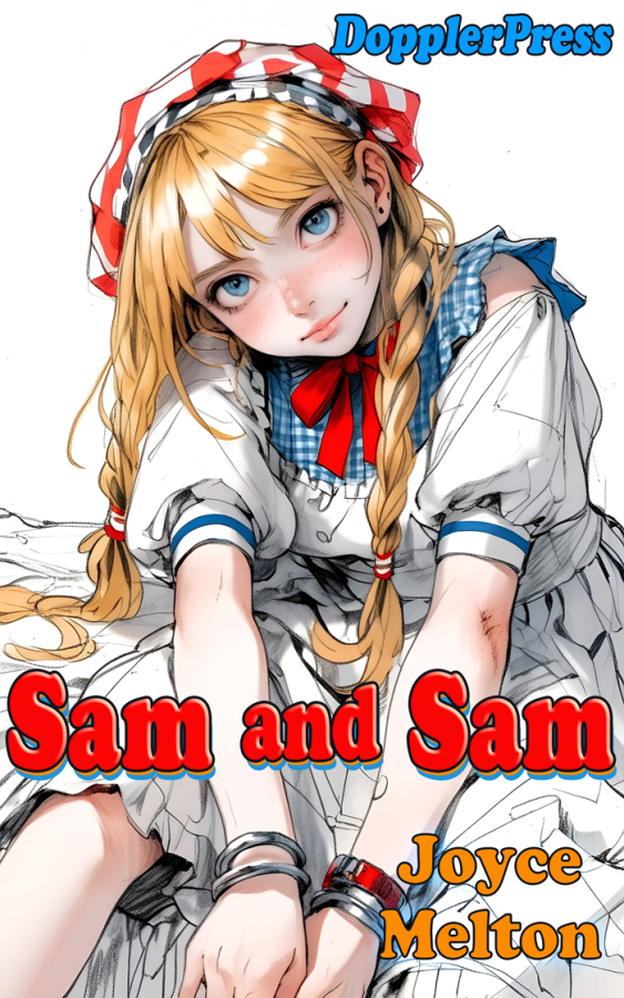
One of Erin/Joyce’s many great covers. No background; almost a line drawing look with only a few areas of color. The minimalist look serves to focus attention on the character’s elfin features (note how pointy the chin appears) and oversized eyes. I associate this look with anime. The title uses a bold font in red that matches the red of the headscarf, and is easy to read.
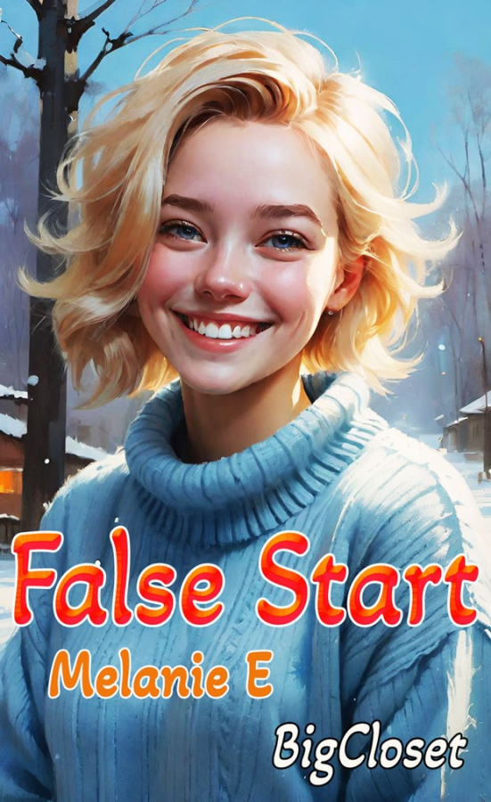
Melanie’s cover brings you right into the story – the kid is just too damned adorable. The big smile, the apple cheeks, the mussed blonde locks. Here, by using a nice light blue for both the sweater and the background sky, the eye is immediately drawn to the face. The general look is of an oil painting, done in a linear style, as an illustration for a book that might be in the “Teens and Young Adults” section of Barnes & Noble (but don’t tell the censors!).
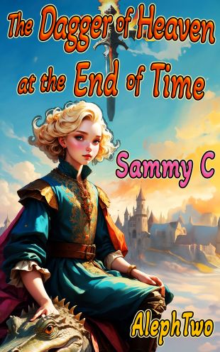
This is a stunning cover, again featuring a linear oil painting style. Look at the richness of the colors – the sunset sky that goes from deeper blue in the upper left to lighter by the sun-drenched clouds, and the golds and reds and turquoise of the main character’s clothes. Do you think the MC might be royalty? Well of course you do! And the castle in the background lets you know that. The subtle inclusion of the head of a large, friendly reptile in the bottom left also cues the reader in to the likelihood that this is pure fantasy and not historical fiction.
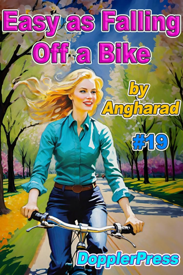
More of a watercolor style on this bright cover from Angharad’s Bike series. Lots of color, with the background dominated by an explosion of spring green, and pink blossoms in the middle background hinting at cherry trees. The play of sunshine and shadow is also eye-catching. Look at the highlights on Cathy’s left arm and thigh, and the shadows of the trees that liven up what would otherwise be boring pavement. It's a very pretty cover, and the look and feel of a bike ride in early spring is enticing.
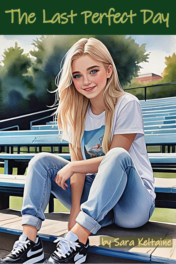
I love this cover for Sara Keltaine’s The Last Perfect Day; there are so many subtle touches that elevate it. Notice how the trees in the background are blurred, to better highlight the foreground. And, the largest, blurriest tree essentially forms a halo around the main character’s head, which brings her face into sharper focus. The foreground image is very photorealistic, and everything from the casual clothes and posture to the setting connects immediately to long summer days, a baseball field, childhood . . . an image of perfection, indeed!
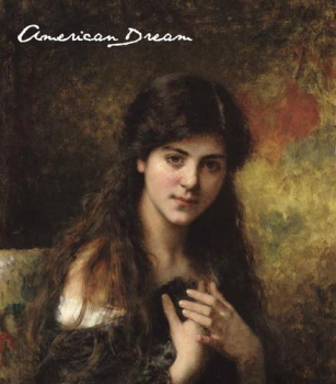
For this cover, Andrea Lena DiMaggio went with more of a “Dutch Master” style. The cover uses tenebrism to create a singular focus on the subject’s face, framed by long, dark hair and a background that is rich in antique tones – burnt gold, muted reds, browns and medium greens. The young woman’s image seems to provide numerous clues to her character – her posture, the slight incline of her head, her crossed hands, her solemn expression . . . Just looking at the cover, you know her.
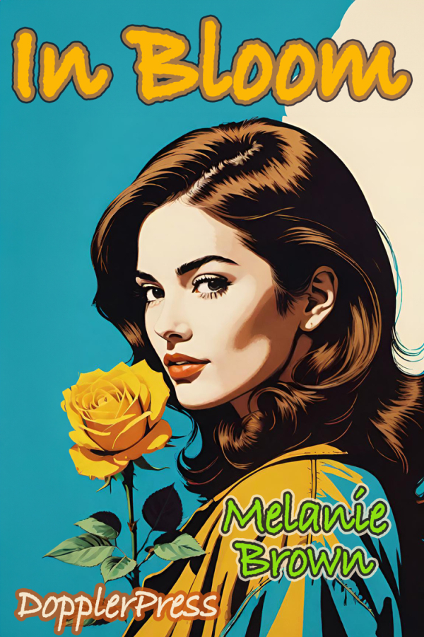
I’ll be honest, this cover for Melanie Brown’s In Bloom is probably my favorite of all that I’ve seen. Bold, clear lines. Dramatic pop-art primary colors. The contrast of the highly photorealistic yellow rose to the more stylized facial depiction. The bright light on the woman’s face, with the shadows highlighting the line of her jaw and her prominent cheekbone. And, right in the center of the picture, the only use of eye-catching, deep-red on lips that are drawn (unlike most of the face) in careful detail. Note the subtle shadow under the lower lip, and the pronounced cupid’s bow. Finally, big, bold yellow font for the title, popping against the blue sky and white cloud. This is just outstanding cover art.
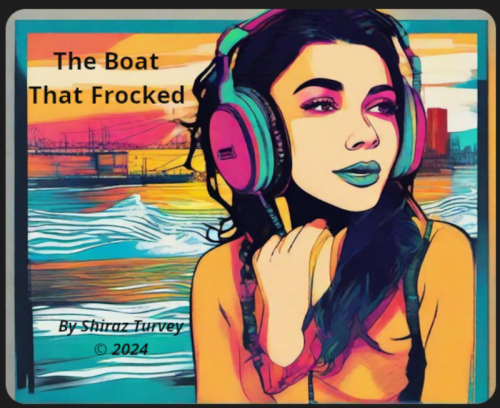
Here’s a classic! Shiraz Turvey’s cover for The Boat That Frocked is another one that brings you right into the story. The funky, off-beat colors immediately evoke the era of ships on the open sea determined to give the people back home what they wanted: the sound of rock and roll! Note, in particular, the blue lips, echoing the blue on the headphones and portions of both sea and sky. Very effective.
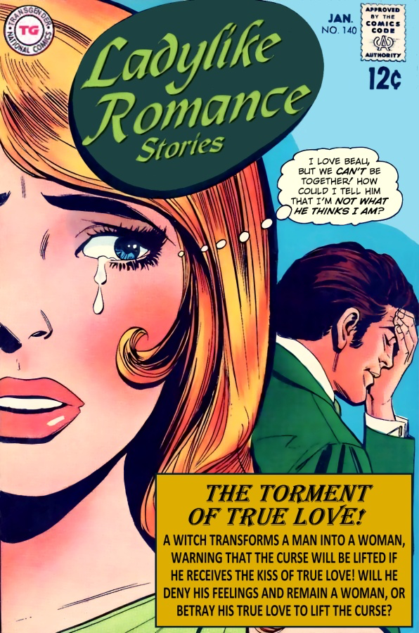
The winner for “Best Cover Art” in last year’s New Year’s writing contest, Jenny North’s pop-art cover for Beauty and the Beast is a tribute to classics of the genre. Oh, it’s busy – but that is entirely in keeping with “Ladylike Romance Stories!” The woman’s tears . . . the man’s visible angst . . . the thought bubbles . . . the teaser on “The Torment of True Love.” Goodness. Pony up the 12 cents, already, you know you gotta have this!
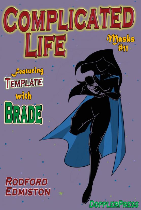
Rodford Edmiston’s covers, in contrast, have the look and feel of D.C. Comic’s original “Batman” covers (he kind of started out as the “Dark Knight.” After a bit of a detour, he went back to his roots). Look at how just a few strokes of white bring definition to the figure that appears all in black against a plain background, with only the blue cape showing as an accent color, sweeping down to accentuate the motion of the legs as the woman runs. The fonts, as well, echo the same comic book feel.
Sometimes, all you need is just the right photo, and the cover falls right into place.
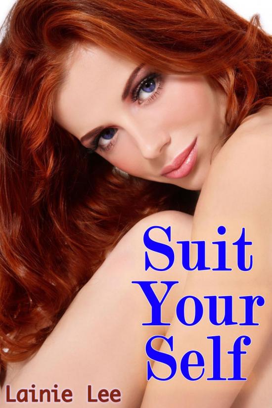
This photo looks like something you might see on the cover of Vogue. The extremely tight focus centers the viewer on luminous blue eyes, full lips, and a cascade of red hair. The pose is seductive, without being remotely indecent. (Sure, you don’t see anything but skin . . . but you don’t see any skin you aren’t supposed to see, do you?). The large royal blue font stands out clearly against all of that highly appropriate and extremely perfect skin.
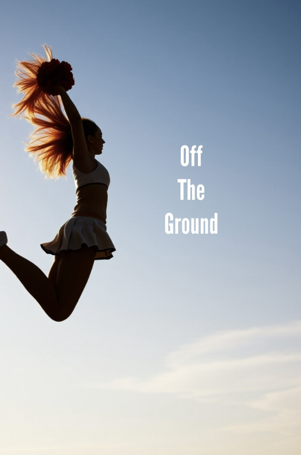
I was scrolling through covers and this one really caught me. The image and the text match exactly. The backlighting of the cheerleader is perfect, accentuating the flying form by avoiding the distractions of color and interior lines. The sole exception is the way that the sun turns her airborne hair into flame. The cover is simple, evocative, and effective.
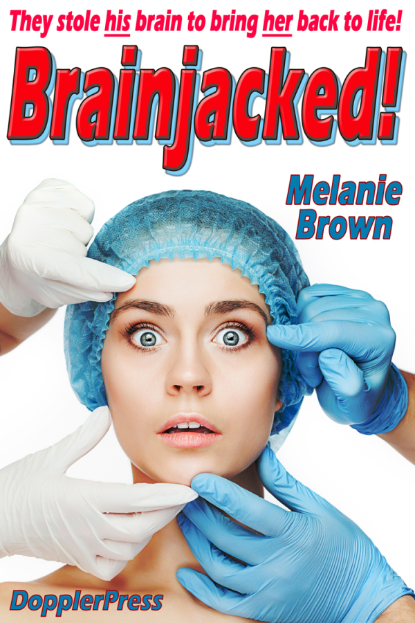
We’ve all seen this cover, and when you see it, you can’t forget it. The plain white background avoids distraction, and all four hands simply direct the viewer to look at the shocked face of the woman who is staring straight out, dead center in the picture. Again, this takes the reader right into the action (the surgical gloves and hair cap . . . yep. You know this is a medical procedure). Just one look at the title and the cover, and you have a pretty good idea of the prime driver of the story!
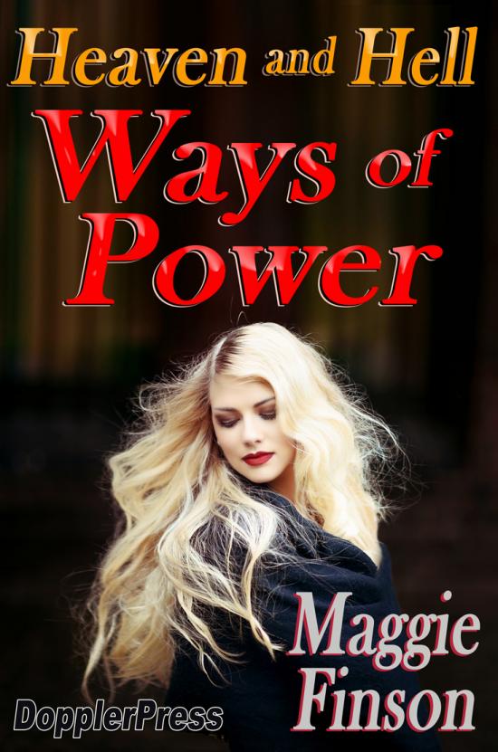
I could have picked any of Maggie Finson’s excellent covers for her Heaven and Hell series. I like this one because of its effective use of tenebrism to center the attention. The background is dark, so the succubus’ platinum blonde hair, pale skin and deep red lips jump off the page (well, the screen, but you know what I mean).
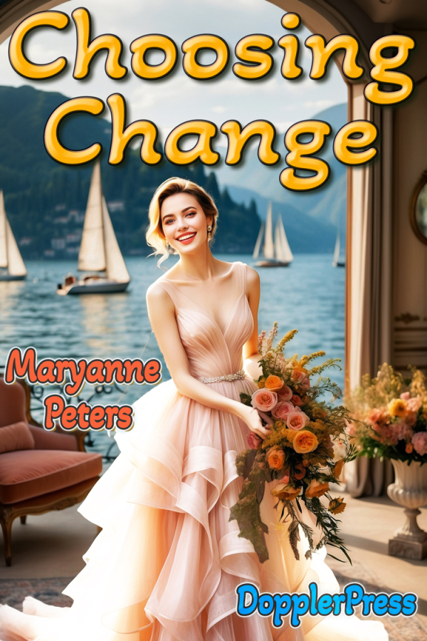
Here’s another cover that tells a story. A beautiful setting, a radiant young woman, and damn, just look at that dress – it’s sumptuous! If you are selling “change” as a concept, it’s fair to say that this might just be the change many readers are looking for! In short . . . smart way to sell books, Maryanne!
Anywho . . . That’s my data dump. What do folks think? Does cover art matter? What makes good cover art? What programs and techniques are authors using to make their covers? And, what are some of your favorites?
Comments
Cover art is important
There's a whole section in "Smashwords -- Style Guide" by Mark Coker; founder of Smashwords. In that section he opens with, "Your ebook cover image is the first impression you make on your prospective reader."
He then boils down the essence of the cover.
"Here’s a quick test, and a challenge: If you were to strip away the title and author name, does the image tell the reader, 'this is the book you’re looking for to experience [the feeling of first love for romance; fear for horror; edge of your seat suspense for thrillers; knowledge for a non-fiction how-to; an inspiring personal journey for a memoir, etc].'”
I never concerned myself with cover art until I started my journey as an indi author. Producing a good cover is an art/talent that is equal to or in my case more challenging the actual writing of the story,
My first efforts were done in Word. A little crude, but not bad. That required another piece of software because I could only save the cover as a PDF and I need JPG or PNG.
Gimp2 to the rescue. It's a free download. It will pickup any format and convert it to any other format. However, it's not too user friendly and there's a steep learning curve. I was able to manage with that for a while. But then I discovered, Pixlr E.
Pixlr E is web base and extremely user friendly. It took a while to discover all the potential (and I'm sure I haven't totally done so yet).
I've gotten better at doing covers, but I've still got a lot to learn. I violate one of Mark Coker's rules on cover art (Don’t design it yourself) because, 1) I'll never sell enough to justify hiring a truly professional graphic designer. (Good ones want a hundred dollars or more.) At best, I might be able to find someone on Fiverr I could afford, but even then the first several copies sold would go to pay for the cover. 2) I want to learn to do it myself.
Mind you now and then, I do one that I think is great. Here's one that I did for an unpublished work written by a personal friend of mine
One of mine that I like happens to be the cover for one of my contest entries that placed. in the romance contest a while back.
Hugs
Patricia
Happiness is being all dressed up and HAVING some place to go.
Semper in femineo gerunt
Ich bin ein femininer Mann
Silhouettes
I think silhouettes can be very effective covers — they can sometimes convey the essence which otherwise might be lost in detail; your cover for Full Disclosure is a great example.
I do my own covers for much the same reasons that you do. I also think they are fun to do, and challenging. I use a number of programs to manipulate images (generally stock photos to start), but I put the final package together with Adobe Photoshop. My biggest weakness in using the program is that I haven’t properly mastered the many options for manipulating text. The fault’s mine, though; I know Photoshop can do more than I’m doing.
— Emma
Fun indeed
I think it's fun as well. I've shied away from Photoshop, mostly due to price and partly because of the reputation it had when I was first looking for such programs. That being that it was a difficult program to learn. The return on investment just wasn't good enough both financially and time.
That said, the only thing Gimp2 had to offer was that it was a free download. I never really learned anything but the basics. Pixlr E is web based and has a free version. Being cheap, I've never looked at what the "Premium" levels would do for me. I don't use it every month, so the way I see it paying monthly is a waist. If they charged per use, or per download, then I might look into it.
Hugs
Patricia
Happiness is being all dressed up and HAVING some place to go.
Semper in femineo gerunt
Ich bin ein femininer Mann
Back when I spent a lot of time in bookstores…….
Cover art was much more important than it is now. The act of physically picking up a book, running your fingers across the slick print on the dust jacket, admiring the bright colors and the crisp lines of the artwork, the action implied by the artists work………. Yeah, all those things mattered much, much more than they do to me now. After all, it was the artwork that caught your eye and drew you to the display. Not the authors name or the title of the book, but the cover art was the first thing that drew you in. Of course, my next act was to flip open the cover and read the synopsis on the inside of the jacket - and it was that which determined whether or not I would buy the book, not the artwork.
I grew up devouring science fiction, and yes, once I found an author whose work I liked I would look for anything new or different from that author that I had not yet read. But to get you to pick up that first book, it was definitely the cover art. The same was true later in life when my taste in books morphed into other genres. It was still that picture or drawing on the cover that drew me in first. After all, why else would the book store turn books on the shelf to show the front cover rather than the spine?
I think our whole love of cover art starts out as children, the bright colors and happy smiles of the characters on the cover of a story book catching the eyes of a child, a child who can’t even read the title yet……… simple psychology on the part of publishers.
But not so much now that I do most of my reading electronically. Now, it is the authors name, or the title that draws me in for the most part. Although I will admit that cover art does still have an impact even when buying books on Amazon, just to a lesser extent. Perhaps that is why many of the books I read now have much duller covers, lol.
D. Eden
“Hier stehe ich; ich kann nicht anders. Gott helfe mir.”
Dum Vivimus, Vivamus
I wonder . . .
While I appreciate many of the covers I see on BC, it’s generally not what gets me to start a story. I think that’s because I usually don’t look past the listing of the most recent posts, and of course that doesn’t show any cover art. Maybe? But, like you, there are also authors I look for, whose work I will read regardless.
— Emma
Covers
Julius Schwarz, an editor at DC 60 years ago or so, had several rules for covers of comic books. The cover should show the hero or someone close to the hero in peril. Somebody should look as if they are just about to speak, whether there is a word balloon or not. If possible, the background should include the color purple for bonus interest. Burning cities and apes were also good. :)
My rules for choosing cover art are different but in line with Julie's aesthetic impulses. :)
My job as a cover designer is to sell the book. I have to catch the viewer's attention, tickle their interest, and encourage them to find out more. And satisfy them at a certain level, too, with balance, asymmetry, and detail. Typography comes into it, too.
Emma, it's certainly pleasant to see some of my covers admired. :)
Hugs,
Erin
= Give everyone the benefit of the doubt because certainty is a fragile thing that can be shattered by one overlooked fact.
How about burning purple apes?
Wow, that’s some crazy guidance!
As Liz Gilbert said to God, “I’m a big admirer of your work.” :)
— Emma
Cover Art
Some Authors have utilized it to great advantage. David Weber in his "Honor Harrington" series did a masterful job of it. Melanie Brown, one of our own, has also. When I was going to book stores, the cover art on a book was the hook that got me to pick it up. Amazon does a great job in their Kindle section. BCTS does too.
I like Melanie’s better!
But I agree, Weber gets good cover art. I thought it was even better for his Armageddon Reef series.
— Emma
Just because I want to toot my own horn :P
I'm personally partial of Zoe's cover art, but then again, I did much of it (both the BCTS releases and Amazon Releases)
Also, I did a lot of work on this one when I made it: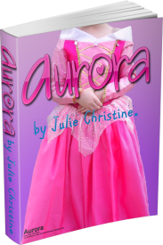
I particularly like . . .
. . . the Becoming Robin cover. It’s almost a complete story all on its own — just the expression on her face speaks worlds. And . . . to Erin’s comment above, it’s got purple!
— Emma
Setting and Competition
Wish everyone could go to a book fair to see how authors works are hawked to publishers and yes the public. Totally different than scrolling through places like BCTS looking for something interesting to read. A book store is in a sense a book fair only the buyers are end readers.
Let's break it down. The cover or art is the initial draw at fairs and stores. As the eyes of the buyer scans the crowed displays count one thousand one. The time it takes to grab enough attention the publisher or buyer is interested in picking up the book. No matter how exceptional the cover art is, not everyone is going to be attracted. But let's say we got their attention. They pick up the book and read gottcha blurbs on the front and back of the cover. They put the book back or at this point open it up. They read the introduction or prelude if it has one and hopefully the flip pages to read parts of it.
At this point we either sold the book or it wasn't what they were looking for and they put it back. If it was one of our dead tree books published in paper and ink and a bunch of them don't sell the book store asks the publisher about disposal. They go to the trash or returned to the publisher. They are called remainders. The publisher may ship them to places such as Bargain Stores at a truly heavy discount, pennies on the dollar. Or they may end up in the recycle bin or land fill. There are very few Steven Kings in the world and every writer is a dreamer.
Everyone who posts on BCTS or any of the sites so dedicated to free stories, are living the dream as a Published Author no matter how much applause they receive from the readers.
In response to Emma's cover art blog. It's highly important as it's usually the first thing a reader may see and then decide if they want to read the story buried within.
Hugs Emma, well done on your blog. I love it.
Oklahoma born and raised cowgirl
I spent two years working for Ollie’s Bargain Outlets……
Some time back - in fact, Ollie’s was my employer when I began my public transition. I actually began transitioning prior to working there, but was still presenting as male although the company I worked for prior to Ollie’s (NFI Industries) was aware of my status and my intent to transition. When I notified NFI of my intent to publicly transition I was in charge of about 65% of the company’s business; within a few weeks of my discussion with the Sr. VP of HR, I was suddenly shipped off to the company’s new Canadian division with a “promotion” to VP of Canadian operations - a “promotion” that did not include an increase in pay and required my relocation to the Toronto area. I will say that they were honest enough to admit that the change was due to the fact that the company’s single largest customer (an account I had been instrumental in landing and developing into our largest revenue producer) was not happy with a transgender person running the business. The company was BBU, a Mexican company.
So I left NFI and went to work for Ollie’s as their Director of Transportation. The pay was comparable, and I got a nice chunk of stock options - which was key as the company went public shortly after my being hired, and I made out very well when they did. I later left Ollie’s due to a conflict with my boss, the VP of Logistics, as he couldn’t deal with my being transgender.
Anyway, my point is that Ollie’s bought a lot of books from publishers and other companies at a huge discount. They were bought as what is called “stuff loads” - this is essentially where you pay a flat rate per 53’ trailer load (usually about $500) for whatever they can cram into the trailer. Books are literally just piled into gaylord containers and then stacked into the trailer. If done correctly, the trailer will hold up to 52 gaylords of books. We would then pay employees to go through and separate the books, ticketing them, and dividing them up for shipment to the individual stores. In this way, a book that was originally priced in excess of $25 probably sells for about $5, and still commands about 80% profit for the seller.
And for those of you not familiar with Ollie’s, it is the largest discount store operator in the US, having over 550 stores. Ollie’s started as a privately held operation in 1982 and is headquartered in Harrisburg, PA. The company went public in 2015
D. Eden
“Hier stehe ich; ich kann nicht anders. Gott helfe mir.”
Dum Vivimus, Vivamus
The wall of books
When I go to the local Barnes & Noble, they have a section right up front with “New in Fiction” and “New in Nonfiction.” It’s a wall of books, and my eyes take it in all at once, a gestalt impression. Unless I’m looking for something in particular, my eye will always be drawn by an image.
(BTW, I think they should rename their “current events” section “Stranger Than Fiction,” for both consistency and accuracy).
Thanks, Barb!
— Emma
BC's cover art
I've always loved the results from Erin's and Mel E's efforts on producting covers. Early on, I'd sometimes would present an existing image to use. Lately Erin's AI wizardry make my books stand out amonst the dull, repetitive covers of the competition. Having taken some commercial art in college, I know how easy it is for a customer to say "I like it, but can you move that over to the other side?" Easy to say, but a pain to do. Fortunately for me, I usually just have to say "I like it."
Melanie
I think . . .
I think she’s got you covered, for sure!
— Emma
Pictures in advertising are important.
Although nearly everyone coming here uses a female name except perhaps Leslie which is a male spelling of Lesley, it has to be remembered that very few of us claim to be female, many are crossdressers who remain very much male in most senses. Psychology suggests that males are much more visually stimulated than females, especially in erotic ways. So it remains very important to most of our readers. Two that have been missed are my dormouse photos on Bike - much more photogenic than any human, and Melanie's 'Pink Bear Romance,' where the girl has a very welcoming smile.
Angharad
A good smile goes a long way!
A dormouse, of course, goes further. :)
— Emma
Leslie/Lesley
In the USA, Leslie is more common, for both males and females. According to Wikipedia "In the United Kingdom, the name is spelled Leslie when given to boys, while for girls it is usually rendered as Lesley." This implies that, outside the UK, that rule is not necessarily followed. The list of people named Leslie in the Wikipedia article on Leslie shows many females.
Historical popularity of baby names
At the risk of derailing the thread, I can't let this pass without offering one of my favorite online resources when writing. This NameGrapher site shows the popularity of baby names in the United States since the late 1800s. So, for instance, if you type in the partial name "LESL" you can see how popular those names and spellings were for boys and girls. (Confirming your point that Leslie is the more common spelling in the US, although still vanishingly low for a boy's name for the last 40 years or so.)
I find this super-helpful when naming characters, or checking to see how a name or spelling might be perceived to the reader. For instance, Dorothy is an old-fashioned name. So is Charlotte, except that Charlotte had a resurgence recently. Madison was really popular in the early 2000s, maybe implying a character in their teens or 20s.
And as long as I'm on the topic, my other favorite naming resource (for US names) is the Social Security Administration's page on popular baby names. So, if I'm looking to name a teenager in a story, I might skim through the top 500 male and female baby names from 2010. That shows like names like Jacob or Olivia were popular then, and will likely sound more right to the reader's ear.
Of course characters (or kids) can be named anything, but whenever I read a story where a parent is like, "Here are our two kids, Paul and Lisa," I always find myself thinking that I bet I can pretty well guess the age of the author...
Yay!
I always figure out my characters’ ages and then look up what names were popular when and where they were born. I thought I was just a geek, but if Jenny North is doing it, I must be on to some somethin’!
— Emma
Our children’s names were not chosen from popular names……
So they wouldn’t fit into your concept. When choosing the names for our three sons, my wife and I used three parameters:
1) We looked at family names - both for names we liked, and names we would never use. My family is Scotch-Irish, being centered around the Charlotte, NC area but covering several states in the US Southeast. This means that there are some very unique names in the family, and having been in the US since before the French and Indian War, there are also many American names as well.
2) We looked at names with a more Scottish heritage. My spouse’s family heritage is Italian, but neither of us wanted another Steve or Tony - or some name that played on the Italian heritage some of them embraced a bit too much.
3) We perused several books of baby names - yes, books. My children were born before the ease of jumping on the internet to research names.
4) We also looked at how a name might be shortened by others as a nickname, or how it might be used to tease one of our children. People, especially children, can be cruel or just lazy about using names. Several of my spouse’s family members have complained for years that their chosen names for their children have been altered or are simply not used.
My wife talked me into naming our oldest son after me - my name is an old family name, and I am the fourth to hold it. That makes my son the fifth, but as I absolutely hated my middle name, he has a different middle name; one which we chose because we liked how it sounded with his first name. In fact, we almost reversed the names in order. His name is Dallas MacKenzie.
Our second son was named Ian Alexander. We chose Ian because of it’s roots in language and in my family, and we chose Alexander as it was a good strong name that sounded good when spoken together with our choice for a first name.
Our third son was named Caleb Montgomery. Caleb being another old family name from my family, and Montgomery we chose because we wanted a good name with a Scottish history that once again sounded good with his first name.
So you see, my children all have uncommon names that would not fit into the parameters of your system.
Also regarding my fourth point, I have always felt that if you choose a name like Anthony you should not object when your child gets called Tony. It is going to happen. Especially if your family has an Italian heritage. I have a nephew who named his son Santino, and gets pissed when the boy’s friends call him Tino; what do you expect? They are five years old, lol.
D. Eden
“Hier stehe ich; ich kann nicht anders. Gott helfe mir.”
Dum Vivimus, Vivamus
To be fair . . .
I also include a sprinkling of oddball names, including Dukkov and Diocletian. :)
— Emma
Totally agree!
Yep, I totally 100% agree--people choose names for their kids based on a lot of factors, not the least of which are old family names. Great point!
That said, when writing fiction, we need to think about how the reader is going to perceive a name. After all, a name implicitly tells readers things about that character and the environment they grew up in. Your example about Santino is sensational. I can totally imagine a character in a story saying to a new acquaintance, “Call me Tino. Only my dad calls me Santino.” And that’s gold as a reader, because now I’m already starting to think about what that might suggest about the character.
I'm not saying we should stick with "typical" names for characters when writing. That's boring and doesn't feel real. I guess my point is we need to be mindful as writers of having an internal bias when it comes to what we perceive as “typical." Like if a character introduces his two teenage kids, Minuet and Agamemnon, I’d hope that the story acknowledges that as unusual. But if I’m writing a story, my mental go-to names for characters might be Lisa and Scott, because those were common names when I was growing up. But if I’m writing teenagers, those are actually more likely to be the names of their parents or grandparents. So even though it may seem fine to me, it may sound "off" to a modern reader. And if I give their friends at school names like Paul, David, Susan, Linda, and Donna, what I'm really signaling to the reader is that I haven't been a teenager in a very long time.
Picking names
I have a thing for using gender neutral names and have downloaded an extensive list from babynames.com. They have a page on their site aimed at authors naming characters. "How to Choose a Character Name" It offers some guide lines for doing that. I've been using babynames.com for ages.
So you're not just a geek, you're a continuous writer
Hugs
Patricia
Happiness is being all dressed up and HAVING some place to go.
Semper in femineo gerunt
Ich bin ein femininer Mann
Gender neutral names
Same here! Keeping a list of gender-neutral names is really handy when writing these kinds of stories. Or for that matter, lists of interesting names in general, male or female. I mean, there's nothing wrong with a name like Chris, but sometimes the main character calls out to be more like a Chase or Tristan. :)
I may be in minority here...
I may be in minority here... But lately, I can not 'unsee' the AI generated images. Especially "realistic" ones. Once you start seeing them, it drops the covers with them straight into uncanny valley for me.
Of those shown here - second and third look like that.
I get that.
I know people who get a headache if they watch movies with CGI — these days, most of them, I guess.
— Emma
Magazines
When I was a kid I was captivated by monthly Science Fiction magazines. I really don't remember if it was the cover art or the content that first drew my attention but I graduated to the magazines from comics. I still subscribe to one of those magazines. I do remember when I first started reading them they had these wonderful covers by artists like Chesley Bonestell, who painted views of the planets in our solar system, as those landscapes were then thought to be. Many of them still hold up today.
Every month Analog, the successor magazine to the ones published all those years ago, still produces spectacular covers (although publication is now every two months). SF does give wide scope for different covers, from aliens to androids and 'near-future' scenes and imaginings.
I can only surmise that the covers help to sell the magazines and bring new readers. For any periodical to have survived for that length of time is quite an achievement, particularly in the face of competition from different forms of media.
The magazine cover that has always stuck in my memory…….
Was the cover art for Anne MacCaffrey’s Dragonriders serial in October of 1967. My oldest sister bought the magazine and gave it to me when she was done with it. That one magazine got a seven year old child started on reading science fiction.
The original cover art for the “Weyr Search“ with it’s drawing of F’lar and his bronze dragon Mnementh confronting Fax at Rutha, the rest of the dragon wing in flight behind them, that is what hooked me on SciFi for a lifetime.
D. Eden
“Hier stehe ich; ich kann nicht anders. Gott helfe mir.”
Dum Vivimus, Vivamus
SciFi
For me, it was SciFi books rather than magazines; I had a subscription to The Science Fiction Book Club for years when I was a teenager. Two books every month, and some of the dust jackets were fantastic.
Funny that you should mention McCaffrey, Dallas. When I was thinking about cover art, I immediately thought of the cover for the paperback edition of Dragonsong. Really stunning image of a girl playing a set of pipes to a clutch of multi-colored fire lizards. Magical!
— Emma
I was a member as well…….
I joined when I was in junior high and kept my membership until I left for college. I was also a member of the Military Book Club as well.
Both clubs were a great way to buy books at a discounted price!
D. Eden
“Hier stehe ich; ich kann nicht anders. Gott helfe mir.”
Dum Vivimus, Vivamus
An example
I remember taking a book out of our school library of Bonestell's illustrations.
Love, Andrea Lena
Purdy!
I’d be willing to let all the billionaires enjoy that view, if we could just induce them to move there. :)
— Emma
Years ago I bought…….
A collection of Boris Vallejo’s illustrations. I believe that my middle son has it now.
I fell in love with so many of his depictions of heroines in the SciFi and Fantasy genres. I wanted so badly to be one of them, to look like them.
I may never have looked like one of his paintings, but I guess in a way that I did become a Warrior Princess for the US Navy, lol. I do still have my sword, but my uniforms just never looked as good as the armor in Vallejo’s depictions…….
D. Eden
“Hier stehe ich; ich kann nicht anders. Gott helfe mir.”
Dum Vivimus, Vivamus
Vintage Chesley Bonestell
Nearly all his paintings had that sense of realism and evoked that sense of wonder. Even if they turned out not to be accurate given what we know today they're still wonderful. I used to dream of standing where his artist's easel might have been.
A good image also needs good text
To me, when looking at author-created covers, the thing that too often gets shortchanged is the typography. Boring fonts or weird color choices, for instance. Or "I added a drop shadow, that's good enough." Or finding a decent font, but then doggedly sticking to it for all the text on the cover. Or maybe going with mixed-case lettering when all caps would make more of an impact.
For example, here are a bunch of covers for my Faraday City stories. I'm hardly a professional, but I'm betting that even at a glance you could pick out the noir story, or the silly whimsical story, or the adventure comedies, or which stories have horror elements, or the Jason Bourne style action thriller. I bet you could still do it even if I hid the art. So many wonderful fonts out there. :)
I'm actually thrilled that the tools are out there to let authors make their own covers. It's fun to see creatives get creative! But it's a double-edged sword since an amateur cover might turn people off. For my money, of the covers shown above, "Off the Ground" and "American Dream" really stand out. Beautiful typography, great sizing and positioning of text, and great color choices. I see those and I already think the author is clever. Great start! :)
By comparison, my covers here? Waaaay more busy. Splashy and colorful. But these are stories set in a city of superheroes, so I'm okay with that. It helps set the vibe, and to me, that's what a good cover should do.
Thank you, Jenny!
Great thoughts, and an array of compelling covers to illustrate them! I couldn’t agree more about the text issue, and it’s a particular weakness of my covers, as I’ve mentioned. Photoshop has quite an array of fonts . . . but unless I really don’t have it sussed out, it’s got nothing as imaginative as what you are showing on your covers. Is there a particular program you are using?
— Emma
The tools are ancient, but the skills are portable :)
Thanks! I’m fortunate that when people started doing captioned images back in the day, I did a bunch of modified comic book covers, like that I one I did for that “Ladylike Romance Stories” cover. (Thanks for the kind words, by the way!) That meant that I looked at a lot of covers, but I also looked for ways to mimic their style. So, I picked some stuff up through osmosis. :)
I use different tools when making covers, but the main tool I still use is a 25-year-old copy of Paint Shop Pro, which was a cheaper off-brand alternative to Photoshop. For the typography, that does a lot of what I need. Anything with layers and outlines and drop shadows, you’re a lot of the way there.
I have a whole mess of fonts, so my font organizer is Typograf, which is nearly as ancient. But it lets me type in some text and show me what it looks like in fonts I have loaded or have downloaded in certain directories. And then sites like Fontspace.com can be good for looking for weird fonts.
I feel like the main thing is figuring out the vibe that you want. Identity Crisis was more high-flying and futuristic. Charade was noir. Tatterdemalion feels creepy and constraining. Brand Strategy has more of that Bourne Identity feel, but I reused the futuristic font from Identity Crisis to give a little connection. Plastic Makes Perfect is kind of a fetishy whimsical horror, so I used a Barbie font in Barbie pink, and then mixed it with a really creepy font in that whimsical pink. Mixing up fonts and colors or mixed case and upper case isn’t right in all cases, but it can create a different look.
I mean, not to be critical, but I’ll point out that on that original list of covers, three of them are using the exact same font. That’s okay, but it is a bit of a miss to help sell the stories on what makes them unique.
Thank you!
I'm honored.
Love, Andrea Lena
Images
I write because I can't draw. Which has meant scouring the web for copyright free pictures I could use, a rather lengthy endeavor at times. Especially as I was aiming for more minimalistic scenic or specific images to convey a feeling or mood that thematically tied to the book / story in some way. Not sure how well they succeed at that, though I do rather like the ones for the last few books and stories I've posted.
Hopefully the images have at least imparted some sort of 'feel' to the parts / chapters / stories for the folks who've been kind enough to read them. And as they're not to be published on Kindle or anywhere in these forms, I didn't have to struggle with the important choice of font and colors for the title text and author's name to be overlaid upon them. (Or just been too lazy...) :)
A good friend did offer to pay to hire a professional artist to do covers, but I didn't want her to spend that kind of money on them. At least not yet...maybe some year when they're re-edited in a way that could be published. Although I don't think I'd want anything with an artist's vision of the main character posing in action or any such thing. Every time I think of that kind of cover for them, I cringe.
Which reminds me I need to start the search for the next book's image...likely to take as long to find as writing it!!
Your gut instinct is correct
Your main character’s physical appearance would obscure her essence. She would appear to be a gorgeous redhead in her late teens — maybe with wings, maybe without. But that’s “just” Jordan. She also has the mind of Justin, the memories of Gabriel and Arcadia, and the Presence of Light itself. Good luck capturing all that with an “action figure” shot. I think you would be better off with something simpler, like the original covers for George R. R. Martin’s books. Those showed nothing but a single object (a crown, or a sword hilt, for instance) set against a textured, single color background, with care spent on the fonts (to Jenny North’s point). My two cents. :)
— Emma
Mostly Anime/Manga inspired.
The few times I've done a cover-art for my stories, I've mostly focused on commissioning artist that are one, part of the LGBTQ+ community and are personal friends of me. And also artist that are in the transgender community. In my many years, of wandering and roaming from one community to the other, I've established connections with several such artist, some have gone the way, some have retired, burned my the endless flame wars that often rage on social media platforms, others have outpriced themselves beyond my limited means. In short, I tend to focus on Anime/Manga inspired pieces when I plan on a coverart. Since I tend to write in Anime/Manga inspired logic with anime/manga inspired plot lines. For example you can consider reach of my stories an story arc, and each chapter belonging to that story an episoded within that arc. These arcs often reference past arcs, sometimes they reference other arcs characters are going through.
So . . .
Can you share your favorite cover? :)
— Emma
Yes Ma'am
This was a stream commission I got from Pastel, It was commissioned I believe for Jamie's Baptisim into the Episcopal Church. This is a classic example of Pastel's style.
This is Jamie again. The artist this time was Fox-Kitten, the first artist to really accept me when I came out of the closet. Pastel was the second. Fox has something of a more late 90's anime style.
This is Cerridwen cosplaying as Sailor Mars. The Artist is Gem, famous for working on "Rain" the ainmation. This will used for a upcoming story I plan on writing as soon as I'd collected a few more spoons.
The coverart to the first story I ever posted here. Featuring none other than Madeline Brewer.
This one was commissioned for a Melody of the Heart Story that can found here. It was also done by Pastel,
And last but not least. Daisy, before coming to Benton. This one was done for "The Womanless Beauty Pagent" and holds a special place in my heart.
Thank you for giving me a chance to share these treasures ma'am.
How wonderful!
How wonderful that you have covers from your friends in the anime art community! I especially like Cerridwen. ;-)
— Emma
Cover turnoffs
Honestly, far too much of the art used here gets the story bypassed by me. Right off the bat, abnormally large breasts and revealing outfits will cause me to skip the story. Soft porn isn't my thing. The superhero covers are totally out. Most of the ones you say "bring me right into the story" take me right past the story. There are a of couple of authors I've not even read, strictly based on the illustrations.
A couple of illustrations I do like are the ones for "Shannon's Course", and the "She Like Me". Could use some more polish, art wise, on "She Like Me" but neat and simple.
I've often wished I could turn off the illustrations on the front page as they are a waste of space. One current series always uses the same illustration, taking up more than twice the area my monitor shows. And as art alone, is a total waste. One of the few things I like on fm is the lack of art in the story listing. I much prefer a decent description.
Which brings up another pet peeve of mine. Multi-part stories that use the same teaser for every chapter. If the description is the same for each chapter than there is no point in reading them as there doesn't appear as if the story advances from chapter to chapter.
Truthfully, I've blocked almost every author currently on the front page of BC. I come back hoping for a change, but I'm disappointed almost everytime. I may reread older stories but the new ones are a thumbs down for art, content or both. Starting to remind me of when fm went downhill.
“When a clown moves into a palace, he doesn’t become a king. The palace becomes a circus.” - Turkish Proverb
I share many of your concerns
Cover art is a two-edged sword. It can attract and it can repel readers. I scan for stories to read on the "Free Stories" page. When I'm reading serial, I like to see the same cover art for the series. It makes it easy to pick out.
But the use of cover art with no summary of the content is pretty much useless. You're left with only the information above the art and the promise made by the art.
Your observations regarding over sized breasts also turns me off. As do most cautions cited. What I'm looking for in a story is a bit of fancy; something to paint a picture of how we would like it to be. Of course, the struggle to get it there is what makes the story interesting.
I did break my own rule for the same description for each chapter when I continued "My Summer in Pantyhose" by Jeremy Chandler. I knew I was writing for a niche audience and I was writing in some else's style. Jeremy had done that so I maintained the set pattern and the content made it plain that my postings were not authorized by Jeremy. I did add a simple cover art to make it easy for readers to locate.
Hugs
Patricia
Happiness is being all dressed up and HAVING some place to go.
Semper in femineo gerunt
Ich bin ein femininer Mann