
Hello out there,
I ended up playing around in Canva a little bit and created a couple covers!
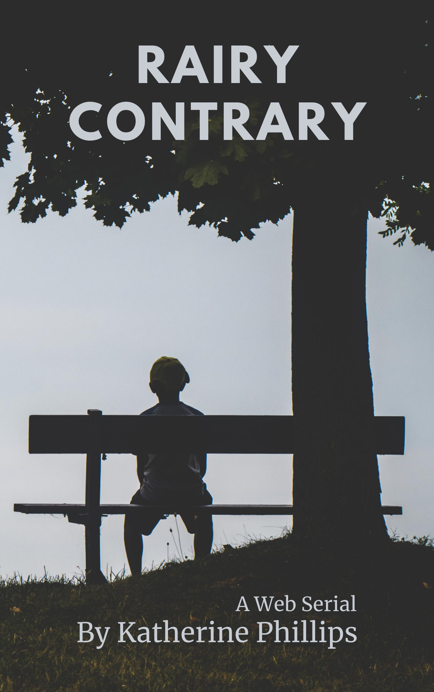
The first one is your standard book cover.
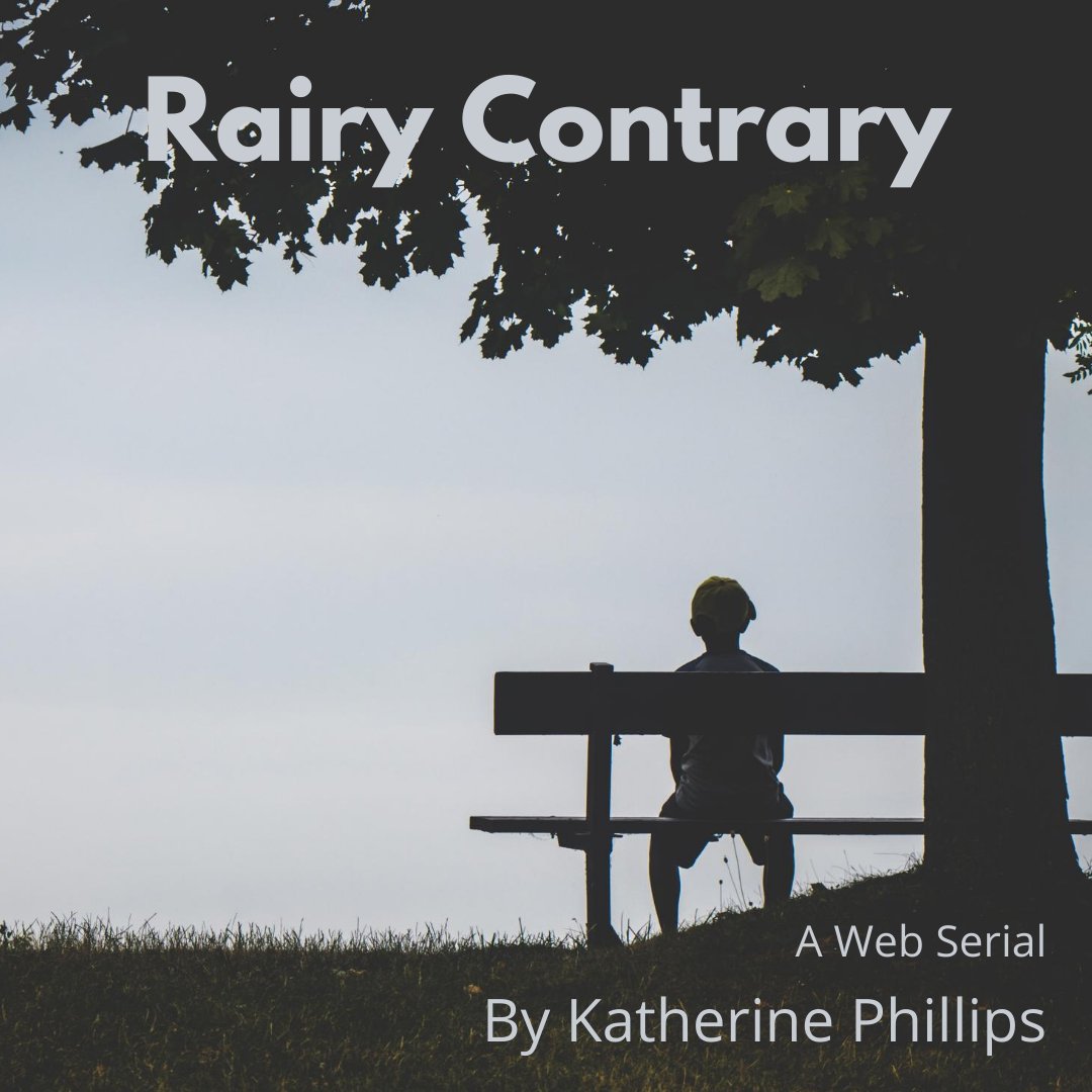
The next one is pretty much the same thing but smaller for instagram.
I like how they turned out. I just wanted to share that with you.
Thanks for having a look!
Katherine
Comments
Good job
I like it too.
Thanks!
I am a bit worried that the title and my name blend in too much with the picture and don't stand out enough.
Hope you don't mind thoughts on readability ...
(Why yes, I am a complete nut, and sometimes I'm a jerk, on readability...)
The first, larger one, with "Rairy Contary" on two lines looks just fine.
In the second, smaller version, the 'Rairy' starts to get lost on the left in the black/blue of the trees and sky. if you could shift it up and to the right a bit, I think readability would greatly improve.
Also, the 'web serial' and your name are a bit small, and may need to go up 1-2 point sizes, and a little more black earth to show them better. Taking a horizontal 'salami slice' out of the tree may 'buy back' enough space for the bottom text to get a larger 'earth' background.
Thanks!
<3
Thanks so much for pointing all of that out. Thankfully the smaller one I used only once on Instagram. If I use it again I'll make sure to modify it in canva before posting it again.