I have to say that I've noticed lately that a lot of authors have been putting more work into the
presentation aspects of stories. Geoff and I were talking last night about this very thing.
Most of us feel like a nice presentation is good step to attracting reader interest, as it certainly
does my interest. I just wanted to say that I think that the front page looks much nicer when
Authors find time to do this, and I think that this week, I've seen a lot of them doing just that.
Although I lack the talent to do a really great job on my own, I have been playing with my own
serial pages. I'm not sure if many people see them, as most folks go right for the story, but I'm
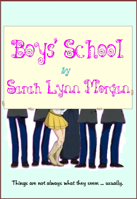
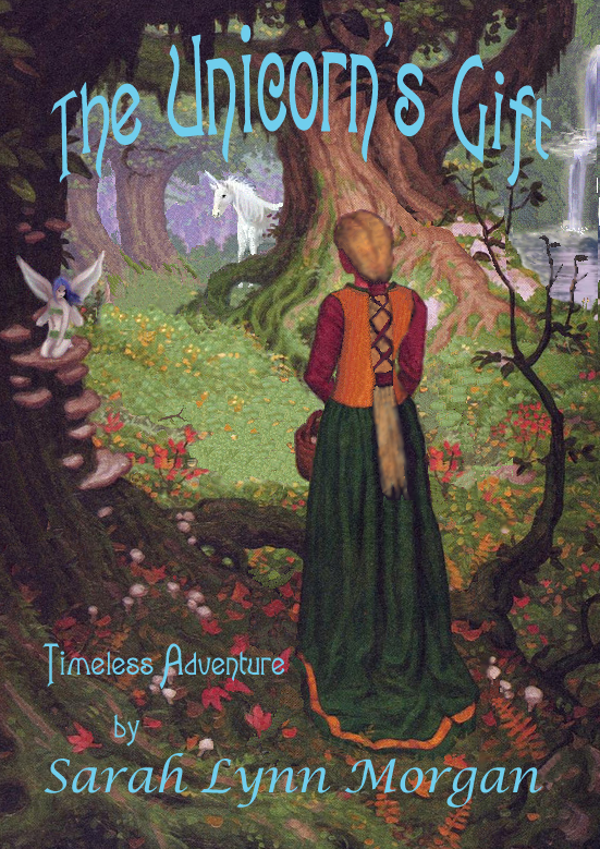
sure that a few do. Either way, I'm proud of them. I thought I'd share the covers that I've cobbled
up for two of my stories. I have to say, that when I'm too tried to write, sometimes it's a lot of
fun to play with these pictures too!
Sarah Lynn


Comments
The downside
is that it takes up more space on the 'front' page, which means less room for other stories. It presumably also takes up more server space.
Angharad
Angharad
Title Pages vs "front" page
These title page illustrations never appear on the site front page, just on the linking page that keeps all the chapters together. And space on the server is not a problem, we've got big hard drives that could hold a couple hundred movies, let alone a few pictures. The one resource that gets pinched at BC is processor time, especially during peak periods, but that's a perennial problem.
Those are good covers, Sarah. Except for the capital H in Sarah on the unicorn cover, they look professional. :)
Hugs,
Erin
= Give everyone the benefit of the doubt because certainty is a fragile thing that can be shattered by one overlooked fact.
= Give everyone the benefit of the doubt because certainty is a fragile thing that can be shattered by one overlooked fact.
Thank you, Erin.
You ruined it for me. I kind of liked das capital.
As for Angharad, I was going to answer the same thing. Having asked permission, the file size, as
opposed to the sizes of the drives in machines these days are really insignificant, even though the file
size equals the story size. These graphics are very seldome seen on the link pages too, but often when
folks come to the site, and they look at an authors page, or in the story pages, that's when they run
into these. They never appear on the front page, where they would gum up the works.
Sarah Lynn
Ummm - Guilty!
Sarah, the front page presentation stuff - that was me. I went through a handful of stories and formatted them and added different fonts based on the theme the story made me feel. On 1, I had to change the table configuration to shorten it on the front page to save space. So i am the guilty party you are looking for.
val
Ummmh?
Would that be why I have to scroll side to side now? I can see where moving the illustrations to one side and placing the text next to them saves space vertically, but the now-required side-to-side scrolling is a bit of a pain, sorry.
Yuri!
Yuri!
Valerie.
I thought someone went through changing fonts and things. I think they look nice.
In order for me to have the font that I wanted for Boys' School, I substituted an
appropriately sized graphic. In that way, I was sure the unusual font would not
run into any display problems, shifting to a standers png graphic.
I think the presentation of the front page in part, but more the quality of some
of our writers here, will keep a lot of the folks who might be just visiting now,
comming back.
Sarah
Images
Sarah, Very nice artwork especially the unicorn cover, I also thought the School one is clever as well, When it loaded I thought "That's just the regular image". Then I scrolled down a bit :D
I have a couple of questions though (if you'd be so kind to answer)
Where did you get the original Unicorn artwork, I'd love to get hold of a bigger copy. And are you going to bless us with anymore of this beautiful story?
Huggs
Sammi
What splendid pictures!
What splendid pictures! I especially like the one of Syna & Asho - it fits the feeling of the story so well.
Pleione
Lol
I kept trying to match legs to characters before realizing that hey, those in slacks could belong to any of the boys. Okay that one on the end is Freddy, so the one at the other side has to be Tom! Of course Chris and Mrs. Peirce is in the middle and ...
The Unicorn cover is just perfect!
Hugs!
grover
PS: I know I'm wrong now. Mrs Peirce would make sure Freddie was in the middle so she could keep an eye on him. Otherwise he'd be peeking around the side. :) LOL!
Boy's School pic
Why is the girl in the Boy's School artwork wearing a cheerleader's uniform? I would have thought Chris would be wearing the beautiful blue gown she found in the theater's costumes, you know, the one she'd have to wear a corset for? Never too soon to start corset training.
Yuri!
Yuri!
The Artwork from the Unicorn’s gift is as follows.
Some time ago, I found a picture that was very close to the feel of this story I’d
been working on. Amazingly really. Unfortunately it was from an unknown artist.
I lack the kind of talent it would take to create something like this from scratch, but
an even bigger hindrance was that until a week ago, the only programs I had on my computer
were MS Paint, and something called Dog waffle, which is the same as MS Paint, but it has a
smudge/blending tool.
The picture I found was this one.
It was amazing. Now if anyone knows where it came from, I would be very grateful
if they could let me know. I’d love to write to the artist. I’ve spent may hours looking
on image searches on Google, and or pouring over the ten thousand pictures of unicorns on Elfwood, etc.
Anyway, It’s an amazing picture, any way you look at it. I liked it so much, I used it
as the pattern to recreate the same thing, but more fitting to the story that I was telling.
I came up with this,
Most of it was redrawn by me, except for her skirt, The big tree in the middle ground, which was only modified on one side, and some of the bracket fungi on the foreground tree. My friend who is an artist did a smudge on the waterfall, which I later redid, and did some blending on the little aida fairy. She also gave her blue hair! LOL I liked it
so much I kept that.
One other note, my friend, the artist has been so impressed with what I do with MS Paint, that she’s given me an old copy of Photoshop she’s never used. I have no idea
what to do with the thing. OH, and one other note. She also put a PUNK Hairdoo on ASHO! That one, I had to fix. It was cool in it’s own right, but just too close to my
vitals.
So you see, this is the original, and what I made from it. Because of the origins, I could never use it for a actual product, but I’ve done enough that I think that using it here for a free site, is fine. If I redraw the tree, and skirt, which is pretty but a little long to go chasing aida though the woods in, then it would probably be even more so.
Now, I'll change that capital H in Sarah. If I have time, I'll probably take out the root/shoot thing infront of the girl, that grows up on her right in my picture. It's too much like the Original.
That's where the picture came from.
Your Artwork is Very Nice Sarah
Especially considering that you did them with MS Paint.
I really like small images in the story intro on the front page providing the graphic and text use a moderate amount of space. The small graphic you used for The Unicorn's Gift Chapters plus the Show Me the Money (Arecee) graphic and the graphics that Alys uses with her stories come to mind as good ones.
SamanthaK, Cbee... Chapter Graphics.
Chapter Graphics.
Same deal. I found the basic graphic on a site about unicorns, that is still up but has not been touched for years. I thought the feel was perfect on this pic, which they had listed as an unknown, and that was years ago.
You can find that site by searching for the original name. Faeunics., which was the name on the original picture. Same deal Searched and searched. Sent three Emails to the site owners, trying to identify the artist. Absolutely futile. The site folks never even answered.
Well I produced several versions, which appear on various chapters. Similar feel, but very different from the original.
Again, if anyone can help me find the original artists, I would be ever so grateful.
Thanks Sarah
Thanks Sarah
Hugs
Sammi
Well, the hair a great color.
The art is very nice. I love the butt length locks too. Mine will never see scissors again, but it is doubtful that I will live long enough for it to get there.
I am still marveling at the difference in your "voice" between Unicorn and Boys School. Very good.
Gwendolyn
I like pictures
Sarah, I like the pictures. They help me better understand the authors and thereby help me understand their characters. You as an author have choosen the specific artwork for some reasons related to your story. It adds for me another dimension to your works. Please continue to use the pictures.
Wendy Marie
Wendy Marie