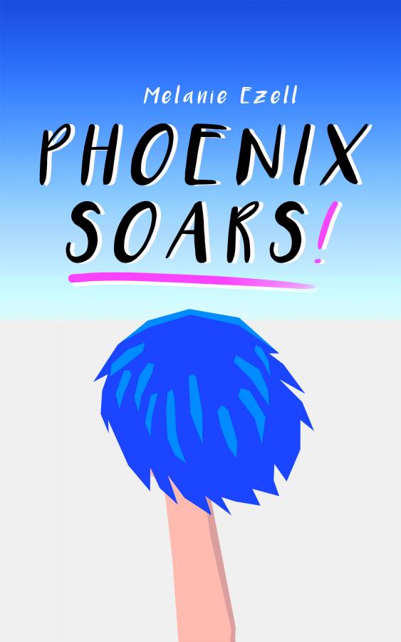
Nyka's finished another cover for me, this time for "Phoenix Soars!," the new and improved version of "Oh, Cheers!"
So, you wanna see it?

Great, right? After much deliberation this is the design we agreed on for the final cover, and I'm quite happy with it. I think it fits the overall theme of the book well, and has the right attitude. She's even done two versions of it for me; one with my name low (as seen here,) and one with my name at the very top, which is what I'll probably use for the normal edition of the book.
If you like Nyka's stuff and are interested in getting her to do YOU a cover, you can find her right here on BC! She's super easy to work with, and willing to work with you to come to something you're happy with.
Melanie E.


Comments
Nice palm tree!
Kidding, I know what (who) it is and it's a GREAT cover!
Not your typical tg fiction cover at all, a lot of which are better art
than I could produce but they tend to be very literal interpretations of what's inside.
This reminds me of an Ed Ruscha or Tom Wesselman painting (both 60's pop guys) for some reason...
hugs, Veronica
Some people leave a mark on this world while others leave a stain
~Eleanor Roosevelt
.
A bit of a pop art influence is what I asked for, sort of.
I do intend to try and avoid the typical TG book cover, since I think that the way a lot of our literature is presented is kind of a problem. Even good books too often will have a front picture depicting a scantily clad girl or other overtly sexualized image to it, and that doesn't do anything to help separate our more mainstream/vanilla stories from the fetish material that permeates the market. My stories, I like to think, are good stories first, TG tales second, and as such I want to emphasize the story within rather than the inclusion of the TG element in my designs.
For examples of the look I wanted to have with this one I sent her A) Google search pictures of cheerleaders holding poms up, and B) screenshots from old rotoscoped games like Another World/Out of This World, Prince of Persia, and the like. We also found the font -- called Luna -- and after a few days of adjustments and such this is what she came up with. It's pretty much right on with what I wanted, and she was willing to work with me extensively to get *just* the right effect.
She's got two more to do with me, both with very different styles, that I'll share as she finishes too. I hope some other authors take her up on doing a few; she's really easy to work with.
Melanie E.