Hello everone! I'm of need of some opinions here. My book Heroes of Justice has lingered in the backroom for ages. There're many reasons why, but mostly because of the lack of a cover. Yes, I do know that many has come forward with solutions, but for me it turned into a mountain of frustrations.
Finally, money problems has forced my hand, so ready or not.
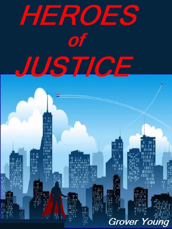
This is a cover I've put together that I think looks half-way decent. My question is what do you my three fans think? What might improve it?
Hugs
Grover


Comments
Oh can I be Fan 4 through 8
giggles, I like the cover though a 1/8 (about 20 degrees) turn of the hero could possibly make it better.
Weeee, the quads and I are going to be one most probably till the end of january now.
Goddess Bless you
Love Desiree
Really into eBook covers
I'm really into eBook covers right now, so I've been working with/researching what makes a good cover. Seems to me that you've got a pretty decent one going. Not sure what the story details are, but from the title, the cover fits.
Hugs
Patricia
Happiness is being all dressed up and HAVING some place to go.
Semper in femineo gerunt
Ich bin ein femininer Mann
E-book covers
are a trick. They have to be eye catching, but you have to bear in mind that most prospective readers will only see the thumbnail. So it had to fulfill both looking interesting, but also look good at that reduced size.
I've noticed a trend where big name authors have their names much bigger than the title. At times I can't find the title without a lot of searching! LOL!
So, perhaps add a tag line? "A Novel of Gamers lost." ?
Hugs
Grover
Typography. The title needs
Typography. The title needs to standout and be more legible. it should overlap the frame of the picture some and be set on an angle with a drop shadow. Use a sanserif font instead of serif. Make it shout the title. Use a different font for your name, the kerning on that one (MS Comic sans?) stinks. :) Make the name a bit bigger and here you could use the same sanserif as you choose for the the title but in a lighter weight and perhaps italic.
The image is good but with the two flying figures seeming to touch the pole and the one flying figure touching the edge of the image, it gives a static feel to what should be dynamic. If you can, back them off in their tracks a bit.
Hugs,
Erin
= Give everyone the benefit of the doubt because certainty is a fragile thing that can be shattered by one overlooked fact.
I can't resist...
*Edna Mode voice on*
No Capes!
*Edna Mode voice off*
~And so it goes...
A few suggestions...
Overall, I think it's a good composition, but I have two main suggestions:
The first, if possible, would be to continue the sky of the image up underneath the book title, rather than sticking it in a separate dark blue box on top of the image.
The second would be to use a cleaner image compression format. It looks like you're currently using a high-compression JPEG, which is causing a ton of artifacting around the title and down in the image. If you have a "clean" master in Photoshop or wherever you assembled it, try re-saving it as a PNG (or GIF, but that might not work as well with the gradients). The JPEG algorithm is designed for more natural images like photographs, and doesn't handle blocky colors well, causing the weird effects you see around the title.
Pieces Parts
Unfortunately this is a shade tree special, built from whatever parts I've been able to find. The Background is a wonderful clip-art. The figure is from a tracing of a character outline from the first edition copy of Champions character sheet.
The JPEG is what I saw recommended for Kindle. Should I try another format? As for Photoshop I only wish. I have only MS Paint. I don't even dare GIMP since one, the learning curve is a little steep and I don't know if my poor laptop which is already slow as ... just trust me it's slow. :)
Doing gradients would be nice, but is out of my reach for the time being. MS Paint has all kinds of limitations, but so does being poor.
Hugs

Grover
try paint.net
instead of gimp, more like paint but much higher functionality and supports png as default.
Terri
Teresa L.
Uhm Yes Please more.
Mind you I'll have to re-read everything but there's yayness there too.
*Huge Hugs*
Bailey Summers
Text and color
I like the all caps text better. Have you looked at white text on the dark background? The reason I say that, the red cape on your hero would catch the eye quicker.
RobinDiaz
Nix on all caps
All caps is harder to read than caps and lower case. The only reason to ever use all caps is to make something standout in a field of caps and lower case. If all caps was more legible, then no one would have ever invented lower case, since capitals came first.
This particular version is not centered and the extension into the picture is almost exactly the size of the width of the character limbs, so it needs to be centered, and perhaps both wider and deeper. Can you achieve dropped shadow? The change in the flying figures is good. The change in the byline is good.
Hugs,
Erin
= Give everyone the benefit of the doubt because certainty is a fragile thing that can be shattered by one overlooked fact.