
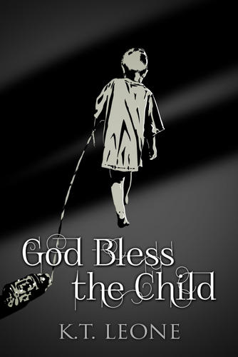
I have two new cover designs for God Bless the Child and wanted to get people's opinion on which one they like better. One is very similar to what is already up and one is completely new. If you don't like either that is a vote also, but you can't like both because that is unhelpful. I thank you .

Comments
I like...
I like the top one, but I think it would look better with a less swirly text.
Have a deliciously devious day,
The broken image...
...is very compelling.
Love, Andrea Lena
Top One
I definitely like the top one better. It draws me in much better than the bottom one.
- Terry
The top one us the most
The top one us the most becoming.
With those with open eyes the world reads like a book
I like
the top one, too. Evocative and hinting at things broken and put back together.
Maggie
I seem to be the only one...
Who prefers the bottom one.
I've never really been all that into impressionistic art, and the top one just makes me go "what the heck even is that?"
The bottom one OTOH tells a tale of a battered child. Or at least an extremely poor one. It hints much more strongly in my opinion towards the content of the story.
And its a picture of a poor child walking a "pet" bottle. That's extremely emotionally compelling.
Abigail Drew.
My God Bless the Child Image Vote
is for the bottom pic. The upper one is a bit disturbing.
May Your Light Forever Shine
In order of preference the
In order of preference the original as it is on Amazon right now, followed by the bottom one. You have to have Pipsy on the cover.
Interesting - Valentine
I always thought that the one on Amazon looked amateurish, that's why I went out and looked for something else. Maybe I should leave well enough alone. And, just to inform people, I paid someone a hefty 5 dollars for both those designs, though the bottom one just added the lettering.
Katie Leone (Katie-Leone.com)
Writing is what you do when you put pen to paper, being an author is what you do when you bring words to life
I like simpler fonts than
I like simpler fonts than what is shown here.
The reason I don't like the top one, is that to me it is implying a broken child. Jenny isn't broken. Battered, bruised, banged up, and bent to near breaking, but not broken.
color
It might need some color. I think I could edit it myself to change the font and add some color. That's why I had the yellow on Amazon. The reason I like the top is it reminds me of les miserables. That and I only sold 9 books this month and I am never satisfied. I have a plan to put an ad out with my Christmas Cards and I will have 470 potential new customers. I wish Dell or Random House would hurry up and discover me already, this is a lot of work.
Katie Leone (Katie-Leone.com)
Writing is what you do when you put pen to paper, being an author is what you do when you bring words to life
I think you need to contact
I think you need to contact them, I doubt they are out looking for you.
Re: Time to vote
I prefer the second image as it ties in better with the story, it is obviously the main character due to pip, rather than a non-descript face. I can see how the symbolism works in the first with the broken mirror, but it took several seconds to realise what I was looking at. The second I instantly recognised as a child walking away. Being "broken" is a bit more vague that being "rejected" or "lonely" which is what the second suggests to me.
Cover VOTE
The Child says more to me than the first one. I want to know WHY a child is so alone and doesn't even have a dog.
ZIP
Absolutely
the second, If ever a picture says it all then it is that one..
Kirri
Both
But if I can only pick one... I think the second one is better. One thing I don't like is the text. With the two fonts together it's too cluttered and lessens the impact. The bold text on top would be eye catching all by itself. In my humble opinion anyway...
Some days you're the pigeon, some days you're the statue
I like the one on the left
Oh wait, my glasses are on sideways. The top one. The bottom one seems a little heavy handed and manipulative. Not that I don't love being manipulated by a story with a strong emotional content, but I like to ease into it by way of the narrative, not be hit over the head with it right at the outset, like Sally Struthers hawking crippled orphans in some charity's infomercial...
Some people leave a mark on this world while others leave a stain
~Eleanor Roosevelt
.
the top one
It is far more visually catchy than the second which is just a little kid dragging a bottle wandering... somewhere. The broken mirror ghost image is much better graphically. The writing in both is slightly overdone, curly is okay but not quite so much.
Kris
Gonna go with the top one.
Gonna go with the top one.
Upon my liar's chair
Full of broken thoughts
I cannot repair
One More Vote...
..for the bottom one. Seemed to take me inordinately long to figure the first one out.
I'd echo the request for a less complicated title font; i.e., eliminating the filigrees (is that the right word?) around the letters.
Eric