Well, I've finally/suddenly reached 100 chapters of Venus Cursed! Wow! I want to thank everybody who's been reading (and commenting, and voting!). My plans when I started this story were that it would probably only be 100 chapters long at most, and would end just about where it's at now. However, things have changed quite a bit since then, as they usually do, and that's not my plan anymore.
I just wanted to reassure everyone who has been following VC that I'm not stopping it any time soon. I don't have any solid plans about how much longer it's going to go, or even what will happen for the most part. So basically I'll keep going as long as people are still reading and I can still come up with something to write. Will it make another 100 chapters? I have absolutely no idea! Don't expect it to get as long as Angharad's Bike, though, I think that might be pushing things a bit! ;)
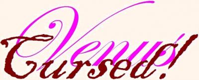
Oh, and I made up a new banner graphic, which I used on chapter 100. I'd appreciate any feedback on whether it looks better or worse than the old one? It's not all that different, but I thought it looked a little cleaner? Please let me know!
Saless


Comments
Sorry Saless
I liked the previous one more.


This is the new one:
This is the old one:
The older one is easier to read. And that is perhaps the only reason I can think of.
Faraway
Big Closet Top Shelf
Where you can fool around like you want to and most you get is some bemused good ribbing!
Faraway
Big Closet Top Shelf
Where you can fool around like you want to and most you get is some bemused good ribbing!
Oh, well...
Back to the drawing board! Hmm, there's a thought, maybe I should try actually drawing it? I can't draw worth beans, but I might be able to manage something halfway decent. I'll have to think about that one!
Saless
"But it is also tradition that times *must* and always do change, my friend." - Eddie Murphy, Coming To America
Hmmm.
While the newer one is nice, it makes it somewhat harder to distinguish the first word from the second. They have the same font and size, and Cursed! is actually more in the foreground than Venus. I would suggest trying enlargeing Venus to make it more prominent, make it bold or something like that in order to make it better.
Faraway
Big Closet Top Shelf
Where you can fool around like you want to and most you get is some bemused good ribbing!
Faraway
Big Closet Top Shelf
Where you can fool around like you want to and most you get is some bemused good ribbing!
Same font? I don't remember
Same font? I don't remember what the first one is called, but I think it might just be 'Script'. Cursed! is Blackadder, the same I used for the first logo (I couldn't find anything else that fit what I was looking for). I intended for Cursed! to be more prominent and somewhat overshadow Venus, but maybe I overdid it this time.
Anyway, thanks for the suggestions Faraway!
Saless
"But it is also tradition that times *must* and always do change, my friend." - Eddie Murphy, Coming To America
Laws of Typography
The new one violates a law of typography: when you do a logo of mixed fonts, don't use two cursive fonts.
There are four broad categories of fonts: Roman (serif), Gothic (sanserif), Cursive, and Stunt. A logo of mixed fonts should not usually include two from the same category, especially if they overlap.
This is a rule of thumb for readability, and it can be violated by people who know what they are doing but it has to be done carefully. In this case, to use these two fonts together you would need to have one much, much bigger than the other and/or not on the same angle, that is one of them, probably the foreground one, angled up or down. Even then, the effect you want might be done better with something simpler.
Your old logo had a large Roman font in all caps behind a slightly smaller cursive font in a darker color on a different level. Roman vs cursive. All caps vs C/lc. Light vs dark. Lower vs higher.
It did work. The new one does not work for me. Now it's Cursive vs cursive and both are C/lc, too. Not enough contrast. Overlapping type needs enough differences for effective visual separation.
Hugs,
Erin
= Give everyone the benefit of the doubt because certainty is a fragile thing that can be shattered by one overlooked fact.
= Give everyone the benefit of the doubt because certainty is a fragile thing that can be shattered by one overlooked fact.
I really wanted the word
I really wanted the word Venus to be elegant and beautiful, as you'd expect Venus herself to be. In my mind that means cursive. But I see what you mean. That's why I used the font I did on the first logo, in fact. Maybe I should find a non-cursive font that still has that dark, cursed-ish look to it that Blackadder does? That's how I originally envisioned it, with the graceful, elegant Venus and then the word Cursed! stamped on it violently, with a dark or bloody color. Probably work best with something animated, but that's beyond me!
Thanks for the info Erin, I definitely think I'll have to rethink this one and try again!
Saless
"But it is also tradition that times *must* and always do change, my friend." - Eddie Murphy, Coming To America
If that is the case
You should go for the unrelentness and depersonalisation. You know, like stamp that is done not primly and straight, but rather as a diagonal stamp.
Faraway
Big Closet Top Shelf
Where you can fool around like you want to and most you get is some bemused good ribbing!
Faraway
Big Closet Top Shelf
Where you can fool around like you want to and most you get is some bemused good ribbing!
Colors
Perhaps you can improve the readability by putting the words in two different colors. 'Venus' should probably remain pink. 'Cursed' can be in a less attractive color.
I suppose I could go with
I suppose I could go with black, but it seems a bit dull. It does kind of fit, though. Thanks for more food for thought! I'm afraid you're all stuck with the new one until I figure something out, though. ;)
Saless
"But it is also tradition that times *must* and always do change, my friend." - Eddie Murphy, Coming To America
I believe.
Though the new one is not as clean per-say. I like the style of it. That is just me everyone has there own thoughts of course.
Take Care
Kittien69 ^_^
Take Care
Kittien69 ^_^
Thanks for the input
Thanks for the input Kittien! It really helps to hear from everyone on this. I think I'm starting to get an idea of what I want it to be. Maybe I'll even manage to get it to come out the way I want! ;)
Saless
"But it is also tradition that times *must* and always do change, my friend." - Eddie Murphy, Coming To America
I personally would encourage a machine-readable title...
supplemented by a logo. Erin's comment about mixing script fonts is perfectly apropos, but there's another ‘law’ of web typography which encourages authors to make pages ‘accessible,’ so that persons with vision disabilities aren't discommoded by ‘invisible’ content.
Horizontal rules using the <hr /> tag, for example, are completely invisible to every screen reader, so should only be used as a decoration, never to separate scenes or chapters.
Images, including title logos, should always be supplied with "alt" and "title" attributes like this:
<img src="/topshelf/system/files/u2392/nirvana.gif" width="100" height="100" alt="[IMAGE: Picture of Nirvana]" title="This is a picture of Nirvana">
In most screen readers for the vision-disabled, the contents of the ‘alt’ tag will be read aloud, and in many browsers, the title tag allows the browser to “pop up” a little “tooltip” which can theoretically be rendered as audible text as well.
Unfortunately, support for these features is not universal, nor is audible rendition easily arranged for, since accessibility is an afterthought in most operating systems and browsers.
You can see the beginnings of a “policy” on accessibility here: http://w3.org/WAI/
Most sites and most browsers are not terribly compliant.
You can test your own browser by “hovering” over the black box with your mouse, or possibly through performing some sort of control-click or right-click with a mouse.
Cheers,
Puddin'
-
Cheers,
Puddin'
A tender heart is an asset to an editor: it helps us be ruthless in a tactful way.
--- The Chicago Manual of Style
Well, it's good to know I
Well, it's good to know I did something right! ;) I did include an 'alt' tag that says "Venus Cursed!" on it. Should it have said "Image: Venus Cursed!", or is it okay as is? Still need the 'title' tag, though, I guess. This is one of the things I like about posting here, I'm always learning new things!
Question; is the <hr> tag any different from the <hr /> tag? I've seen them both used, but their effect seems identical.
Thanks Puddin!
Saless
"But it is also tradition that times *must* and always do change, my friend." - Eddie Murphy, Coming To America
HTML versus XHTML
<hr> is HTML
<hr /> is XHTML, a more modern form that requires slightly more care, but is read as ordinary HTML by applications that don't support XHTML directly.
XHTML requires all tags to be “closed,” even tags that don't have a closing tag, so the trailing stroke allows the XHTML parser to recognise the fact that the IMG tag, for example, doesn't have a closing tag, so it really should be represented like this if you're creating pure XHTML code:
The Alt attribute is designed specifically for accessibility, and should usually be a simple (and brief) text description of the picture. Some people prefer that the included text say the word "image" when read aloud, which the prefaced "Image:" or "IMG:" an alternate which will be spelled out ensures, thereby avoiding ambiguity when the ordinary text flow is broken by an included image. It also makes it easier to find "important" images when looking at the code. If an image is not "important," such as mere decoration, you can set the "alt" text to blank by collapsing the string to nothing, an important step as some editors will insert such tags automatically, which may be awkward if you mean to avoid impacting the screen reader text flow. People often do this to images used for spacing, for example, or to images which have a plain-text caption included in the HTML, so the Alt attribute caption is redundant.
The title attribute can include more text (although some browsers have definite limits). Try accessing the tooltip for this one, for example:
Another help for persons with visual impairments is the "longdesc" attribute, which allows the author to point to a URL containing a long description of the image so that a visually-impaired user can learn more about the image if desired.
cabanel-venus.html can contain any text desired, or you could point to an existing web address that contains such a description, a Wikipedia article, for example.
<img src="/topshelf/system/files/u2392/cabanel-birth-of-venus-title.jpg" width="400" height="232" alt="[IMAGE: Cabanel: The Birth of Venus]" title="Alexandre Cabanel was a French artist who painted his famous Naissance de Venus in 1863." longdesc="http://en.wikipedia.org/wiki/The_Birth_of_Venus_%28Cabanel%29"/>
Unfortunately, the longdesc link is not supported by any major browser, although Firefox has an available “add-on” that makes the longdesc link available through the context (right-click or control-click) menu.
If you're using Firefox, and if you've installed the longdesc add-on, you can right-click on the image and the link will be displayed in the context menu, so you can take the link by clicking on it. It goes to the wikipedia article, so there's no secret there:
http://en.wikipedia.org/wiki/The_Birth_of_Venus_%28Cabanel%29
You'll note that I edited the image to remove the visual kitsch. So sue me.
Cheers,
Puddin'
-
Cheers,
Puddin'
A tender heart is an asset to an editor: it helps us be ruthless in a tactful way.
--- The Chicago Manual of Style