Puddin' River
Author:
Organizational:
Audience Rating:
Taxonomy upgrade extras:

Ancient History
Author:
Blog About:
Chimerae.net
Author:
Not exactly a new story, but it's there:
Sea Changes
A mutant story with animal/human hybrids/Chimerae and beaucoup other stuff. It will be published as a Kindle title and made a part of the BC online store, as soon as I can figure out exactly how to maintain the formatting and a few other technical details involving the limited HTML functionality inherent in the stupid Kindle format.
I particularly like the substitute for the poorly-supported Tooltips which are accessed by clicking in words or phrases highlighted in yellow. In many cases, a fuller explanation can be discovered in the Glossary.
Puddintane
Notable
Author:
Organizational:
Audience Rating:
Taxonomy upgrade extras:
A Uniquely Indian Perspective on Gay Marriage
Author:
Taxonomy upgrade extras:
Read and listen to the story on NPR
Worth the time...
A woman's exploration on the high seas, Jeanne Baret
Author:
Blog About:
Taxonomy upgrade extras:
The first woman to circumnavigate the glove was disguised as a man for the first portion of her journey, and was brutally raped by the crew when she was discovered. It's not a pretty story.
“http://www.npr.org/2010/12/26/132265308/a-female-explorer-discovered-on-the-high-seas”
She was a botanist at the time, and is evidently the actual discoverer of the common ornamental plant, the bougainvillea.

An Inspiring Letter to Anita Bryant
Author:
Taxonomy upgrade extras:
An Open Letter to Anita Bryant
Well worth reading.
Here's Anita Bryant: Anita Bryant's bio on Wikipedia
Note: The article mentions that Florida's ban on Gay and Lesbian adoptions was overturned by the State Supreme Court, but doesn't mention that the State appealed from the ruling and the struggle continues.
Like the poor, the hateful we have always with us.
Puddin'
Ann Rice Comes Out
Author:
Taxonomy upgrade extras:
Well, out of organised religion…
Because of things like this:
Bradley Manning, now Chelsea - Quote without Comment
Author:
Blog About:
Taxonomy upgrade extras:
Quote without Comment
“As I transition into this next phase of my life, I want everyone to know the real me,” Manning said. “I am Chelsea Manning. I am a female. Given the way that I feel, and have felt since childhood, I want to begin hormone therapy as soon as possible.”
Caster Semenya Vindicated -- Free to Compete
Author:
Taxonomy upgrade extras:
Athlete Caster Semenya free to compete
South African athlete Caster Semenya has been given the all-clear to return to competition by the International Association of Athletics Federations.
The 19-year-old world 800m champion has been out of the sport for 11 months after undergoing gender tests.
"The IAAF accepts the conclusion of a panel of medical experts that she can compete with immediate effect," said a statement from the athletics body.
-----------
And about time. Twits.
Common Decency
Author:
Taxonomy upgrade extras:
The California Supreme Court has ruled that a transgender prisoner can sue her guards and the prison system as a whole for their failure to protect her from sexual assault while held in the general male prison population.
The Prison system and the guards had claimed that they had no duty to protect or care for the inmates under their charge.
http://www.sfgate.com/cgi-bin/article.cgi?f=/c/a/2009/02/11/...
Gay Marriage
Author:
Taxonomy upgrade extras:
The recent victory against in the California Superior Court shouldn't be taken for more than what it is, since it's only a regional court, but it's also not trivial. Judge Walker laid out the issues fairly carefully, and the conservative half of the US Supreme Court -- where the case is undoubtedly headed -- has a particular problem in that the case was framed very carefully to draw parallels with the laws prohibiting miscegenation (the mixing of races) that existed in many regions of the USA prior to 1967, when Loving vs. Virginia decided the question in favour of general human rights throughout the USA. He was very specific in finding that the campaign against marriage for all was motivated by animus, not reason, which is a very good thing. In specific detail, his finding of fact are almost a wish list of incontrovertible truths about the hate-filled and bigoted motivations behind the anti-gay movement.
We note with some pleasure that one of the most vicious of the Conservatives on the current court is a Black man married to a White woman, and his vote to allow the public to outlaw anything they don't like would be a vote against his own marriage. He might not care, but his wife ought to.
This is often depicted in the media as a "culture war," but that's a deliberate distortion. It's only the latest faux "issue" in a long series of "white-bigots-only" skirmishes.
The fundamentalist preacher Jerry Falwell (He's the twit who thought that the Teletubbies were gay infiltrators trying to convert American children into flaming sodomites) was still preaching White Supremacy at the time Loving became the law of the land, but soon switched to anti-gay hate mongering:
In 1984, Falwell called the gay-friendly Metropolitan Community Church "a vile and Satanic system" that will "one day be utterly annihilated and there will be a celebration in heaven." Members of these churches, Falwell added, are "brute beasts." Falwell initially denied his statements, offering Jerry Sloan, an MCC minister and gay rights activist $5,000 to prove that he had made them. When Sloan produced a videotape containing footage of Falwell's denunciations, the reverend refused to pay. Only after Sloan sued did Falwell cough up the money.*
Times are changing.
"If Chief Justice Warren and his associates had known God's word and had desired to do the Lord's will, I am quite confident that the 1954 decision would never have been made," Falwell boomed from above his congregation in Lynchburg. "The facilities should be separate. When God has drawn a line of distinction, we should not attempt to cross that line."
Falwell's jeremiad continued: "The true Negro does not want integration.... He realizes his potential is far better among his own race." Falwell went on to announce that integration "will destroy our race eventually. In one northern city," he warned, "a pastor friend of mine tells me that a couple of opposite race live next door to his church as man and wife."*
Pretty soon, real soon now, bigotry of this sort will be intolerable in civilised society.
I can hardly wait.
* From Agent of Intolerance by Max Blumenthal
Interesting SF Book by Melissa Scott
Author:
Taxonomy upgrade extras:
Lambda Literary Award-winning author Melissa Scott often features GLBT characters, but I just ran across The Shadow Man, which explores a world of many genders, most of whom are forced into a binary model. Very interesting.
Iran to allow first transsexual marriage
Author:
Taxonomy upgrade extras:
Woman wins court battle for father's approval to marry schoolfriend who has undergone sex-change operation [FtM]
http://www.guardian.co.uk/world/2009/sep/11/iran-transexual-...
Laura Jane Grace, Transgender Punk, On Life In Transition
from: National Public Radio
http://www.npr.org/2014/01/19/263503567/laura-jane-grace-transgendered-punk-on-life-in-transition
Love Story
Author:
Taxonomy upgrade extras:
Mainstream Transgender Novel
Author:
Taxonomy upgrade extras:
Prisoners of Gender by John Bushore
A Medieval-Style sword and sorcery novel of magic spells and derring-do.
Used to be free, now free loan for Amazon Prime members, which means it may be free again, but it's only ninety-nine cents in any case.
Puddin'
Note: I've fixed the link.
Oh! It's available in paperback as well, more pricey, though.
My son, the pink boy
Author:
Taxonomy upgrade extras:
Interesting article from Salon.
New and Notable: The Good Lord Bird
Author:
Blog About:
Taxonomy upgrade extras:
The Good Lord Bird by James McBride
A work of fiction, the protagonist is one Henry Shackleford, a "coloured" man "liberated" by John Brown, the famous Abolitionist and activist. In an odd development, John Brown comes to believe that "Henry," a petite young man, is actually a girl and renames him "Henrietta," which masquerade "Henry" adopts with more or less equanimity.
News isn't always bad
Author:
Taxonomy upgrade extras:
From Stars and Stripes, a newspaper whose audience is primarily men and women in US military service:
http://www.stripes.com/article.asp?section=104&article=68606
Policy revisions approved to allow transfer benefit for same-sex teacher couples
By Travis J. Tritten, Stars and Stripes
Pacific edition, Saturday, March 13, 2010
SASEBO NAVAL BASE, Japan – Same-sex teaching couples are eligible after all for joint job transfers this year at Department of Defense schools, officials said Wednesday.
====================
http://www.stripes.com/article.asp?section=104&article=68652
South Korea bar district offers a safe haven for gay servicemembers
By Ashley Rowland, Stars and Stripes
Pacific edition, Sunday, March 14, 2010
Perhaps of interest...
Author:
Blog About:
Taxonomy upgrade extras:
Hit & Miss - Season One
DVD or BluRay
Available in PAL, NTSC, and BluRay at different price points.
http://www.amazon.com/dp/B00AQYUY9C
Mia is a contract killer with a secret: she's a transgender woman. After a young life where she never quite fitted in, Eddie, an underworld linchpin, took Mia under his wing and created a brilliant assassin. But Mia's life is turned upside down when she receives a letter from her ex, Wendy, who reveals that she's dying from cancer - and that when they were together Mia fathered a son, 11-year-old Ryan. Now Mia is his legal guardian. Travelling to a tiny village in West Yorkshire to see the boy, Mia meets the rest of Wendy's farmhouse clan: 16-year-old Riley, 15-year-old Levi, and 6-year-old Leonie. Hit & Miss follows Mia's attempts to mix her killer instincts with her new maternal ones, in a search for her own identity. A lethal killer at the heart of a troubled family in the middle of nowhere is where the series begins. ...Hit & Miss - Season 1 - 2-DVD Set ( Hit and Miss -- Six part series)
Serious SF/F which explores gender???
Author:
Blog About:
If you have a recommendation about great speculative fiction which explores gender in some way, please send the recommendation to the Tiptree Award jury. They’re reading now for works first published (as a book -- or possibly an e-book) in 2015 only.
http://tiptree.org/recommend-works-for-the-2015-james-tiptre...
James Tiptree, Jr., as you may or may not know, was a woman.
==========
Wikipedia Entry:
James Tiptree, Jr.
Alice B. Sheldon
Born Alice Hastings Bradley
August 24, 1915
Chicago, Illinois, U.S.
Died May 19, 1987 (aged 71)
McLean, Virginia, U.S.
Pen name James Tiptree, Jr.
Raccoona Sheldon
Occupation Artist, intelligence analyst, research psychologist, writer
Nationality American
Education BA, American University
PhD, George Washington U.
Period 1968–1988 (new fiction)[1]
Genre Science fiction
Spouse William Davey (1934–1941)
Huntington D. Sheldon (1945–1987, their deaths)
Relatives Mary Hastings Bradley (mother)
Herbert Edwin Bradley (father)
Alice Bradley Sheldon (August 24, 1915 – May 19, 1987) was an American science fiction author better known as James Tiptree, Jr., a pen name she used from 1967 to her death. From 1974 to 1977 she also used the pen name Raccoona Sheldon. She was most notable for breaking down the barriers between writing perceived as inherently "male" or "female" — it was not publicly known until 1977 that James Tiptree, Jr. was a woman.
Son of Fred Phelps
Author:
Taxonomy upgrade extras:
Story from Xtra! Gay and Lesbian News in Canada
Fred Phelps' son has a new job: promoting atheism and battling homophobia.
NEWS: Son of 'God Hates Fags' preacher likes Lady Gaga and wants more gay bars in Calgary
by Neil McKinnon
National
Thursday, July 22, 2010
Suicide and Suicidal Ideations
Forums:
Taxonomy upgrade extras:
Suicide and Suicidal Ideations
Suicide, the threat of suicide and suicidal depression are chronic problems among transgendered folk and other sexual minorities. Suicide is about emotional pain. Emotional pain can be managed and relieved with skilled assistance. Anyone who has persistent or recurrent thoughts of suicide needs to know that their lives are valuable, that there are people who care about them, and that there are people who can help, are trained to give timely assistance, and have resources on call.
If you, or someone you know, is in immediate danger because of thoughts of suicide, please call 911, the US National Emergency Number now. You will be helped, but you have to call.
If you're not in the USA, you can call your local emergency number, or one of the short selection below.
In the USA, There are two national hotlines, plus every state and many communities have local hotlines as well. A call to directory assistance or the local emergency number will put one into contact with effective help very quickly if a number isn't readily available.
The following numbers are available seven days a week and twenty-four hours a day in the USA.
Suicide.org - Suicide Prevention, Awareness, and Support
http://www.suicide.org/
1-800-SUICIDE
1-800-784-2433
National Suicide Prevention Lifeline
http://www.suicidepreventionlifeline.org/
1-800-273-TALK
1-800-273-8255
Deaf TTY Hotline:
1-800-799-4TTY
1-800-799-4889
In the UK and the Republic of Ireland
Samaritans: http://www.samaritans.org/
UK: 08457 90 90 90
ROI: 1850 60 90 90
In Australia: http://www.lifeline.org.au/
Telephone: 13 11 14
In New Zealand: http://www.lifeline.org.nz/
Telephone: 0800 111 777 (Christchurch)
Telephone: 0800 543 354 (National)
All Other Countries
Befrienders Worldwide http://www.befrienders.org/
They offer an extensive list of national and local helplines by country.
For everyone, even if you can foresee no possible need for one of these numbers on your own, it might be thoughtful to enter one of the local numbers on your cellphone, or write one down on a scrap of paper in your billfold or wallet. Life is long -- or should be -- and you may stumble upon someone who needs it.
TG Kindle Title download on Amazon
Author:
Taxonomy upgrade extras:
The Velvet Closet [Kindle Edition]
by Chandra Borden
Note: This title is no longer free.
There's a Good Tradition
Author:
Taxonomy upgrade extras:
Transsexual wins $500,000 lawsuit
Author:
Taxonomy upgrade extras:
Interesting piece originally in the SF Chronicle:
Article reprinted in the Pink Pages
A federal judge has awarded a former Army Special Forces commander nearly $500,000 because she was rejected from a job at the Library of Congress while transitioning from a man to a woman....
etc.
Turnabout Film on Cable
Author:
Blog About:
Turnabout, the 1940 Body-Swapping film from the original novel by Thorne Smith, is scheduled on Turner Classic Movies (TCM) at 5:00am Pacific Time tomorrow morning, if anyone is interested and has Cable or Satellite access to the channel. People who live in other timezones will have to apply the appropriate timezone arithmetic.
It’s not the greatest film, but it’s not terrible either, and (like most of his other works) is fairly droll.
If one lives in Europe, the book is out of copyright (published in 1931) and is available at the Forgotten Futures website, along with many of his other works.
A precís of the plot follows:
Tim and Sally Willows are vaguely dissatisfied with their lives, and are bickering about whose rôle in life is easier when they annoy a pagan idol from Egypt, one Mr. Ram, who swaps their bodies out of a certain malicious sense of humour. Tim is forced to cope with the complications of his wife’s life, including the amourous attentions of the local cad, whilst Sally has to manage Tim’s job as an advertising executive. Complications ensue, including the completely unplanned pregnancy of Tim (as Sally) who winds up giving birth to their child.
US House passes inclusive hate crimes bill
Author:
Taxonomy upgrade extras:
U.S. House Passes Inclusive Hate Crimes Bill
Updates to Federal Law Would Strengthen Law Enforcement Ability to Investigate, Prosecute Hate Crimes.
4/29/2009
Washington — The Human Rights Campaign — the nation’s largest lesbian, gay, bisexual and transgender civil rights organization — hailed today’s bipartisan vote of 249-175 in the U.S. House passing the Local Law Enforcement Hate Crimes Prevention Act, also known in the U.S. Senate as the Matthew Shepard Act.
“All Americans are one step closer to protection from hate violence thanks to today’s vote,” said Human Rights Campaign President Joe Solmonese. “Hate crimes are a scourge on our communities and it’s time we give law enforcement the tools they need to combat this serious problem.”
“No one should face violence simply because of who they are,” said Judy Shepard, executive director of the Matthew Shepard Foundation. “This bill is a critical step to erasing the hate that has devastated far too many families.”
Yesterday the White House released a statement from President Obama calling for passage in the House and urging the Senate to follow with swift action. Along with the President, more than 300 law enforcement, civil rights and religious organizations support the bill.
“The Senate should heed the President’s leadership and quickly pass the Matthew Shepard Act,” said Solmonese. “After more than ten years and tens of thousands of victims, there should be no delay in passing this bill into law.”
This is the eighth successful vote on a federal hate crimes bill which — following a veto threat from former President Bush — died in the last Congress.
“Fair-minded leaders in Congress have for years stood strong against lies about the bill and we are grateful for their efforts,” continued Solmonese. “The leadership of Speaker Pelosi, Majority Leader Hoyer and Majority Whip Clyburn as well as Reps. Conyers, Kirk, Baldwin, Frank, and Polis made this incredible victory possible.”
Working in coalition with the Leadership Conference on Civil Rights, the Human Rights Campaign mobilized its members to support the bill. The website www.FightHateNow.org gives users opportunities to contact their member of Congress, watch video testimonials on hate crimes and learn the truth about the legislation. The site will continue as a clearinghouse for information leading up to Senate action.
The LLEHCPA gives the Justice Department the power to investigate and prosecute bias-motivated violence where the perpetrator has selected the victim because of the person's actual or perceived race, color, religion, national origin, gender, sexual orientation, gender identity or disability. It provides the Justice Department with the ability to aid state and local jurisdictions either by lending assistance or, where local authorities are unwilling or unable, by taking the lead in investigations and prosecutions of violent crime resulting in death or serious bodily injury that were motivated by bias. It also makes grants available to state and local communities to combat violent crimes committed by juveniles, train law enforcement officers, or to assist in state and local investigations and prosecutions of bias motivated crimes.
UPDATE: The Matthew Shepard Act was, in fact, signed by President Obama on October 28, 2009. Whilst not perfect, it's a very good start.
Wikipedia Article on the Matthew Shepard Act
Web Communities
Author:
Taxonomy upgrade extras:
A web community is like any other community, and needs police.
Just as people become tired and distant from their own local communities when vandals are allowed to freely trash the buildings, cover walls with vulgar or hateful messages, and play music loud enough to destroy eardrums, people demand a minimum level of civility in the places they spend any time in.
Since ordinary users can't perform a "citizen's arrest" of vandals, they are dependent on the "cop on the beat" to control things on their behalf. In most cases, this is a site admin, or a localy-appointed monitor if the community is large enough, and the job is largely thankless.
Ignoring the policing part of creating a community will inevitably destroy it, as there are always a few putzes around, who will quickly mess up the neighbourhood if not controlled. Messy neighbourhoods, hate-filled neighbourhoods, discourage loitering, so people move on quickly.
Cheers,
Puddin'
On Writing
Author:
Organizational:
Audience Rating:
"Said Bookisms are boring," she snarled.
Author:
Taxonomy upgrade extras:
"Said Bookisms are boring," she snarled.
by Puddin'
For reasons of my own, I have a treasured copy of The Said Book by J.I. Rodale and Mabel E. Mulock. While I've never actually studied it, I think of it from time to time because it's so infamous amongst writers that it has it's own catch phrase, a "said bookism." Go ahead, google it, you'll see.
It's so familiar that one often sees it abbreviated to the simpler "bookism," what might be called a euphemism for a particular style of purple prose in which the author elaborately avoids the use of the word "said" in favour of other, seemingly more descriptive verbs.
--- she laughed.
--- she cried.
--- she sighed.
--- she expostulated.
--- she lucubrated
The trouble with these verbs is that the first three aren't actually speech, and we must presume that they take place either before or after an act of speech, so they're really leaving the most cogent information being conveyed — the simple identity of the speaker — by the wayside and then haring off on a more-or-less lovely meander. The next two are just elaborate verbs that may or may not be easy for a reader to understand. They get in the way of understanding the story, and might as well be Sanskrit for many people.
These "descriptive" verbs aren't actually all that descriptive, don't serve their intended purpose of breaking up long and terminally-boring stretches of unleavened dialogue with evocative descriptions of the scene or the behaviour of the speaker, and are almost certain, in real life, to cause an acquisitions editor to toss a manuscript containing more than one or two per chapter back into the slush pile, if not to hurl it against the wall in disgust.
The advantage of "said" is that it's nearly invisible, nearly as invisible as the word "the," and takes up almost the perfect amount of visual dwell time to correspond to a natural pause in speech, like a comma. "Asked," although technically a "said bookism," is usually not counted amongst them, but the pair of these words is almost always sufficient for dialogue spoken without too much ambiguity or sarcasm.
Here's Hemingway's short story, Hills Like White Elephants as an example of the depths of subtlety possible, even within the span of these two simple verbs:
Note that the attributive verbs used are "said" and "asked," and that even these are sparsely distributed. Dialogue is quite often understood from context, and the flatness, sometimes anguished desperation, of the woman's speech lies hidden under the bland surface of the written dialogue like a strong current under the placid surface of a river.
Hemingway was a proponent of not saying everything possible, and of deliberately leaving some things unsaid, because the reader would become aware of them despite their seeming invisibility, so we quickly figure out that the "operation" in Hills Like White Elephants is actually an abortion, that the man is a fatuous and irresponsible fool, and that the whole scene is as dreary and oppressive as the flat landscape and heat.
He said once that he wrote one page of masterpiece for ninety-one pages of shit, and that he tried to put the shit in the wastebasket, an excellent motto for the aspiring writer.
Dialogue can indeed become boring, but the best solution is to introduce more evocative prose, not a single verb.
Instead of " 'Fred!' she cried," one might try "She fell sobbing to the ground, lifted up her face toward her husband, and slowly wiped the tears from her eyes. 'Fred!' "
Raiders of the Lost Ark, the movie, doesn't start with a narrative description of the dubious career of Indiana Jones and then talk about a fabled treasure he might like to look for whilst everyone is sitting around a shabby table in Podunk, Oklahoma. It starts with a cliffhanging episode of tension and catharsis which *shows* us what Indiana is like before the first line of dialogue is spoken.
Dialogue is easy, l'esprit d'escalier, the sort of thing one has running through one's head at times, "...and then I should have said...." Capturing the soul of a moment, a series of moments, picking and choosing which moments to describe --- possibly including dialogue --- and then retain and which to toss away is hard.
Here's an excellent discussion of Said Bookisms:
Cheers,
Puddin'
----------------------------
The first draft of anything is shit.
--- Ernest Hemingway
A Generous Baker's Dozen: Writing Guides by Women (Mostly)
Author:
Blog About:
Taxonomy upgrade extras:
A Generous Baker’s Dozen: Writing Guides by Women (Mostly)
in no particular order
- The Writing of Fiction by Edith Wharton
- Great book by the first woman to win the Pulizter Prize. Not only that, she has a chapter on Marcel Proust.
- Negotiating With the Dead: A Writer on Writing by Margaret Atwood
- The compilation of a series of lectures, Margaret Atwood is seriously literate, which every writer should strive to be.
- Steering the Craft: Exercises and Discussions on Story Writing for the Lone Navigator or the Mutinous Crew by Ursula K. Le Guin
- Ursula Le Guin. Enough said.
- Writing from the Body: For Writers, Artists and Dreamers Who Long to Free Their Voice by Ceci Miller-Kritsberg and John Lee
- An interesting approach, perhaps a bit reminiscent of Natalie Goldberg, but he runs a very popular writing workshop. Very focused.
- The Scene Book: A Primer for the Fiction Writer by Sandra Scofield
- This is a nitty-gritty book that takes a very detailed approach to creating the ‘scenes’ that chapters and books are made of.
- Bird by Bird: Some Instructions on Writing and Life by Anne Lamott
- This is a book that focuses on struggle. The title comes from an experience faced by her brother as a child, the need to write a report on birds that he’d been procastinating about until the last minute. Their father told him, ‘Just take it bird by bird….’
- One Year to a Writing Life: Twelve Lessons to Deepen Every Writer’s Art and Craft by Susan M. Tiberghien
- If you like Carl Jung, you’ll love Susan Tiberghein. Her excercise are something like a quick(ish) psychoanalitic treatment series.
- Writing Down the Bones: Freeing the Writer Within by Natalie Goldberg
- This is another deeply philosophical book inspired by Zen meditation. She has several books out, all of them excellent, in my opinion.
- Silences by Tillie Olsen
- A classic work for women on writing.
- Writing Fiction: A Guide to Narrative Craft by Elizabeth Stuckey-French and Janet Burroway
- The classic textbook used in many writing classes. Since it’s essentially a college text, it’s terribly expensive unless you find it in an out-of-the-way used bookshop, if things like that still exist in your neighbourhood.
- 20 Master Plots and How to Build Them by Ronald B. Tobias
- For those who like ‘cookbooks’ rather more than pure creativity, Mr Tobias gives one a simple precis. Fill in the blanks, season to taste.
- The Situation and the Story: The Art of Personal Narrative by Vivian Gornick
- Great book, but focuses more on nonfiction and essays.
- On Writing: A Memoir of the Craft by Stephen King
- Okay, speaking of personal narratives, this one’s definitely not by a woman, but it’s compelling in spite of that. I don’t particularly like his fiction books, as I’m not at all fond of the horror genre, but this, this book is different.
- Writing the Breakout Novel by Donald Maas
- This one is actually two books, the book proper and its workbook. The author is a literary agent, so perhaps knows a bit about what it takes to get one’s masterpiece published. Reading is all very well, but practice makes perfect.
- Your favourite title(s) by your favourite author(s)
- This/these is/are perhaps the most important book (or books) to reference. Write what you love, not what you think will sell. Emulate the authors whose books moved you, the books that made you want to write. Writing is an apprenticeship, when push comes to shove, and studying the work of a master, someone whose books you desperately want your work to resemble, is the most personal lesson you can learn. With every sentence, think about how (fill in the blank) might handle the scene, the dialog, the action. Seek out examples in his or her work, and see how they work.
Adding Pictures to Your Stories
Author:
Taxonomy upgrade extras:
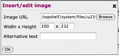
The key to adding pictures is one of the buttons at the top of your edit box. It looks like this:

If you click on it, a little box will pop up that looks like this:
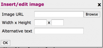
This new box allows you to do one of two things, you can enter the URL of a picture from the web in the field labelled Image URL*, or you can click on the ‘Browse’ button to either select preloaded pictures from your picture directory (if you've already loaded some) or you can click on yet another ‘Browse’ button at the bottom on the resulting selection box to choose a picture off your own hard disk. I shrank the size of this box down to almost nothing in the image below, so you can't see most of the box yet. Ignore the top of the box entirely.
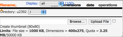
To load something from your hard disk, you'll have to look at the bottom of this box. There are two important buttons, first the ‘Browse’ button, which will pop up a directory listing, from which you'll select your picture. Here's what they both look like:
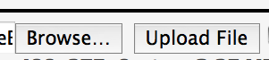
Once you select the picture, click on the second button, the ‘Upload File’ button, or it will stay on your hard disk and never be copied to your picture directory on Big Closet.
Eventually, you'll see the screen change so that looks like this:
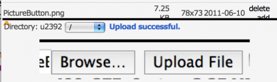
Note that your picture will be displayed, so you can easily see if you got the right image when you selected the original file.
It might have another "success" message, which means that the picture was too big, and had to be scaled to fit the maximum allowed size. Here's what it looks like:

This is a good thing, because it's courteous to readers who don't happen to have a T1 line run to their home or office. It's a good thing for you as well, because you won't have to fiddle with graphics editing programmes to tweak your pictures.
Now, there's only one step left; you have to look at the top of the box we ignored before and choose the picture you've just uploaded from the user directory listing shown at the top of your screen. Don't select ‘Delete.’ Select ‘Add.’ The same ‘Insert/Edit’ box will pop up that we saw at the start of our little journey, except this time it will have the URL box filled in. Now click the ‘OK’ button. All the fancy HTML text needed to insert a picture is now inside your text.
You can use the ‘Preview’ button at the bottom of the Edit screen to see how it looks.
Voila!
Puddin'
* Taking pictures directly from the web isn't usually a good idea. In the first place, a lot of pictures on the Web are a lot larger than many Big Closet readers can comfortably download, if they have slow connections to the Internet, and it causes Erin's server to access the Web every time a Big Closet reader views your story or blog entry, which slows things down for everyone. URL accesses take time. Time is money.
Author Names
Author:
Taxonomy upgrade extras:
I've noticed quite a few stories with no titles and/or author names attached.
There may be a title vaguely associated with the story taken from the file name, but those two things are not necessarily the same thing, as you can see with this very blog.
Likewise, there may be a posting name associated with the story, but again, those things may have little or nothing to do with the author.
It's fairly important, if one wants at some point to assert a copyright to one's words, to have something like a real name or pseudonym that one can claim in the actual story display page.
Titles cannot be copyrighted, so a hundred authors can all write books called War and Peace and have no claim against each other.
Likewise, most names are not unique, so a hundred John Smiths can write a hundred novels, all named War and Peace, but you start to see the difficulty, which is why most writers come up with a name that is unique within their own particular genre, and there's a sort of tacit agreement not to tread on each other's toes in this regard.
If one becomes famous (even a little famous) in a particular genre, trademark law becomes an issue, so one might face problems if your real name was Anne Rice and you wanted to write Vampire or Witch novels, unless you happen to be the same Anne Rice who wrote The Vampire Lestat and made the name famous to begin with.
With really famous names, you probably don't want to use the name at all, even if you were given the name at birth, as many people named McDonald have discovered to their cost when they tried to open a restaurant named after themselves.
It's a reasonable precaution, then, to make sure that a reasonable story name and a reasonable author name are included on the page. Most authors are proud enough of their work that they insist upon it, but publishing with no name at all is an invitation to theft.
There are handy little buttons at the top of the story Body: entry box that make it easy to enter a title and an author, the [C] button (fourth from the right) and the [H] button (fifth from the right), which centre and emphasise selected text respectively.
They can be used sequentially on the same text or any single selection.
Right-Justified Title and Author
The Vampire Fred
by Edna Farkle
Centred Title and Author
By the way, when you look at the shelves in any real bookstore, you'll notice close to zero "author names" that look like 'Romeo472.' Part of trying to be a real author is looking like a human being, not a robot with a serial number attached to a model name. Mind you, there is a real book named Ralph-124C 41+, by Hugo Gernsback, but this describes the naming conventions of a dehumanising civilisation of the future, which Ralph himself eventually transcends. The book itself is written very badly, but it's simultaneously one of the most important works of Science Fiction ever written, a very pretty paradox.
Cutting Loose
Author:
Taxonomy upgrade extras:
Cutting Loose
by Puddin
Loose is pronounced with an "S" sound. One has loose change. One looses an arrow, or loosens a bolt with a spanner. One is at loose ends. One cuts loose a kite string.
Lose is pronounced with a "Z" sound. One loses one's mind, or one's way.
Usually, one doubles an "O" to make a long "OO" sound, but in this particular case the vowel sound is much the same and the doubling marks a change in the consonant. The double "O" in "loose" does make a difference, because it keeps its long sound when you fiddle with it, whereas "lose" turns to "lost" and changes both sounds at the same time.
You can always tell the difference between "lose" and "loose" if you say the word aloud.
She let her dog run loose, which is a sure way to lose it.
I tightened the loose nut on the axle, because I didn't want to lose it at high speed and crash.
If one loses weight, one's trousers may become loose. If one's trousers become too loose, one may lose them.
Editing Humour
Author:
Blog About:
Taxonomy upgrade extras:
English Punctuation Skills
Author:
Taxonomy upgrade extras:
English Punctuation Skills
by Puddin'
The Importance of Correct Punctuation
Author Unknown
Dear John:
I want a man who knows what love is all about. You are generous, kind, thoughtful. People who are not like you admit to being useless and inferior. You have ruined me for other men. I yearn for you. I have no feelings whatsoever when we're apart. I can be forever happy--will you let me be yours?
Gloria
-----------
Dear John:
I want a man who knows what love is. All about you are generous, kind, thoughtful people, who are not like you. Admit to being useless and inferior. You have ruined me. For other men, I yearn. For you, I have no feelings whatsoever. When we're apart, I can be forever happy. Will you let me be?
Yours,
Gloria
English Spelling Skills
Author:
Taxonomy upgrade extras:
English Spelling Skills
by Puddin'
No less a respected figure than Mark Twain, notable American author and raconteur, has offered a coherent plan for the simplification of English spelling such that, in a few short years, everyone will be fully literate and perfectly capable of spelling to a level that any English speaker could easily win at least local spelling bees.
-----------
A Plan for the Improvement of English Spelling
by Mark Twain
For example, in Year 1 that useless letter "c" would be dropped to be replased either by "k" or "s", and likewise "x" would no longer be part of the alphabet. The only kase in which "c" would be retained would be the "ch" formation, which will be dealt with later. Year 2 might reform "w" spelling, so that "which" and "one" would take the same konsonant, wile Year 3 might well abolish "y" replasing it with "i" and Iear 4 might fiks the "g/j" anomali wonse and for all.
Jenerally, then, the improvement would kontinue iear bai iear with Iear 5 doing awai with useless double konsonants, and Iears 6-12 or so modifaiing vowlz and the rimeining voist and unvoist konsonants. Bai Iear 15 or sou, it wud fainali bi posibl tu meik ius ov thi ridandant letez "c", "y" and "x" -- bai now jast a memori in the maindz ov ould doderez -- tu riplais "ch", "sh", and "th" rispektivli.
Fainali, xen, aafte sam 20 iers ov orxogrefkl riform, wi wud hev a lojikl, kohirnt speling in ius xrewawt xe Ingliy-spiking werld.
Giggles Seen as Harmful
Author:
Taxonomy upgrade extras:
Giggles Seen as Harmful
by Puddin'
There seems to be a misconception --- or perhaps a folk belief --- among many authors on this and other "transgender" sites that "giggle" means "to laugh in a girlish or womanly manner," and that using the word regularly, perhaps even to excess, makes a story more "feminine," but this isn't quite true.
Giggle - Verb
1. to laugh in a silly, often high-pitched way, esp. with short, repeated gasps and titters, as from juvenile or ill-concealed amusement or nervous embarrassment. (Random House Unabridged Dictionary © Random House, Inc. 2006)
The word is actually somewhat contemptuous, as you can guess from this definition, and in practice is quite often used in a snide and deliberately misogynistic way, implying that the females so described are noticeably less clever, capable, or mature than males are, and may even partake of the disgusting male "bimbo" fantasy.
There are situations in which this condescending and unflattering description might be accurate, but both young girls and women usually chuckle, laugh, snicker, or guffaw like other human beings, albeit usually in a higher vocal register. The word "giggle," like "cackle," "natter," "prattle," "titter," "chatter," and other contemptuous words most usually applied by men to women and/or homosexual men, does not reliably convey this latter meaning and, when almost every female expression of amusement is so depicted, it's more than a little tiresome and offensive.
One hardly ever hears a woman use the word, except as a noun, and possibly a joke, usually expressing (wryly or otherwise) a somewhat negative or hostile view of male attitudes toward women and girls, although this latter point is often a bit too subtle for most men to notice.
In fact, in stories purportedly being written a woman's viewpoint, with a woman as author, its cliched presence usually betrays an underlying masculine viewpoint, which tends in this culture to be misogynistic by default, and so is distinctly "unfeminine," despite its fetishistic presence in some "transgender" writing.
"Laugh" is the basic word, and should always be considered before other options. "Giggle" is not the female default, unless you mean to simultaneously imply stupid or immature behaviour and/or inappropriate emotions.
In the Batman stories, the Joker often "giggles" because he is psychotic, not because he's secretly a woman. Renfield, not generally thought of as transgendered, "giggles" in the Dracula novels and movies for the same reason, but insanity is not usually a reasonable opinion of the customary mental state or behaviour of women and girls.
Cheers,
Puddin'
Horizontals Rule
Author:
Taxonomy upgrade extras:
Horizontals Rule
by Puddin'
Although they look very tidy, they're only decorative elements in HTML, but people often use them as scene separators, a burden they're not meant to carry. Because they have no semantic meaning, they're exactly equivalent to nothing in the syntax of the web.
Amongst the pernicious effects of this logical invisibility, they're inaccessible to many people with vision difficulties, and the many people who archive their favourite stories will be discommoded as well, because the scene breaks will disappear from their purview, whilst the story turns into one endless scene mash-up.
Tricks of the Trade
There are three primary strategies often used in stories to signal scene changes, textual, visual, and some combination of both:
Meanwhile, back at the ranch, Dusty was packing up his bedroll for the long trail ahead…
…is a textual indication. It's a traditional storytelling tool, and needs no special equipment other than an author's voice or pen. Although this particular technique is very terse, it also depends upon the audience knowing that a ranch exists, and is familiar enough with it that they'll have an instant picture of it in their minds. It's often wise to add a few more bits of detail, because every scene should have an immediate presence and reality. It's almost always a mistake to transition between scenes when one scene ends with dialogue and the next begins with dialogue.
"O! what a rogue and peasant slave am I," said Hamlet.
-o~O~o-
"O most pernicious woman! O, villain, villain, smiling, damned villain!" said Hamlet
Even with enough space left to mark a scene change, and decorative indications, the lack of textual confirmation makes the continuity confusing, and may even lead to inadvertent jokes, because the reader can easily lose the context.
Another Trick
Chapter Seven
…is another textual indication. In the verbal storytelling tradition, it might correspond to a musical interlude or even an interval between one night's entertainment and the next. Ideally, a chapter indicates a logical break in the continuity of the story. A "cliffhanger" has been presented, an exciting revelation has been made, or something important has happened. At the end of a chapter, the reader should be very anxious to turn the page, and it ought to mark a significant milestone in the progress of the story.
Because they're so important, stories quite often add special indications as well, printing the chapter title in Bold Face, Larger, SMALL CAPS, and — most importantly — putting extra space between the end of one scene and the next, or even an extra page between one chapter and the next.
White space is very important on the printed page. It helps us see what's important, because our eyes are very finely attuned to variations in brightness and colour. We can see the glint of a panther's eyes in the forest, or the slight variation in the colour of the vegetation that masks a hidden mire. If we didn't have these skills, we would by now be a footnote in some other creature's paleontology books.
Printers have long made use of space to create a pleasing page that's easy for the eye to follow. The reason we hate sentences and words in ALL CAPITAL LETTERS is that there's not enough white space around them. Capital letters are square and ugly, so quickly cloy when there are too many of them. Normal letters go up and down as you read along the line, with ascenders and descenders that might remind you of a wooded meadow, if you could separate your literacy from your aesthetic sensibilities for a moment. Every human writing system uses similar tricks of light and shadow to make characters unique, although some are better at this task than others.
Squint your eyes together for a bit, until the letters on this page start to blur. You'll start to see organic patterns in the blocks of words, rivulets of white space running down through the paragraphs like the pale roots of trees, variations in the horizontal stretch of the lines that make them look a little like earthworms with rings and undulations them make them wriggle with life.
We humans enjoy life. We see living faces in clouds, the outline of dogs or horses in craggy rocks, we recreate life in paintings and drawings using smeared pigments or graphite dust, we make our words live by the way we place them on the page.
In traditional typography, empty space breaks up the page and gives it what typographers call "colour," although the "colour" may be only shades of grey, so it was and is traditional to celebrate that living space by filling the precious emptiness with one or more decorative elements, in older books, usually somewhat elaborate, often explicitly floral or vegetative, and in more modern books simple rules, but the primary indication of the scene break is the extra space, not the decoration meant only to embellish it.
If you glance to your upper right (you may have to scroll a bit), or follow the link, you can see more about using empty space in my essay on Paragraphs.
Poking a horizontal rule between two paragraphs does nothing, unless you create the space that rule is meant to decorate, and in fact the rule itself obscures the white space through partially filling it with typographical colour.
Pellentesque nibh felis, eleifend id, commodo in, interdum vitae, leo. Praesent eu elit. Ut eu ligula. Class aptent taciti sociosqu ad litora torquent per conubia nostra, per inceptos hymenaeos.
Maecenas elementum augue nec nisl. Proin auctor lorem at nibh. Curabitur nulla purus, feugiat id, elementum in, lobortis quis, pede. Vivamus sodales adipiscing sapien.
On BC, you create that extra space using one of the buttons above the edit box — the ninth button — the non-break space, labelled with an underscore: _ . You can also enter it directly:  
If you place a non-break space on a line by itself, the BC rendering mechanism treats it as if it were an empty paragraph, so leaves a bit of extra space between one line and the next. If you don't use this trick, multiple empty lines will be collapsed into one empty line and your scene break will logically disappear, even if you add a horizontal rule. Here's a similar example with more whitespace added using a non-break space:
Vestibulum posuere nulla eget wisi. Integer volutpat ligula eget enim. Suspendisse vitae arcu. Quisque pellentesque. Nullam consequat, sem vitae rhoncus tristique, mauris nulla fermentum est, bibendum ullamcorper sapien magna et quam. Sed dapibus vehicula odio. Proin bibendum gravida nisl.
Fusce lorem. Phasellus sagittis, nulla in hendrerit laoreet, libero lacus feugiat urna, eget hendrerit pede magna vitae lorem. Praesent mauris.
In the above case, I added even more whitespace by adding a width attribute to the horizontal rule: <hr width="50%" />
The Original Tricks
![]()
he old typographical rules for print publications used actual characters instead of lines, quite often stylised vegetation like ivy leaves (the Hedera - ☙ - sometimes improperly labelled a "floral heart"), other "pi" characters, or especially-cast decorative rules. You've seen them, I'm sure. The connection to living vegetation was so strong that they were collectively called "fleurons," from the Old French word for "flower." The stories recently posted by The Professor use especially florid examples, large graphics like this:

but simpler graphics are possible:
❀ ❀ ❀
~❦~❦~❦~
₪₪₪₪₪₪₪₪
The last example uses a particularly pretty character for texts involving ancient times, although it's a modern symbol, the Sheqel symbol ( ₪ ), entered (one at a time) like this: ₪
The Catch
![]()
The problem with all these decorative imitations of a printed page, however, is that the Web allows authors to specify the actual construction of a page in very flexible ways. To properly use a horizontal rule, or any decorative separation, they should really be combined with semantic elements meant to carve documents into relevant bits, the "Heading" elements: H1-H6
Like this:
<H1>My Life with George</H1>
<H2>by Bess</H2>
<H3>In the Forest</H3>
Lorem ipsum dolor sit amet. Suspendisse vestibulum dignissim quam. Integer vel augue. Phasellus nulla purus, interdum ac, venenatis non, varius rutrum, leo. Pellentesque habitant morbi tristique senectus et netus et malesuada fames ac turpis egestas.
<H4>☙X❦X❧</H4>
Duis a eros. Class aptent taciti sociosqu ad litora torquent per conubia nostra, per inceptos hymenaeos. Fusce magna mi, porttitor quis, convallis eget, sodales ac, urna. Phasellus luctus venenatis magna. Vivamus eget lacus. Nunc tincidunt convallis tortor. Duis eros mi, dictum vel, fringilla sit amet, fermentum id, sem.
☙X❦X❧ (H4)
Phasellus nunc enim, faucibus ut, laoreet in, consequat id, metus. Vivamus dignissim. Cras lobortis tempor velit. Phasellus nec diam ac nisl lacinia tristique. Nullam nec metus id mi dictum dignissim. Nullam quis wisi non sem lobortis condimentum. Phasellus pulvinar, nulla non aliquam eleifend, tortor wisi scelerisque felis, in sollicitudin arcu ante lacinia leo.
☙X❦X❧ (H4)
Blah blah blah...
The End (H4)
Of course the "headings" don't have to be words, and can be centred or decorated however one desires, but it will automatically generate a real structure for the document that most web-based tools for the vision-impaired can decode and present in accessible form.
Accessibility
If you use Firefox, you can actually see and make use of these features to help navigate through stories, if the author has included semantic elements. As a trial, start up Firefox — if you're not using it already — and select Accessibility from the top menu bar. Then select through Navigation and then Headings to pop up a navigation box for this page.
Because of the method used to display stories, it will say that there's an error on the page, because there are too many <H1> elements on the page. You can ignore this.
Look down the list in the navigation box and select the line that says: <H1>My Life with George</H1>
You'll notice that the main screen will adjust itself so that this element is highlighted and visible on the screen. You can select any of the other semantic elements and the same thing will happen.
Think of how handy this might be in many situations…
If you were blind and using the JAWS screen reader, this completely non-visual browser would speak the semantic elements aloud, and you could jump to different portions of the document by reacting when a particular element is read by pressing a key. Then, the browser would read the text following that element aloud. With practice, a blind user can navigate through a well-formatted document almost as quickly as a sighted user can.
Access for Everyone
Readers who archive the story for later reading -- perhaps because their Internet access is through a local library -- are able to see the physical characters used to construct the separators, and even primitive screen readers -- like the accessibility text to speech reader built in to your computer operating system -- will say something, even if it isn't clever enough to know what an ivy leaf looks like. The following element, for example, contains "hidden" characters interspersed with the visible decorations that will be pronounced if the screen is read aloud.
☙X❦X❧ (H4)
Here's how it's done:
<blockquote>
<h4 align="center"><big>☙<font color="#ffffff">X</font>❦<font color="#ffffff">X</font>❧</big></h4>
</blockquote>
It uses "Secret" (text with the colour set to white — accessed through the S button, seventh on the row above the edit box. You'll have to manually erase the text that says: {Highlight to read} ) Almost all screen readers will ignore the decorative hedera (ivy leaf) characters, but will pronounce the two X characters, which draws at least some attention to the break in the story flow.
It's not that much extra work, pays big dividends for disabled readers, and can be useful for almost everyone.
Puddin'
You shall not curse the deaf nor place a stumbling block before the blind — Leviticus 19:14
Note: To avoid having some of the code that creates the special characters automatically translated into the characters themselves, I poked a thin-space in between the ampersand and the number portion. This may cause the number to split across line boundaries, and will make it difficult to copy by highlighting it. If you see a space — or possibly a strange character like this: ¿ — between a copied & and a "number sign" or "octothorpe" ( # ) like this: & # with some numbers following after, then a semicolon, the way to fix it is to delete the extra space or strange character. For instance, &¿#160; should have the strange character removed.
How to count...
Author:
Taxonomy upgrade extras:
How to count...
by Puddin'
As a writer, you're meant to put words on blank paper. Accountants, on the other hand, are paid to put arabic numbers on paper with lines on it, which makes all the difference. Arabic numbers are not words, they're symbols, which don't actually translate all that well into real words. There are a whole set of rules that are absolutely mandatory when writers write using numbers, mostly to avoid confusion, but also to avoid looking like a rank amateur. The two instantly diagnostic symptoms of amateur writing are bad spelling, and the inappropriate use of arabic numerals.
The first thing a writer has to know about arabic numbers is that they're not precise, even though they look like they ought to be, and it's usually important for a writer to get the words right all the time. If you write: "Sam said, ‘It's 7:00,’" what the heck did Sam actually say? "Seven?" "Seven o'clock?" "Sevenish?" "Seven on the dot?" "Seven exactly?" "Seven AM?" "Seven PM?"" "Seven in the early evening?" "Seven in the morning?" "Oh seven hundred military time?" Those bare arabic symbols say nothing at all beyond what an accountant might dream of, and leaving important details as an exercise for the reader is rarely a good idea.
Every professional writing venue has what's called a "style guide" which details many of the rules associated with putting words on paper for that particular venue. Newspapers have style guides, as do magazines, as do book publishers, as do many web sites. This article addresses only the use of numbers, and offers explanations, which is rather more than most style guides do, since the typical response to submissions which don't follow the rules is to toss them into the trash.
Number Styles
Rule One — Spell out every isolated single-digit whole number. Arabic numerals should be used for large numbers, exact times, exact amounts, and certain other specific situations, but the exact point at which numbers become “large” varies. Some venues treat ten as a large number, but see rule two.
Correct Examples: The two of us went to town. I have 10,763 unique clips in my paperclip collection.
Rule Two — Be consistent. If you have a lot of small numbers that you spell out, and a very few larger numbers, you might consider spelling out every number. An exception may be made for extremmely large numbers, in which one may mix arabic numbers and spelled-out large portions of numbers, to spare your readers the difficulty of counting zeros. Likewise, if you have a lot of large numbers, which might use arabic numerals, you might consider using arabic numbers for everything, as long as you stick to one general topic, but see rule three.
Correct examples: One potato, two potato, three potato, four. I have forty-seven potatoes in all. The US military budget is $663.8 billion.
Incorrect example: The three of us carried 12 pounds each.
What consistency might be in any given instance may also depend on how you start out, but may be modified by other, less flexible rules.
Correct example: Whilst on my trip to the Moon, I collected 739 specimens of dust, 283 rocks, and 2 golf balls.
Incorrect Example: I’d ordered six eggs, but was given 66 eggs.
Rule Three — Never start a sentence with an arabic numeral.
Incorrect Example: 17 of us are astronomers.
Note that there are no "capital" arabic numbers, and it always looks stupid to start a sentence without a capital letter in English. If you have to use arabic numbers, for whatever reason, you either have to reword the sentence to put real words first or spell out the initial number, even if it’s ‘large.’
Correct example: Seventeen of us are astronomers.
Correct example: We're all astronomers, 17,639 of us.
Rule Four — Always spell out simple fractions and hyphenate them to make life easier for your readers. Unless consistency dictates otherwise, use ‘half,’ ‘a third,’ or other simple spelled-out fraction for common fractions.
Correct examples: We ate half the pies. Two-thirds of us were involved in the effort. A tenth of us were left behind. Three-quarters of the volunteers weren’t quite sober. An eighth of the men weren't qualified as yodelling cowboys.
Rule Five — Mixed fractions should be written as arabic figures unless, as dictated by Rule Three, it begins a sentence. Never use special glyphs for mixed fractions, like ¼, ½, or ¾, unless they are the only vulgar fractions used in a document, because this would violate Rule Two, which is all about consistency. Note that ¼ looks nothing like 1/5. Also, these special glyphs aren’t available in all fonts, nor are they guaranteed to exist at all, so your document may wind up with these characters looking either ‘odd,’ or invisible, on other people’s computers, if you use them at all.
Correct examples: The interest rate on secured deposits is 3 1/2 percent. Seven and one-half percent is the maximum you can expect on unsecured money-market accounts. Note that these two correct sentences would none-the-less violate the consistency required by Rule Two if they appeared in the same paragraph or talked about the same subject in a single document.
Incorrect example: Take 1 ¼ cup flour, then add 2 1/3 cup sugar, and mix slowly into 1 7/8 gallon of water.
Rule Six — Simple is better. If a number is ‘round,’ especially if it’s an explicit or implied approximation, spell it out. Arabic numbers tend to imply a precision which may not exist.
Correct examples: Into the valley of death rode the six hundred. Ali Baba and the forty thieves hid in the cave. There were hundreds of casualties. Almost fifty arrows hit the target.
Incorrect examples: We had 12s of eggs and didn’t know what to do with them. A few 100 bicyclists rode by the grandstand.
Rule Seven — Always use arabic numbers to express decimal numbers, and note that this implies precision. Put a single zero in front of a decimal number unless the decimal number begins with a zero.
Correct examples: Under the Rules of Golf, a golf ball weighs no more than 1.62 ounces (45.93 grams). The Euler-Mascheroni constant is approximately 0.577. There were only .07 parts per million of arsenic in the sample.
Incorrect example: Roughly 3.77 Girl Guides were assigned to sell cookies.
Rule Eight — In general, use arabic numbers for the days and years in dates, although they can be spelled out for stylistic reasons. Dates tend to look more formal when spelled out, and this is often done for formal invitations, as to a wedding. One can add ordinal indications if desired.
Correct examples: August 7th fell on a Saturday in 1909. January 9, 2007. December 21st, 1945. The 20th of November. June 2nd. You are cordially invited to Tea on October Fourth, Nineteen Hundred and Twelve.
Rule Nine — In running text, the time of day should always be spelled out, unless extreme precision is implied. If you use the idiom, ‘o’clock,’ the time must always be spelled out.
Correct examples: Dinner is served at eight o’clock. I plan to leave at three thirty in the afternoon. It’s seven oh seven in the evening right now.
Rule Ten — If you use AM or PM, use arabic numbers, and likewise when precision is implied, even when the precise time is on the hour, the half hour, or the quarter hour.
Correct examples: Dinner is served at 8:00am. The plane leaaves at 3:34pm. It’s 7:07 P.M. right this minute. The bomb is set to go off at 23:08.
Rule Eleven — Use noon and midnight rather than 12:00 P.M. and 12:00 A.M. Although they’re theoretically exact times, they’re also approximations of the location of the sun, like ‘dawn’ or ‘sunset.’ To be consistent, they have to be spelled out. Also, many people are confused about AM and PM in these contexts, and will often say ‘Twelve noon’ instead of 12:00 PM, or ‘Twelve midnight’ for 12:00 AM.
This actually makes a lot of sense. Other than amongst obsessive-compulsives, most people actually mean (or imply) ‘about’ when they speak of times. Few people will shoot you dead if you're one or two minutes late to an appointment made for ‘noon.’
Correct examples: She’s never up past midnight. We usually eat luncheon at noon. It’s high noon, on the dot. The take-off is on the stroke of midnight.
Rule Twelve — Hyphenate all compound numbers from twenty-one through ninety-nine unless using archaic forms for effect.
Correct examples: Ninety-nine bottles of beer on the wall, ninety-nine bottles of beer, take one down and pass it around, ninety-eight bottles of beer. Four and twenty blackbirds, baked in a pie. One hundred and forty-five ducks in a row.
Rule Thirteen — Never use arabic numerals in dialog.
Correct examples: “I plan to leave the office at half past five.” “Twelve-thirty is way past my usual bedtime.” “Happy New Year!”
Incorrect examples: “I plan to leave the office at 5:30pm.” “12:30 is way past my usual bedtime.” “Happy 01/01/2014!”
Hyphenetically Speaking
Author:
Blog About:
Taxonomy upgrade extras:
Hyphenetically Speaking
The Hyphen is one of those curious characters left over from ancient systems of writing, something like the ‘Pilcrow’ ( ¶ ) but much more common.
In Greek, it means ‘under one,’ (ὑπό ἕν = hypá³ hén) and was originally much like a simple underline written under two consecutive characters to indicate that they belonged to the same word. This helped to reduce ambiguity in phrases like:
‘WHENIWASACHILDANICEMANLIVEDNEXTDOOR’
By ‘joining’ the N and the I in this way, it was much simpler to distinguish the difference between ‘an iceman’ and ‘a nice man’. Everything else in this little sentence can be figured out with comparatively little effort, so of course they didn’t bother.
If you’ll glance at the blog entry on Paragraphs, you’ll see that spaces between words are a relatively recent invention, because parchment, which was made from real lamb skins, was way too expensive to waste on frivolous things like empty space when any fool could figure out where word boundaries were located for themselves.
Mind you, back in those days, speed-reading hadn’t been invented either, so taking half an hour to figure out what a single page of text meant was a worthwhile investment.
Well, to make a long story short, eventually cheap paper made of plant fibres was invented and the riffraff learned to read, thereby putting a lot of scribes out of business, since the act of writing a simple letter home was no longer a commercial transaction involving a third-party writer on one end and a third-party reader on the other. One still finds them in societies where illiteracy is common, but in most of the ‘Western World’ one needs them almost as rarely as one needs a blacksmith to shoe a horse or a tinker to mend a broken pot.
The appearance of spaces between words left the handy textual metacomment that the hyphen represented available for other purposes, and in fact it was drafted into service for several notions, the most common in handwritten missives being the underline which adds emphasis, usually represented in printed text as italics.
The second use — which also preserves the original meaning of a ‘joining’ between two things — is today’s ordinary hyphen, which we use for many purposes hovering around some sort of linkage, whether explicit or implied.
- Hyphenated Names
- In some traditions, and in some families, it’s customary to join the family names of certain married individuals with that of their spouses, that is: Mary Smith, MD might marry Joe Schmoe, carpenter, and decide either to keep her professional name, Mary Smith, MD, or to hyphenate it with her husband’s name, Mary Smith-Schmoe, MD. Joe might or might not make the same choice, and this is usually a matter of negotiation these days, at least in civilised society. These sort of hyphens are never optional, but required, despite the fact that many applications fail to accept hyphens (and many other characters) as legal characters in names.
Roughly the same situation exists for the nobility, except that the usual scheme was for a woman who married a man of lesser social status to retain her higher-status family name as part of a blended name, with the husband adopting the blended name as well. Which name comes first is often a matter of personal preference.
Likewise, some given names are hyphenated, like Jean-Claude Van Damme or Jean-Paul Sartre, so if you’re ever in charge of designing an input field for names, don’t be a boor. Many people use ‘unexpected’ characters in their names, like José Feliciano or Já¼rgen Todenhá¶fer. It’s polite to let people do pretty much what they want to do with their own damned names, to say the least. ASCII character input fields may have made sense in ancient times, let’s say 1991, but ever since Unicode became an international standard, there’s little or no excuse to pretend that every modern computer doesn’t support every character used in every major language in the world.
- Distinguishing Homophones
- Just as in the original use of the hyphen, one major purpose of their use is to eliminate ambiguity concerning similar-sounding words, so resource, a supply of money, raw materials, or other assets can be easily distinguished from re-source, to find or acquire another supplier for a particular item or asset.
- Conventions
- Many words are strung together so often that they’ve acquired a meaning of their own, at very least slightly separate from the meaning of the individual words combined. As an example, hard-boiled can refer either to an egg or to a detective in a certain type of novel, although this is a very similar use to the tradition of distinguishing between substantive and attributive uses of the very same string of words.
- Distinguishing attribution from substantiation
- A woman who is thirty-four years old (an attributive use) can be described as a thirty-four-year-old (a substantive use). In general, when you make a string of adjectives into a noun, you’re often well-advised to glue the pieces together with hyphens.
- Ambiguity
- The manner in which we jam words together is often ambiguous, if you can’t actually hear the person creating the words, so we often tie certain words together with hyphens if they’d normally be strung together in speech. High-achieving students are a rather different matter to high achieving students.
The wine-dark seas of Homer (attributive) might either be described as wine dark (predicative) or as wine-dark, depending on how the speaker believes the words ought to be spoken and the exact usage of the words involved. Some words are inherently ambiguous without the context supplied by one or more associated words, so a safe cracker isn’t quite the same as a safe-cracker. The first might simply be gluten-free, whilst the second is more probably a felon.
- Standards
- Over time, some types of hyphenation are falling into disuse, especially in the UK and places influenced by UK usage. Most professional writing follows a style guide, and writers who make money at it typically pay close attention to whatever standards they’re expected to adhere to. Even in the self-publishing field, one of the more common criticisms made by reviewers is bad grammar, spelling, and general sloppiness, many of which have resulted in returns for credit. That’s the dark side of publishing for the Kindle or Nook or iPad, because that ‘sale’ that flows so easily from a few ‘clicks’ on the part of the reader can be just as easily reversed, as long as the retailer’s time limits haven’t been exceeded.
- Style Guides
- The most accessible is probably the Wikipedia version, which can be found here: http://en.wikipedia.org/wiki/Wikipedia%3AManual_of_Style It has the great advantage of being free for anyone to use.
The Associated Press Stylebook is very valuable for newspaper reporters and print publishers, because it pays attention to the requirements of print media, and so values space-saving conventions. The online version is available here by subscription: http://www.apstylebook.com/ or you can purchase the print version through any bookstore.
The Tameri Guide for Writers is available online here: http://www.tameri.com/edit/style.html It tracks the AP Stylebook fairly closely, but has the advantage of being available gratis.
The Modern Language Association Handbook is very popular for scholarly writers in the humanities, especially academic writers. It’s available online here: http://www.mlahandbook.org/ and one ‘purchases’ online access through purchasing a copy of the current printed book, all of which contain access codes.
The Guardian Styleguide is available online here: http://www.theguardian.com/styleguide There’s no charge for online use, although they also sell an updated printed version. It’s nice for UK usage.
The BBC News stylebook from a while back is available as a PDF here: http://www2.media.uoa.gr/lectures/linguistic_archives/academic_papers0506/notes/stylesheets_3.pdf They do have a more recent version available to people in the UK available here: http://www.bbc.co.uk/academy/journalism/news-style-guide but you’ll be intercepted unless you’re ‘local,’ the theory being that UK citizens have paid their license fees and are thus deserving of BBC largesse. On the other hand, About.com has a freely-available version here: URL Gobbledygook from About.com
In Canada, you might want to take an online look at The Canadian Style: http://www.btb.termiumplus.gc.ca/tpv2guides/guides/tcdnstyl/index-eng.html?lang=eng
You might also want to take a look at the famous The Elements of Style by Strunk and White, which is described here: http://en.wikipedia.org/wiki/The_Elements_of_Style
Strunk and White has its detractors, but few writers would ignore the overall thrust of the work. It’s well worth having, even if you use it as a source of arcane ‘rules’ that you’d personally prefer to flout.
I Should Be Writing
Author:
Blog About:
Taxonomy upgrade extras:
Here's a lovely little ditty for the writers among us:
I Should Be Writing was commissioned by Mur Lafferty as the theme song for her podcast.
Inserting the copyright symbol
Author:
Taxonomy upgrade extras:
The Copyright Symbol ©
Inserting the copyright symbol
by Puddin'
While it's possible to simulate a proper copyright symbol like this: (c)
It looks a little more elegant to use the authentic character: ©
It's not hard. All you have to do is type what's called an entity in the HTML/Web world, either a named (or mnemonic) entity using alphabetic characters or a numeric entity using assigned numbers, either option surrounded by "escape" characters that let your Web browser know that it should do something "special" with the mnemonic characters or assigned numbers. The escape characters are the ampersand (&) and the semicolon (;)
The numeric entity that will be turned into the copyright symbol is:
©
The mnemonic entity that will be turned into the copyright symbol is:
©
If you want to display an actual code in the screen text, as I do here to show you how to do it, you will have to "escape" the leading ampersand like this:
&copy;
although Big Closet sometimes ignores the "escaped" escape ampersand character, especially with numeric codes. Test it before you commit your edit. Luckily, there are few reasons to do this, other than to be absolutely certain that an intended ampersand will be properly displayed, so Big Closet's odd behaviour isn't usually a problem.
There are a raft of others which can be found here:
if you want to "spice up" your text with authentic accented characters (É), most common Greek letters (Ψ), and whatnot (¶).
It's important to use the actual escape character, and not some clever symbol inserted by your word processor, because different computers use different symbol sets, and if you use a character that's not in the user's character set, it will look something like this: ’ or this Â, when you meant something else entirely.
The default character set for the Internet is essentially the characters you can see on your keyboard. If the character you want isn't there, you have to "escape it" with an "entity" as shown above.
While not a "character," a lot of authors have good and sufficient reason to want to use indented text. Whilst there are a number of kludges floating about using non-breaking spaces and the like, the most reliable way to generate indented text is with HTML <blockquote> tags, which should be used in pairs like this:
<blockquote>
Stuff to be indented.
</blockquote>
Pay particular attention to the stroke (or forward slash) in the last "blockquote" tag since, if you don't close the tag pair properly, your text will start wandering to the right.
All of the above indented text was generated in just this manner.
An easy way to generate a pair of these tags online is to use the Q button at the top of the Big Closet editing screen.
You can then cut and paste them anywhere, or insert them at the point where you want the text indented and than cut and copy the closing tag and move it to where you want the indentation to stop.
Have fun!
Let’s Rest a Spell
Author:
Blog About:
Rarely Confused Words, Sort Of…
| Usually Intended | Often Mistaken | |
| Disdain – To hold in contempt | Distain – To stain or tarnish | |
| Distain is so rarely appropriate these days that it’s almost certainly a mistake, unless you’re still living in the Eighteenth Century, but most so-called ‘spelling checkers’ allow it. | ||
| Whose – The possessive of ‘Who’ | Who’s – A contraction for ‘Who is’ | |
| There are exactly zero possessives of the common pronouns formed with apostrophe ‘S’ in English, but most so-called ‘spelling checkers’ either allow or encourage the confusion. | ||
| Compliment | Complement | |
| When one says something nice about another person one ‘compliments’ them. | ||
| When things go well together they complement (or complete) each other. | ||
| We have a full complement of baseball players. | ||
| Our latest acquisition, the Biltmore in New York, complements our chain of hotel properties. | ||
| The easiest way to distinguish the two is usually one of agency. | ||
Feel free to add your own pet peeves…
One of These Days, Let's Get Organised!
Author:
Taxonomy upgrade extras:
At the top of the screen, usually over toward the right if you use the default ‘appearance’ for BC, you’ll see a row of links (you can click on them) preceded by ‘++’ that looks like this:
Click on ‘++Organizer’.
An edit screen will appear with various blanks to fill in. Everything that simply must be filled in is marked with a colourful asterisk.
Most of the fields are self-explanatory, but be aware that the field at the very top labelled ‘Title’ can be repurposed for other uses. For a multi-part story, you’d enter your overall story title, lets call it ‘My Story’. If you’re creating an Author page, your Author name will go here instead.
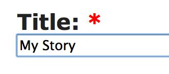
Under that is an ‘Parent’ field. Most of the time this will be your Author name, but some authors create several levels of Title pages, perhaps to separate poetry from stories proper, or for whatever reason makes sense to you. You’ll click on this and see a long drop-down list. Scroll down (or up, if you overshoot the mark) until you can click on your Author name. Try not to attach your story to someone else’s name. You can always fiddle with it after you’ve attached it somewhere, so don’t worry about this overmuch. On the other hand, don’t turn away from the task until it’s been done correctly.
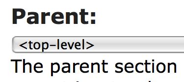
The default type of Organizer page is a title page, but the same form is used to create an author page or any of several other types. There’s a field to choose from a pull-down list if you don’t want to use the default.
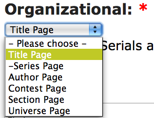
Most of the page is just like the Story entry page, so I’ll just skim over a few of the fields as examples.
The default Rating is Mature, but there’s a pull-down list for that as well, if you want to change it.
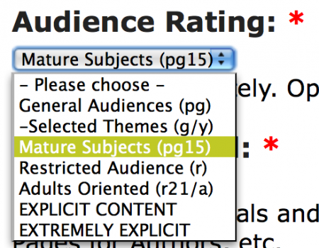
In the Body edit box, you’ll enter the title of your story, or whatever makes sense for the type of Organizer page you’re creating.
Just the words will do, or you can use the edit buttons to format the text on your page, or duplicate the HTML codes from a page that looks as if it would suit, changing fields around as desired. I’ve done both simple words and formatted text in the example. Pick one. Don’t do both.
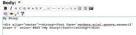
Note: It’s considered bad form to take up too much room, so in general you’ll want to keep your Title page to something reasonable, which is pretty much what everyone does already, so you can look at the other stories on the site to see what you might like to use as an inspiration. If you do wind up taking more than your fair share of the BC splash page, someone in authority will chide you privately, which takes up valuable time, so please be conservative. Here’s an example showing the sorts of things which might be done, taken at random from recent entries:
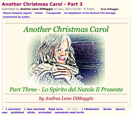
Under the Body edit box are several minor fields or drop-down menus.
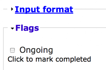
Input format can be safely ignored unless you’re an expert, in which case you’ll probably never read this. As a general rule, don’t ever change it.
Flags can usually be ignored, since stories are ongoing by default. When you come to the last Chapter / Episode / Part, it’s polite to tick off the Ongoing checkbox to mark the story Completed.
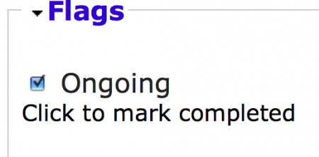
If your story is less than ten chapters, you'll never have to fiddle with the Weight setting. In general, Weight should be set to zero for chapters one (1) through nine (9), and one (1) from ten (10) to ninety-nine (99), the three (3) on up to the next power of ten, and so on. Further manipulations are usually unwise, unless you’re an expert. You might have to use it if you have a very complex structure for the story, but site maintainers will likely mutter under their breath if you get it wrong. Of course, if you can’t see it, feel free to ignore it. If you think of a reason to use it, the BC staff can help you. It works in exactly the same manner as Weight does on the Outline tab.
Note: It’s possible to use the Weight field to move your Author page to the top of the list, even if your name is Zenobia Zebra. Don’t do it. It’s bad form, because it makes it difficult to find pages in the drop-down Outliner lists. For quicker navigation, you can — after clicking to make the drop-down list appear — enter a single keystroke which will take you to the first entry with that letter (or less) as its first letter. So if Zenobia pokes her name into the list ahead of the normal position, it messes things up for everyone.
Note: When these things happen — and they do — for what seems to someone like a sensible reason at the time — you can scan down the list until you’re past the strange outliers and then enter the first letter. As long as the highlight is beyond the outliers, this ‘shortcut’ strategy will still work.
Note: As a matter of further strategic navigation, it may make more sense for an author named Tunafish (just for example) to skip to ‘U’ and page backwards, whilst an author named Tammy might do better with ‘T’. Your personal experience will vary. In general, Authors with names beginning with ‘A’ will quickly discover whether their names come either before or after Angharad, and there are several other prolific authors whose stories will form prominent landmarks which may affect quick navigation strategy. You can also use the ‘Page Up’ and ‘Page Down’ key combinations to traverse largish distances. Scrolling only works very roughly, because there are simply buckets and buckets of stories and only a tiny bit of scroll bar, so the merest twitch may fly by several hundred entries.
The Log Message field is mostly useful for site maintainers, but feel free to fill it out if you wish.
Below the Log Message edit box, there are more miscellaneous fields:
Comments can be turned off. By default, they’re enabled.
Authoring information shouldn’t be fiddled with unless you’re an expert, because it’s fairly easy to get into a situation in which one might make a mistake and be utterly unable to fix it.
Publishing options shouldn’t be fiddled with. They’re set the way they’re set by default for a reason.
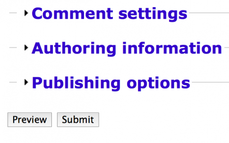
Just as with the story edit box, you’ll have to preview the submission before you can submit it, which gives you an opportunity to make corrections before everyone sees any incipient errors. Please proofread carefully from the Preview screen before submitting the page for public viewing. You can (and should) always Preview again after making any change.
Then select the Submit button.
Now look at it again, because this is an ideal time to change it, before many people have seen it.
You’re done with this step and can either post new chapters or reorganise those you’ve already submitted.
Paragraphs
Author:
Taxonomy upgrade extras:
Paragraphs
Paragraphs in English are interesting things, because they aren’t really anything at all.
That’s not the way they started out, of course, as we can see by the word “paragraph” itself, from the Greek “paragraphos,” which means “beside the writing.”
Back in ancient times, parchment, a type of very thin leather used for writing with ink, or smoothed slabs of stone for carving, was so terribly expensive that they crammed as many words into the lines as they could after allowing wide margins for notes on the text. In fact, they didn’t even put spaces between words, if one could figure out where the word boundaries were by contextual clues. soasentencemightlooklikethisandaparagraphwasjustthesame, one unbroken sequence of letters. The reader was expected to figure out the meaning of the text by sounding out the words, just like children learning to read do even today.
The distinction between capital and lowercase forms of letters had yet to be invented, so there were no clues in the text as to how the text was to be spoken, or indeed understood. Everything, in that irritating phrase so popular in mathematics texts, was left as an exercise for the reader.
Gradually, however, a system of little marks that could be inserted in or near the text became popular, amongst the first of which was the hypodiastole, a little mark that looked something like a comma, but was only added to the last letter before the word boundary when it might be ambiguous. So the English letters, “aniceman,” might separate either into “an ice man” or “a nice man,” and so would require a single hypodiastole to distinguish the two possibilities, here picked out in red to make it slightly easier to notice: “an⸒iceman.” Since the last two words were not ambiguous, they didn’t bother with a mark.
Note that the hypodiastole was only indicated in red in the previous example to make it a little easier to pick out when seen in some fonts, since we’re not used to looking underneath letters for clues, which is where it ought to appear, but some fonts place it below and off to one side, looking something like a comma. Here it is again, in black, but with an extra indication in blue where a letter ought to be: ⧫⸒ is really tiny — easy to overlook — and was often used beneath the last character rather than between the ambiguous words, because they didn’t have the habit of thinking that words ought to be separated. Like the zero in mathematics, the space within text, empty space, was a huge invention that required a whole new way of looking at things, of seeing, in fact, that “nothing” was real, and had value. Note that some Greek fonts place the hypodiastole way off to the side, so it looks more like a modern comma, which isn't really how it started out, but there you are. This is something more like it should look: aņiceman.
Even with this sort of basic help added in as a sort of afterthought, a mass of crowded text could be confusing, so they eventually made a special mark beside the text to indicate important changes in thought or focus, although the words themselves were left to run on until the speaker ran out of breath.
Originally, in Greek texts, the mark was just a sort of long dash at the beginning of the new thought, like this: ⸏ Eventually, they decided that a simple line wasn’t distinctive enough, so they added a little fork at one end or the other, like this: ⸐ or like this: ⸑ Well, since this mark was beside the writing, usually — but not always — in the margin, but wasn’t really writing by itself, since it had no actual meaning, other than that a change of subject had occurred, the Greeks called it a paragraphos, which means “beside the writing” in the wacky Greek language they insist upon speaking rather than English, as everyone ought do. If you can't see the actual symbol, here's something like it: Greek Paragraph.
And in fact, because writing systems are astonishingly slow to change, we still see a remnant of the paragraphos in some typographical styles used for dialogue in French and a few other languages, as well as by James Joyce — who lived in France for quite some time, and thought it was a good idea — the quote dash, which can be used within a block of text, just as in antiquity, albeit with slightly restricted scope:
― Quel est, dit Candide, ce gros cochon qui me disait tant de mal de la piá¨ce oá¹ j'ai tant pleuré et des acteurs qui m'ont fait tant de plaisir ? ― C'est un mal vivant, répondit l'abbé, qui gagne sa vie á dire du mal de toutes les piá¨ces et de tous les livres ; il hait quiconque réussit, comme les eunuques haíssent les jouissants : c'est un de ces serpents de la littérature qui se nourrissent de fange et de venin ; c'est un folliculaire. ― Qu'appelez-vous folliculaire ? dit Candide. ― C'est, dit l'abbé, un faiseur de feuilles, un Fréron. »
This quotation style is often seen indented in separate paragraphs as well, sometimes with line spacing closed up:
― Quel est, dit Candide, ce gros cochon qui me disait tant de mal de la piá¨ce oá¹ j'ai tant pleuré et des acteurs qui m'ont fait tant de plaisir ?
― C'est un mal vivant, répondit l'abbé, qui gagne sa vie á dire du mal de toutes les piá¨ces et de tous les livres ; il hait quiconque réussit, comme les eunuques haíssent les jouissants : c'est un de ces serpents de la littérature qui se nourrissent de fange et de venin ; c'est un folliculaire.
― Qu'appelez-vous folliculaire ? dit Candide.
― C'est, dit l'abbé, un faiseur de feuilles, un Fréron. »
The reason for this is that the compressed form violates English rules for marking paragraphs, and the same rules apply generally in many other languages, so the style is particularly irritating to decipher for those not intimately familiar with this telegraphic method of indicating dialogue, exacerbated by the parallel habit of including attributions, such as ‘said Candide’ and ‘said the Abbot’ in the preceding text without separating them from the dialogue itself, a relic of the days when everything was left as an exercise for the reader.
Things went along just swimmingly for a thousand years or so, during which time some scribal genius invented spaces, which caused the hypodiastole to fall into disuse — which may be why a similar symbol, the comma, eventually became used to indicate changes of breath or tone that can alter the meaning of words slightly — but the notion of marking a change of subject hadn’t changed much, other than that many European scribes changed the ancient symbol to be more decorative and distinctive, thriftily moving the line above the initial word instead of off to one side in the margin, and adding a bit of fatness to the fork in the line, resulting in a mark very similar to our modern Paragraph Mark, the “Pilcrow: ¶”
That's a little too small to see clearly, although it’s quite clear that the only division in the text is to separate it into parallel ‘newspaper’ columns. so here's an enlarged portion of the same page. This paragraph indication happens to be at the beginning of line, but doesn't have to be, and was lettered in red by the original scribe to make it easy to see, since paragraph marks were somewhat innovative at the time, and some early quality control specialists were upset by the waste of valuable space on the parchment. So they were often treated as decorative elements, a convention already familiar to most of us if we've seen pictures of a medieval text.
It's fairly easy to see that this version of our modern pilcrow has retained some qualities of the ancient paragraphos as well, since it has an extended line trailing off to the right, but thriftily placed on top of the lettering. Eventually, the horizontal line was eliminated, because it was difficult to arrange once print came along, and the double vertical line at the right of the symbol was extended downward to make it look like a fairly normal capital letter and we have the modern paragraph symbol: 
In fairly recent times, we discarded the symbol entirely in ordinary text, and substituted the great invention that gave us separate words: empty space.
This has several advantages:
- The human eye is very quick to notice space, so it's actually easier for us to notice emptiness than it is to decipher special symbols, which is an aid to comprehension and ease of use. The particular style of space used in this short list is often used for lists, and bumps out the first line instead of indenting, and uses a special symbol to attract your attention with another visual helper. The lack of vertical space, on the other hand, helps to indicate that the list is a single entity, and should be viewed as a whole.
- It decreases the number of letters and symbols needed in ordinary writing. A glance at any computer keyboard will demonstrate how crowded it is, so much so that we already have to memorise special combinations of keystrokes to easily enter certain letters, like the accented characters in many European languages. Why have more?
- It's a very flexible system, with two main variants:
The first variation is the one we use by default on almost every page of text you see on almost every web site, space between paragraphs. Looking up and down this page will offer beaucoup examples, except in the block immediately below:
The other variation is found in cheap paperback books, in newspapers, and in pages typed on old-fashioned typewriters, the indented first line, as illustrated here.
Chose one or the other. Using both is a sort of affectation, something like dotting one's "i's" with little hearts or drawing smiley faces in the text.
The reason one sees it in less expensive media is that it minimises blank space on the page, leaving just enough that our eyes can see it. While paper is much less expensive than parchment was, we print more books, so saving four pages per book if one prints five thousand of them can make a bean-counter's eyes light up. Or perhaps that's merely a steely glint.
With either variation, don't use too much. Exaggerated indentations can cause unfortunate visual interactions with trailing spaces at the end of previous paragraphs, and they interfere with our reading habits, because our brains know where they expect every line to start, so if they have to search for the real beginning it will annoy us, if only subconsciously.
The default setting for web pages is the first variant, line-spacing, and the other, first-line indents, is difficult to arrange, and requires the use of Cascading Style Sheets (CSS), which in our case we have not got.
This inevitably means that elaborate efforts to circumvent the Web conventions usually wind up looking… not so good. Best to avoid them entirely and save all that effort, which only serves to make the page look worse in any case.
There's another reason not to use first-line indents as well; staring at computer screens is hard on the eyes, because unless we're reading this on a Kindle, or other “electronic paper” reading device, we're staring directly into a light source, which we're not well-designed to do. Lots of white space makes it easier for our eyes to cope, and electronic space is essentially free, so there are exactly zero reasons to conserve it and ample reasons to use it liberally, within the limitations of our eyes and brains.
In English, we use paragraphs for every single arc of thought or action, and individuals by definition all have their own separate thoughts and actions, so deserve their own paragraphs.
A good paragraph is usually a short paragraph, unless you happen to be Marcel Proust, so if your paragraphs wind up as huge unbroken blocks of text, you're quite likely doing something wrong.
If two people appear in a single paragraph, that's probably a mistake as well, either in presentation — failing to indicate a paragraph when it ought to appear — or construction — jamming together words that ought not to appear together, because they belong to separate thoughts, actions, or people.
If you see close quotes immediately followed by open quotes, it's always a mistake, although it may not be the only one:
“Hi, Becky!” “Hi, Tom!” “Are you going to the mall,” he said. “No, I have to wash my hair.”
Because there are two speakers in the above example, and they alternate speaking, there are necessarily four paragraphs.
“Hi, Becky!”
“Hi, Tom!”
“Are you going to the mall,” he said.
“No, I have to wash my hair.”
There's a third variation, seen far too often in pages written in Word Processing programmes like Microsoft word, no space at all, except whatever space shows up accidentally at the end of the line, like this:
This is a short paragraph.
This is a longer paragraph.
This is the longest of all.*
This is very short.
This is somewhat longer.
* It has more letters.
Physiologically, this is all wrong, and places a terrible burden on the reader, since the eye has no way of picking out the beginning of any paragraph without asking the reader to take out a ruler and use it to line up the end of one line with the beginning of the next. Because these lines are short, it's somewhat easier, but if I said that there were only two paragraphs in a very narrow column, how could you tell?
It's also hostile to persons using screen reader software, since most such software for the disabled is even more dependent on real white space to separate paragraphs, and will turn the page into mush if real space is not present.
Another problem lies in the fact that font sizes and screen widths are flexible on the Web, and stories may be viewed on anything from fifty-six inch HD monitors to tiny little cellphones, so the author has exactly zero control over where the line will break. If the ends of lines at the edge of the page can't readily be distinguished from the ends of lines in paragraphs, the reader has a logical puzzle to figure out in addition to following the story line, which is rude.
It's also a burden on the site editors, who will eventually stumble (literally) across the malformed page and either fix it or send the author a note about the problem.
Because of the way Drupal — the "content management system" which runs BC — works, having no space between paragraphs can also break the display of your story entirely, causing it to be invisible, despite having what looks like lots of words in it.
Use space wisely, but use it. Six thousand years of human ingenuity created the carefully-crafted letters and conventions of space you see before you now. Only you can prevent confusion.
Publishing with Microsoft Word
Author:
Taxonomy upgrade extras:
Publishing with Microsoft Word
by Puddintane
It's entirely possible to publish very pretty stories using only Microsoft Word and the Big Closet story tools, but you have to be aware of a few tricky things that Word* does that may be confusing.
The first, and most common trick it plays on authors is the fact that it uses what are called "style sheets" internally, which automatically affect the display, so a single carriage return is magically made to *appear* as if it were a separate paragraph, possibly indented on the first line, and so on, but these are all illusions, smoke and mirrors meant to lull an author into a false sense of security. It does this by embedding a block of special coded descriptions in your text with pointers that link to the places where the treatment of each little chunk of "different" text starts and ends.
You might think of it like this:
[In position 9, a little block of text should be displayed in BOLD; In position 12, the text reverts to normal; ...]
[This is BOLD text]
MS-Word will put this all together as:
[This is BOLD text]
Of course, this sort of jiggery pokery is fairly easy for a computer to keep track of, but any little degradation in the characters and exact locations within the file can result in what amounts to garbage.
If you've worked with MS-Word long enough, you've experienced "corrupted" text files. Fun, isin't it?
The first thing to do is to turn on the display of "hidden" characters. I don't usually use MS Word, so I'm not an expert, but poke around in the menus and you'll find a setting that will let one display carriage returns and tabs onscreen, instead of hiding them as is usual.
Tabs and other non-displaying characters on the web, are utterly invisible (they count as "whitespace," and all adjacent whitespace is collapsed into a single space in HTML) so any "formatting" achieved with tabs or spaces will have to be redone using other tools.
Carriage returns are also "whitespace," and theoretically just as collapsible as any other "whitespace," but are treated in a special manner by DruPal. Because of the way Big Closet operates using DruPal, our publishing system, you need two of them between every "paragraph," and none at all within a paragraph.
With the display of carriage returns turned on in MS Word, you can easily see if that's the problem, and exactly what problems you have to solve.
|
Here's a rough indication of what your screen might look like in MS-Word with hidden carriage returns displayed. Nulla facilisi. In vel sem. Morbi id urna in diam dignissim feugiat. Proin molestie tortor eu velit. Aliquam erat volutpat. Nullam ultrices, diam tempus vulputate egestas, eros pede varius leo, sed imperdiet lectus est ornare odio. Lorem ipsum dolor sit amet, consectetuer adipiscing elit. Proin consectetuer velit in dui.¶ Phasellus wisi purus, interdum vitae, rutrum accumsan, viverra in, velit. Sed enim risus, congue non, tristique in, commodo eu, metus. Aenean tortor mi, imperdiet id, gravida eu, posuere eu, felis. Mauris sollicitudin, turpis in hendrerit sodales, lectus ipsum pellentesque ligula, sit amet scelerisque urna nibh ut arcu. Aliquam in lacus. Vestibulum ante ipsum primis in faucibus orci luctus et ultrices posuere cubilia Curae; Nulla placerat aliquam wisi.¶ Mauris viverra odio. Quisque fermentum pulvinar odio. Proin posuere est vitae ligula. Etiam euismod. Cras a eros.¶ |
This example has too few carriage returns (only one per paragraph, recognisable by the little pilcrow, or paragraph signs, at the end of each — there ought to be two of them between each paragraph.) and is easiest to solve, although the story jams together into a block of text in which it's difficult to see paragraphs at all, and it *looks* like lot of trouble to fix. It actually isn't much trouble at all. Here's roughly what it will look like on Big Closet, if posted as is:
|
Here's a rough indication of what your screen might look like with hidden carriage returns displayed. Nulla facilisi. In vel sem. Morbi id urna in diam dignissim feugiat. Proin molestie tortor eu velit. Aliquam erat volutpat. Nullam ultrices, diam tempus vulputate egestas, eros pede varius leo, sed imperdiet lectus est ornare odio. Lorem ipsum dolor sit amet, consectetuer adipiscing elit. Proin consectetuer velit in dui. |
The only way you can see if there's a paragraph present is that a final line may (or may not) be noticeably shorter, which is a drag, not to mention ugly.
Even more of a drag is the fact that at some secret limit, posting long blocks of text without an intervening two-line break between paragraphs on BC may run into a limitation of the BC content management system, which blithely makes long blocks of unseparated text utterly invisible. (It's probably an internal buffer overflow, but I've never actually looked to see what causes the problem) Looking on the bright side, though, turning ugly text invisible might possibly be seen as motivation.
You can use Word's search and replace function to turn single carriage returns into two of them globally using a special "escape sequence" within Word: ^p (which stands, I believe, for "paragraph.")
Search for ^p (two characters -- the "hat," technically a "circumflex," is above the number 6 and the "p" is right there above your right little finger if you use a US or British keyboard layout.) and choose type "^p^p" as your replacement string, then select "replace all" or however this function appears on your particular system. You can safely ignore any extra carriage returns between paragraphs, as they will be ignored once you get to Big Closet's default story entry page.
Too many carriage returns, especially when they appear *inside* the paragraphs, is actually worse, because one has to take these out "by hand," although it's sometimes possible through clever search and replace strategies to select out paragraphs and "replace" these, and these alone, with a special string (I like [[PARAGRAPH]] just like that, as it's unlikely to appear in the text) and then turn all the carriage returns into spaces, then turn [[PARAGRAPH]] into ^p^p as a global replace.
One usually sees too many in files designed for "ASCII" bulletin board systems, which required every line to end somewhere around or under seventy-two, or eighty, whatever... characters, as if it were a piece of paper in an old-fashioned typewriter.
The problem with this was that some authors used tabs to indicate paragraphs, as they do in newspapers and some books, and these (as we observed above) are utterly invisible on the BC screen.
|
Here's a rough indication of what your edit screen¶ |
If so, careful use of those special search "escape strings" can save one, as "^t" represents a tab, so you can search and replace "^t" with [[PARAGRAPH]] as above, then change the carriage returns to spaces, then proceed as above to a final "clean file."
Once this has been done, you can "select all" off the screen and simply paste it into the story entry box and you're *almost* done.
At the top of the story entry box are a row of little icons. Each of these does something special that can add to the overall "look and feel" of your story with very little effort.
For now, we'll address only a few. Each quick description will be followed by an example, which may be on the same line, or several following lines, displaying what each button does.
B = BOLD
I = Italics
U = Underline
C = Center
Q = "QUOTE" (This is a method of indenting a block of text, which could be used to indicate a written note that a character reads in the text, for example.)
Twinkle, twinkle, little star.
H = Header Another form of BOLD, with added code that changes the colour and size. (This is a quick way of making a distinctive Title, for example.)
TITLE
S = Secret (This is a method used to make words either invisible or inconspicuous, so you could use them for the "punchline" of a joke, for example.)
{Highlight to read} And the pig got up and slowly walked away.
Y = Another form of Italics, with added code that changes the colour and size. (These can be used for author names or mental telepathy, for two examples only.)
The Shadow knows! [sinister laughter]
_ = "non-break space" (These can be used to create kludgy paragraph indents)
Six kludgy indents.
n = "Normal text," neither italic nor bold, with added code that changes the colour and size. (These can be used for author names, for one example only.)
by Mark Twain
< = Insert a special code which allows a "less than" sign to appear in the text. (Unless you need to do this, you can safely ignore this icon and button.)
> = Insert a special code which allows a "greater than" sign to appear in the text. (Unless you need to do this, you can safely ignore this icon and button.)
L = LARGE Make text larger.
s = small Make text smaller
With the exception of "_" which inserts a single non-breaking space, all these buttons are typically used by highlighting a word or phrase and then clicking on the button. Experiment and you can see what they do using "PREVIEW," and as long as you don't "POST" the result, no harm can come. Just navigate away from the entry page using any of the buttons at the top or side.
Most of these can be "piled on each other," so you can add italics to bold and get italicised bold. Just keep pressing buttons.
====================
The buttons that insert complicated text leave behind code, and the code can be edited. The title at the top of this blog page is a little unbalanced, for example, and can be improved by "tweaking" the code slightly.
Here's the raw code as it will appear in the story box:
<strong><font face='verdana,arial,geneva,sanserif' size='6' color='#A05'>Publishing with Microsoft Word</font></strong>
<font face='verdana,arial,geneva,sanserif' size='2' color='#603'>by Puddintane</font>
I'll pick on the size attributes: size='6' and size='2' respectively. It's easy to see and fairly intuitive. Larger numbers make the enclosed text bigger. Smaller numbers make the enclosed text smaller.
Since I want to create a more balanced appearance, I'll change the big number, 6, to make it smaller by one. Then I'll change the small number, 2, to make it larger by one.
Here's what it looks like:
Publishing with Microsoft Word
by Puddintane
Pretty good, but it could be better, maybe, if it were centred, so I can highlight the title and author clumps of code and add centring using the C button.
That edit looks like this:
The five little pictures that follow can be ignored for now, except the little picture on the very end, which looks like a/b, only prettier.
What this does is to allow you to control what's included in the introduction to your story which forms the entry link to the story itself. It does this by placing a special "comment" in the text that looks like this:
<!--break-->
I made this bold as well as indented it, because it's very important. Everything above the "break" line (within reason) will be displayed in the little entry box. Everything below it will always be displayed only when reading the actual story file.
I put it right at the bottom of the first paragraph after the two title lines, and you can see the result by looking at the recent blog posts directly using the link towards the top of this main entry page.
Cheers,
Puddin'
* NOTE: If you use Wordpad, or Visual SlickEdit, or BBEdit, or other professional text and code editors, please ignore this post and do whatever you're already doing. This is meant only for those who write and edit in Word, or similar "office" word processors.
Quotes with or without Comment
Quotation marks in English are used to set off parts of a sentence that represent quoted words.
While it’s true that there are exceptions – some writers don’t use quotation marks for parts of a sentence that aren’t actually spoken, for example, thus using them like other writers use italics or the lack of them.
Thus:
Mary said Hello.
is always incorrect.
So is:
Mary said. "Hello."
Which consists of two sentence fragments.
It should be:
Mary said, "Hello."
If you juggle the various pieces around, the same logic applies:
"Hello," Mary said.
"Hello," said Mary.
Both version are correct.
"Hello." Mary said.
"Hello." said Mary.
on the other hand, are both incorrect, having turned one coherent description into two sentence fragments each.
Even worse is:
"Hello." Said Mary.
But only because one compounds the error in punctuation by adding an error in capitalisation rules to the first mistake, a "two-for-the-price-of-one" solecism.
Optionally, and purely as a matter of style, some writers don’t use quotation marks to surround words that aren’t actually spoken aloud, but are rather only thought..
I won’t do that, thought Mary.
Some writers still want to set the thoughts off from the rest of the sentence in some manner, so may use italics:
I won’t do that, thought Mary.
whilst still others use both conventions at once:
"I won’t do that," thought Mary.
This is a matter of taste, not prescription. It really doesn’t matter what you do in these marginal situations, since the only firm portion of the rule is that spoken words should be set off in some manner, because we think of thoughts as being quite different to words.
We all know this in real life:
What a schmuck, Mary thought.
"What a schmuck," Mary said.
The first instance represents a private thought she can easily get away with, because thoughts are private.
The second instance represents "fighting words" that might well lead to an altercation of one sort or another.
Now there are a few variations on this theme available to the writer. James Joyce, for example, who actually lived in France for a while, became enamoured of so-called “French quotes,” one form of which looks something like this:
Mary said,
— I won’t do that.
Note that the French language, having been invented by French people, is very inconsistent in its application of all the quotation rules. In fact, some people believe that French doesn’t actually have any rules for quotations, preferring to let confusion reign supreme. I personally think that this is a slight exaggeration, but then I do try to be kind.
http://en.wikipedia.org/wiki/International_variation_in_quotation_marks#French
Rules for Using Numbers in Stories
Author:
Taxonomy upgrade extras:
Rules for Using Numbers in Stories
by Puddin’
One sees all sorts of advice on using numbers on the Web. Here’s one example out of many:
Daily Writing Tips — the basic point of which is “spell out numbers under ten,” with plenty of special rules to modify the basic advice, as well as common variants of the usual rule.
I disagree, and so do many others. It’s partly a matter of taste, but also of courtesy and consideration, so I personally choose to follow the most stringent rules, which restrict the use of arabic numerals to fairly large numbers like 10,974,126 or numbers involving decimal fractions like pi is approximately 3.141592638…, plus lots of following digits. Common fractions, on the other hand, should almost always be spelled out:
One half gallon
Seven sixteenths of an inch
If I had a third of an apple….
The same advise goes double for symbols, however cleverly they’re automatically inserted by one’s word processor or painstakingly inserted by hand:
½ only looks like something, and is completely invisible to most screen readers, so it’s moderately contemptuous of people who have trouble seeing, depending on exactly what one might be thinking when one uses it. What does it mean? “One half?” “One over two?” “Point five?” How are you supposed to read it? The reason we’re fluent in reading is that our brains instantly flood our thoughts with the sound of every word we read. We may not even be aware of this, but they can see it happening on brain scans these days, the wave of neural activity spreading out from the visual cortex to the auditory cortex, sometimes even to the areas of the brain which control the movements of our tongues, lips, and vocal chords. We’re few of us that fluent with arbitrary symbols, so they put a stumbling block before your readers that they may or may not trip over.
¾ is the same. You may have saved a few keystrokes for yourself, but what are they worth if they annoy your readers?
Two ¢ is not as transparent as two cents, much less 2¢. What are you supposed to think if you can see the symbol at all? Two cents, two cent, two pennies? Why not “a couple of cents,” or “a pair of pennies?” Symbols can stand for many things, not just the one one happens to be thinking of. How much of an author’s story is the reader expected to finish on their own? If the reader isn’t familiar with US conventions, they may not recognise the symbol at all, which kind of spoils the effect, as well as the flow of the story while the reader wanders off to find a reference book and puzzles out what the hell the author was trying to say. Can all of us, for example, instantly identify which monetary denominations the following symbols indicate? ₮, ₯, ₴, ₪, ₤, ₡, ₨, ₩? How about the countries which use them? Does the sound of the symbol spring instantly into your mind? How would you read it aloud?
The symbols stand for Tugrik, Drachma, Hryvnia, New Sheqel, Lira, Colón, Rupee, and Won, by the way, but the fact is that the vast majority of people who speak English will have no clue.
The currencies they indicate are used in Mongolia, Greece, Ukraine, Israel, Italy, Costa Rica or El Salvador, India and many other countries in that part of the world, and North or South Korea, respectively.
If one is old enough, and lived in the UK well before 1968, one may remember prices that looked like this: £1 2/6, which stands for ‘one pound, two shillings and six-pence’, or ‘one pound, two and six’, or any number of slangy and dialectical variants. Should your reader know how to convert the symbols to words, or should you?
According to The Chicago Manual of StyleThe Chicago Manual of Style (2003, p. 380), in nontechnical written contexts, whole numbers from one to one hundred should always be spelled out, and other whole numbers should be written in terms of numerals. In addition, when a number begins a sentence, it is always spelled out unless it appears awkward, in which case the sentence should be recast, although this runs the risk of making the sentence itself awkward, unnatural, or weak.
The American Press Association has a similar rule, expressed differently: Write out numbers that require no more than two words.
Correct: A hundred and one trombones led the big parade.
Bad: 101 trombones led the big parade.
Worse: The parade was led by 101 trombones.
Correct: Ninety-nine bottles of beer on the wall...
Bad: 99 bottles of beer on the wall...
Worse: There were 99 bottles of beer on the wall...
Partly, these rules are a matter of courtesy because people speak numbers in different ways. Highway 101. Is it “Highway One Oh One,” “Highway One Hundred One,” “Highway One Hundred and One,” or is it “Highway a Hundred and One?” As an author, however, the way people speak makes a huge difference in characterisation, as well as the rhythm of the sentence, but you give the reader no clue without writing down the actual words. A character who says, “A hunnert ’n one dalmatians” is different — and sounds different — from a character who says, “One hundred and one dalmatians.”
Is the author supposed to leave character quirks to the reader, creating words the author never meant to say?
In the Gettysburg Address, Abraham Lincoln said:
Four score and seven years ago our fathers brought forth on this continent, a new nation, conceived in Liberty, and dedicated to the proposition that all men are created equal.
Would it be correct to write: “4 20’s and 7 years ago...”? How about “87 years ago...”? After all, they mean the same thing, don't they?
In some areas of the English-speaking world, “22” is pronounced “two and twenty.” In others, “twenty-two.” What does your character say?
Your character has the following smattering of letters and numbers attributed to her: “I’ll give you £10 for your hat!” but what does your character actually say?
1. I’ll give you a tenner for your hat!
2. I’ll give you ten quid for your hat!
3. I’ll give you ten pounds for your hat!
4. I’ll give you pound sterling symbol one zero for your hat!
Arabic numerals and monetary symbols don’t actually sound like anything, but must needs rather be translated into local language or slang. As a writer, there are very few occasions on which it’s advisable to let your reader finish the story on your behalf or write your character’s dialogue.
If you have a sentence in German, and the character says, « Ich habe dreiundzwanzig Bücher. », does it make a difference if you type: « Ich habe 23 Bá¼cher. »? Do your readers hear it the same way? How do you know?
In some cases, how a number is pronounced depends not only on who’s counting, but on when and what’s being counted: Lakeland Dialect Society - Te deu wid sheep
There are also typographical reasons for this delicacy that may not be immediately apparent to those without an eye for fine detail. Due to the fact that a large proportion of technical types are fashion and design klutzes, when computer standards were defined, the only slots reserved for numbers were uppercase numbers, because they’re handy in the neat little columns of figures preferred by accountants and electronic calculator fans. Because we live in the computer age, many of us either don’t know, or don’t remember, that there are lowercase numbers as well, designed to be used in running text, and for that reason often called “text figures.”
Because the same general class of nerd are in charge of Unicode, they’re left out of the standard definitions of every world alphabet on the spurious grounds that they’re only a different way of writing the same characters. Of course, upper and lower case letters like “a” and “A” have exactly the same problem, but that’s different, somehow, which I’m quite sure makes perfect sense if one is a perfect dweeb: Numbers are better than words anyway, so why muck about with numbers which look well when lumbered with trivial excrescences like words. One shudders to think of it.
All this thick-headedness means that the only place you’re at all likely to see text figures is (if you live in the USA) on the date stamped on a US penny or happen to be carrying a facsimile copy of the Declaration of Independence in one’s pocketbook. In the UK, you’re out of luck unless you usually like to carry around a Bank of England Tercentenary 1994 two pound coin for sentimental reasons:

Note that the above coin is “double struck” and extremely valuable. If it’s not double struck, it’s worth a penny, despite the very pretty old style numerals in the date. If it is, it’s worth upwards of US$30,000 and still has lovely figures.

The rest of the British coin assemblage uses ugly numbers by default, very apt, one supposes, for a “nation of shopkeepers,” as Napolean once contemptuously called them (somewhat before Waterloo, one is forced to observe), since they were invented in the late Eighteenth Century for the convenience of producing advertising display text without custom pi fonts or engraved art.
A printed copy of the American Declaration of Independence
Here’s an example of how lowercase numbers should be used:
You are cordially invited to a cocktail party at 1279 18th Street, on the 7th of July, 2010, at 21:30 hours. Please R.S.V.P. to 1-800-123-4567, Extension 89.
Notice (if you’re lucky enough to have one of the handful of decent fonts available without paying the extra dosh for a “professional” font family) how the overall typographical “colour” (actually, greyish) of the page is maintained by text figures, which also maintain the usual profile of English sentences.
Contrast this with the same invitation using the ordinary (but extraordinarily ugly) run of the mill dreck one sees in machine fonts these days:
You are cordially invited to a cocktail party at 1279 18th Street, on the 7th of July, 2010, at 21:30 hours. Please R.S.V.P. to 1-800-123-4567, Extension 89.
Using uppercase numbers designed to complement advertising signage:
APPLES: 23¢/lb.
is quite similar to using all capital letters in sentences:
Now IS the TIME for ALL good….
and they irritate at least some eyes.
The fonts I used that contain default text figures are:
Georgia, 'Hoefler Text', 'Big Caslon', Constantia, 'Colona MT', 'Bradley Text', 'Bradley Text TT', 'Palatino Linotype', 'URW Bookman L', Cardo, and 'FF Scala' which last is a professional font which will set one back the best part of US$300 for the full set of common variants, regular, italic, italic bold, bold, and small caps.
If the preceding example didn’t make any sense because the numbers looked the same in both examples, many of the fonts listed above can be readily found on the Web or are included on your computer system distribution discs as a “extra” to be installed at your leisure.
Note that commas should not be used to separate words that are part of one number because this can make the number ambiguous or confusing.
Correct: One thousand one hundred one...
Correct: One thousand one hundred and one...
NOTE: An “and” between the hundreds and the digits from one to ninety-nine is optional and regional.
Bad: One thousand, one hundred, one...
Bad: One thousand, one hundred and one...
The following table summarizes the English names given to the first one hundred and fifty positive numbers. The optional “and” is omitted for brevity.
| 0 | = | zero |
| 1 | = | one |
| 2 | = | two |
| 3 | = | three |
| 4 | = | four |
| 5 | = | five |
| 6 | = | six |
| 7 | = | seven |
| 8 | = | eight |
| 9 | = | nine |
| 10 | = | ten |
| 11 | = | eleven |
| 12 | = | twelve |
| 13 | = | thirteen |
| 14 | = | fourteen |
| 15 | = | fifteen |
| 16 | = | sixteen |
| 17 | = | seventeen |
| 18 | = | eighteen |
| 19 | = | nineteen |
| 20 | = | twenty |
| 21 | = | twenty-one |
| 22 | = | twenty-two |
| 23 | = | twenty-three |
| 24 | = | twenty-four |
| 25 | = | twenty-five |
| 26 | = | twenty-six |
| 27 | = | twenty-seven |
| 28 | = | twenty-eight |
| 29 | = | twenty-nine |
| 30 | = | thirty |
| 31 | = | thirty-one |
| 32 | = | thirty-two |
| 33 | = | thirty-three |
| 34 | = | thirty-four |
| 35 | = | thirty-five |
| 36 | = | thirty-six |
| 37 | = | thirty-seven |
| 38 | = | thirty-eight |
| 39 | = | thirty-nine |
| 40 | = | forty |
| 41 | = | forty-one |
| 42 | = | forty-two |
| 43 | = | forty-three |
| 44 | = | forty-four |
| 45 | = | forty-five |
| 46 | = | forty-six |
| 47 | = | forty-seven |
| 48 | = | forty-eight |
| 49 | = | forty-nine |
| 50 | = | fifty |
| 51 | = | fifty-one |
| 52 | = | fifty-two |
| 53 | = | fifty-three |
| 54 | = | fifty-four |
| 55 | = | fifty-five |
| 56 | = | fifty-six |
| 57 | = | fifty-seven |
| 58 | = | fifty-eight |
| 59 | = | fifty-nine |
| 60 | = | sixty |
| 61 | = | sixty-one |
| 62 | = | sixty-two |
| 63 | = | sixty-three |
| 64 | = | sixty-four |
| 65 | = | sixty-five |
| 66 | = | sixty-six |
| 67 | = | sixty-seven |
| 68 | = | sixty-eight |
| 69 | = | sixty-nine |
| 70 | = | seventy |
| 71 | = | seventy-one |
| 72 | = | seventy-two |
| 73 | = | seventy-three |
| 74 | = | seventy-four |
| 75 | = | seventy-five |
| 76 | = | seventy-six |
| 77 | = | seventy-seven |
| 78 | = | seventy-eight |
| 79 | = | seventy-nine |
| 80 | = | eighty |
| 81 | = | eighty-one |
| 82 | = | eighty-two |
| 83 | = | eighty-three |
| 84 | = | eighty-four |
| 85 | = | eighty-five |
| 86 | = | eighty-six |
| 87 | = | eighty-seven |
| 88 | = | eighty-eight |
| 89 | = | eighty-nine |
| 90 | = | ninety |
| 91 | = | ninety-one |
| 92 | = | ninety-two |
| 93 | = | ninety-three |
| 94 | = | ninety-four |
| 95 | = | ninety-five |
| 96 | = | ninety-six |
| 97 | = | ninety-seven |
| 98 | = | ninety-eight |
| 99 | = | ninety-nine |
| 100 | = | one hundred |
| 101 | = | one hundred one |
| 102 | = | one hundred two |
| 103 | = | one hundred three |
| 104 | = | one hundred four |
| 105 | = | one hundred five |
| 106 | = | one hundred six |
| 107 | = | one hundred seven |
| 108 | = | one hundred eight |
| 109 | = | one hundred nine |
| 110 | = | one hundred ten |
| 111 | = | one hundred eleven |
| 112 | = | one hundred twelve |
| 113 | = | one hundred thirteen |
| 114 | = | one hundred fourteen |
| 115 | = | one hundred fifteen |
| 116 | = | one hundred sixteen |
| 117 | = | one hundred seventeen |
| 118 | = | one hundred eighteen |
| 119 | = | one hundred nineteen |
| 120 | = | one hundred twenty |
| 121 | = | one hundred twenty-one |
| 122 | = | one hundred twenty-two |
| 123 | = | one hundred twenty-three |
| 124 | = | one hundred twenty-four |
| 125 | = | one hundred twenty-five |
| 126 | = | one hundred twenty-six |
| 127 | = | one hundred twenty-seven |
| 128 | = | one hundred twenty-eight |
| 129 | = | one hundred twenty-nine |
| 130 | = | one hundred thirty |
| 131 | = | one hundred thirty-one |
| 132 | = | one hundred thirty-two |
| 133 | = | one hundred thirty-three |
| 134 | = | one hundred thirty-four |
| 135 | = | one hundred thirty-five |
| 136 | = | one hundred thirty-six |
| 137 | = | one hundred thirty-seven |
| 138 | = | one hundred thirty-eight |
| 139 | = | one hundred thirty-nine |
| 140 | = | one hundred forty |
| 141 | = | one hundred forty-one |
| 142 | = | one hundred forty-two |
| 143 | = | one hundred forty-three |
| 144 | = | one hundred forty-four |
| 145 | = | one hundred forty-five |
| 146 | = | one hundred forty-six |
| 147 | = | one hundred forty-seven |
| 148 | = | one hundred forty-eight |
| 149 | = | one hundred forty-nine |
| 150 | = | one hundred fifty |
The Vocative Comma in English
Author:
Blog About:
Taxonomy upgrade extras:
Well done, thou good and faithful servant.
The above phrase is in what's called the vocative case, which was used in most Indo-Euorpean languages when addressing people (or animals) directly. In this case, the speaker is addressing someone called "good and faithful servant," but it could be almost anyone: Well done, Mom! Well done, Sam! Well done, Son!
Leave out the comma, and you're talking about cooking Mom, or Sam, or one's son, which is not "done" in civilised societies.
Historically, in English, most of the ancient indicators of the vocative case have disappeared, except for a few relics like the vocative O:
| O Romeo, Romeo! wherefore art thou Romeo? |
| O ye of little faith. |
Mostly though, we use a comma, which represents an actual pause when we speak aloud, but is conspicuously absent in the two examples of the vocative "O". The comma represents and actual change in the rhyth, -- and in many cases the pitch -- of uur voices when we speak aloud, which is one of the reasons that it's a very good idea to read your words aloud when you're writing dialogue.
If you misspell the above sentences with "Oh," a type of exclamation, usually, you change not only the sense of the sentences but the mandatory punctuation:
| Oh, Romeo, Romeo! Bird thou never wert! |
| Oh, ye of little faith. |
This is something of a fine point, and unusual, since the vocative O is rarely seen these days, except for purposes of humour or deliberate archaism:
| What's up, O Romeo? |
| Oh, Romeo, Romeo! What's up, O handsome dude? |
| O, ye of little faith, you don't seem to have believed me when I said that the show always starts at eight. |
If you really listen to the way people speak, you can hear either the comma, a slight pause, or a distinctive raising and lowering of pitch when we speak people's names or appellations.
Well done, Mom.
-- ^^ --
How do you do, Bob?
-- -- -- ^^ --
You could almost as easily punctuate the above sentence: How do you do? Bob.
This looks slightly odd only because we're used to seeing the question mark at the end of the sentence, but the actual question is asked by the first three words. "Bob" is a vocative naming of the person being addressed, which is quite clear when you change the words a bit: How do you cook Bob?
| Fred to Jack: Do you know Mike? |
| Jack to Fred: I do, Fred. |
| Fred to Jack: I don't know Mike. |
| Jack to Fred: Do you know Steve, Fred? |
Note too that the vocative comma surrounds the name or other description of the person being addressed, if necessary.
| Jack to Fred: | Fred, do you know Steve? |
| Jack to Fred: | Do you, Fred, know Steve? |
| Fred to Jack: | I don't know Steve. |
| I don't know Steve, Jack. | |
| I don't know, Jack. | |
| No, Jack. | |
| Jack, I don't know Steve. | |
| Jack, watch out for the bull, you fool! |
Leave out those pauses, or those commas, and you invite ambiguity and confusion.
| Fred: | Do you know Jack? (Who is Fred talking to?) |
| Fred: | Do you know Steve Jack? (Is Fred talking about Steve Jack?) |
| Fred: | We lost Jack. (Is Jack lost? Or have Jack and Fred both lost?) |
| Fred: | Jack watch out for the bull you fool! (Is there a "Jack watch?" Does it have to worry only about bulls you fooled?) |
Typographical Errors?
Author:
Taxonomy upgrade extras:
Typographical Errors?
Typographical errors are part of being human, since our brains are designed to gloss over small details and fill in from context. It’s not a matter of being “smart,” but how we’ve survived over millions of years of evolution. Those who noticed the lion hiding in the grass — even though lions are perfectly suited to hide in the grass — and guessed straight away that it was a lion, even though they couldn’t really see every detail, even if they looked very carefully when they should have been running away, did much better over time than those who noticed that “Those colours don’t really go well together,” or “Does it strike anyone else as odd that Mickey Mouse only has three fingers on his hands?”
![Lion in the Grass]](/topshelf/system/files/u2392/lion.jpeg "Lion hiding in the grass.")
So if you’re one of those who finds it difficult to notice typos, you might console yourself with the realisation that this perfectly demonstrates the utility of not focusing on details, but rather extrapolating from subtle clues such as those leonine eyes, all by themselves, or even one of them, which allow the brain to hypothesize the lion’s body behind them, quicker than thought, and immediately make a rational decision about one’s future course of action based upon incomplete evidence.
It’s not only you, but all your ancestors, stretching back into prehistory, stretching back to before human beings were truly human, who possessed these intuitive skills, which kept them alive when they could have easily been dead, and most all of them couldn’t read worth a tinker’s dam.
Survivors take one look and scream, “Lion!!! Run for your lives!!!”
Philosophers look and say, “How curious, a lion’s head… I wonder what it’s doing out here?”
I don’t know it you’ve seen it, but this is an excellent example of why “typos” are very difficult to see:
Aoccdrnig to rscheearch at an Elingsh uinervtisy, it deosn’t mttaer in waht oredr the ltteers in a wrod are, olny taht the frist and lsat ltteres are at the rghit pcleas. The rset can be a toatl mses and you can sitll raed it wouthit a porbelm. Tihs is bcuseae we do not raed ervey lteter by ilstef, but the wrod as a wlohe.
Almost everyone can read the above text almost as easily as if it were not jumbled. Speiling that’s only slihgtly off is easily overlooked by comparison, and the famous example of “little words” is fsmiliar to us all.
GUESTS PLEASE
KEEP OFF THE
THE GRASS!
Here’s a little test with seventeen errors:
Nothing is more embarassing than making a writing
mistake. Of course, we all think its funny when we
spot a mispelled word in magazine ads or on giant
billboards. If one of your employee’s are making the
the mistakes, it can be disasterous. And if you have a
a typo in a memo to the boss, how do you think they will
view your professionalism? These kind of mistakes can
be prevented, irregardless of the persons job title.
The people that make the mistakes can seriously effect
how other’s view you’re company. That can cost any
organization money and hurt it’s profits.
{Highlight to read}
1. “embarassing” should be “embarrassing”
2. “its” should be “it’s”
3. “mispelled” should be “misspelled”
4. “employee’s” should be “employees”
5. “are” (after employees) should be “is”
6. there are two “the”(s) in the third sentence
7. “disasterous” should be “disastrous”
8. There are two “a”(s) in the fourth sentence.
9. “they” (sentence 4) should be “he/she” or something
like it. The epicene “they” is frowned upon
by many authorities. This is a judgment
call, though.
10. “kind” should be “kinds”
11. “irregardless” should be “regardless”
12. “persons” should be “person’s”
13. “that” (in the second to last sentence) should be “who”
14. “effect” should be “affect”
15. “other’s” should be “others”
16. “you’re” should be “your”
17. “it’s” ( in the last sentence) should be “its”
Here’s another chestnut:
Find the error; its almost impossible!
000
111
222
333
444
555
666
777
888
999Did you know that 80% of UCSD students could not find the error above? Repost this with the Subject: ‘Find the error; its almost impossible!’ and when you click ‘Submit Post’, the answer will be really obvious.
{Highlight to read}
The answer, of course, is the old confusion between the possessive “apostrophe ‘S’ ” and the irregular forms of most English pronouns.
So it’s “his book,” not “he’s book.”
It’s “her book,” not “she’s book.”
“Whose book?” and not “Who’s book?”
And “its book,” not “it’s book.”
The reason it will “be obvious” is that the mistake will be in the subject line.
Puddin’
Waking up from a Comma...
Author:
Blog About:
Taxonomy upgrade extras:
…and no, that's not a spelling error.
The comma — that tiny little squiggly thing one sometimes sees between words — can be used, amongst many other things, to mark an interjection. For example:
“Now, are you ready to go?”
implies that the speaker is trying to get the putative listener's attention, the rough — but slightly more polite — equivalent of:
“Hey, you! Are you ready to go?”
whereas:
“Now are you ready to go?”
implies a level of impatient sarcasm, which might also be indicated with italics:
“Now are you ready to go?”
with the more or less hidden subtext being:
(‘I'm tired of waiting for you,’ so) now are you ready to go?
Like the jot or tittle which shall never pass from the Law, those little commas mean quite a lot, and can be omitted — or included — only at the writer's peril. It helps a lot to speak one's words aloud as one writes, or at least maintain an active mental awareness of how one means the words set down on paper to be spoken.
The comma should also be omitted when a word is used as a simple noun, such as when the word ‘now’ refers simply to the present time without any hint of sarcasm:
“Now is the winter of our discontent….”
Appositives Attract
An appositive is a word or phrase equivalent in meaning to an adjacent word or phrase, but it's sometimes difficult to determine whether that word or phrase is actually being used appositively or not, although one can always tell if you actually hear the sentence spoken aloud.
“I talked to my sister Karen yesterday.”
Is not an apposition, because in fact I have two sisters and ‘Karen’ is being used as a type of postpositional adjective to distinguish my sister Karen from my sister Barbara.
If I had only one sister, I would write:
“I talked to my sister, Karen, yesterday.”
because ‘my sister’ and ‘Karen’ would mean exactly the same thing, with the ‘Karen’ added only to clarify the meaning of ‘sister’ if it had slipped the listener's mind for any reason, just as one might say:
“Have you seen my (only) book Winnie the Pooh?”
assuming that I don't have more than one book. Of course one could use ‘Winnie the Pooh’ in a non-appositive manner as well:
“Have you seen my book, Winnie the Pooh (as opposed to my other book, Now we are Six) ?”
Just Because
English is a remarkably subtle language. Not for us the tedious and myriad declensions and cases so common in most human languages, so much of our meaning — at least in spoken discourse — is implied by tones and pauses. Unfortunately, tones and pauses are usually implied by commas — or their absence — in written dialogue, so their putative presence — or absence — isn't inherently obvious without at least mentally hearing the sentence in your imagination. ‘Because’ can introduce sentences with or without what we call a ‘dependent clause’ in English, although the actual words might be exactly the same. The only difference lies in the punctuation.
I don't hate him because he's stupid.
I don't hate him, because he's stupid.
mean two completely different things. The first says:
I hate him, but not because he's stupid.
whilst the second says, more or less:
I don't hate him, because because the fact that he's stupid makes me pity him.
In this case, the comma is a marker of dependency and mirrors the distinction we make between the two meanings when we speak, inserting a pause before dependent clauses.
Relatively Speaking — Which and That
We make a distinction in English between parenthetical phrases and relative phrases, the difference between them being only what's being emphasised in the sentence proper.
“The cow that jumped over the Moon has absconded with the milk money.”
This sentence uses the words ‘jumped over the Moon’ to identify a particular cow, so it might as well be “the red cow.” Because we're emphasising the cow, we omit commas, because the descriptive phrase is necessary to distinguish this particular cow from all others.
“The cow, which jumped over the Moon, has absconded with the milk money.”
In this version of the sentence, we're primarily concerned with the milk money, not the cow, so the phrase ‘jumped over the Moon’ is parenthetical, not relative, and commas here stand in for parentheses, and are necessary, but might also be replaced with real parentheses:
“The cow (which jumped over the Moon) has absconded with the milk money.”
The intent is not to identify a particular cow, but to explain the sorts of exploits that particular cow gets up to. Tch, tch, she was always a little daring, so no wonder she stole the milk money and ran off to parts unknown.
Introducing, the Phrase
People often begin sentences with rather arbitrary words and phrases. In some cases, it's de rigueur to set off the phrase or word with a comma, if only because most people pause slightly before continuing. In other cases, it's arbitrary, because at least some people don't pause between the introductory phrase and the rest of the sentence.
“Nevertheless, when the weather is warm, I like to reach right up and touch the sky.”
“In the summer time when the weather is high you can reach right up and touch the sky….”
The first sentence uses a word which must be followed by a comma. For the sake of consistency, many purists insist that all such dependencies should be set off with a comma. It's entirely possible to make perfect sense of the lyrics of the song without any commas at all, however, so it's quite common in casual writing to omit them. Be aware, however, that at least some purists will grit their teeth and mumble bitter imprecations about the sorry state of the modern educational system, so would be happier to see:
“In the summer time, when the weather is high, you can reach right up and touch the sky….”
Independent Thinking
Many sentences are made up of two or more independent clauses separated by a conjunction, a word which is rather circularly defined as a word used to join two independent clauses. These are often set off by placing a comma before the conjunction, such as:
“Oh, I am a Cook, and a Captain bold,
And the Mate of the Nancy brig,
And a Bo'sun tight, and a Midshipmite,
And the crew of the Captain's gig.”
When the independent clauses are short, as they are in the above song lyrics, it's fairly common to omit one or more of these distinguishing commas, but not strictly correct.
If one worries about the Grammar Police, who have no actual authority unless one is working for a stickler for such things, you might want to include them, but even if you omit them be aware that there's a completely arbitrary point at which most people will include a comma to avoid confusion. The exact point at which people become confused will vary by the capaciousness of their short-term memory, so it's possibly better to err on the side of conservatism.
Coördinating Your Adjectives
Some adjectives come in integral pairs, and some do not. Those whose relationship is defined by their pairing should never be separated by commas. Those which are completely independent should always be separated by something, most often a comma or the word ‘and.’
“I looked up at the dark blue sky.”
‘Dark blue’ defines a particular colour, so the two adjectives are coördinate, so cannot be separated by a comma, or anything else.
“Black and blue” doesn't define a particular colour, so these two words are noncoördinate, so should always be separated by either a comma or the word ‘and.’
You can always tell the difference by plugging in the word ‘and,’ so all you have to do is listen as you write.
“I had on a dark blue jumper, black and blue striped trousers, and a red scarf.”
See also my blog on the vocative comma in English.
Who's that girl?
Author:
Blog About:
Taxonomy upgrade extras:
Did you ever stop to think that there's no possessive form of That? There is, on the other hand, a possessive case of who.
That's because the two words have been intertwined since the days of Middle English, and sometimes merge imperceptibly together:
WHAN that Aprille with his shoures soote
The droghte of Marche hath perced to the roote,
And bathed every veyne in swich licour,
Of which vertu engendred is the flour;
Whan Zephirus eek with his swete breeth 5
Inspired hath in every holt and heeth
The tendre croppes, and the yonge sonne
Hath in the Ram his halfe cours y-ronne,
And smale fowles maken melodye,
That slepen al the night with open ye, 10
(So priketh hem nature in hir corages:
Than longen folk to goon on pilgrimages,
And palmers for to seken straunge strondes,
To ferne halwes, couthe in sondry londes;
And specially, from every shires ende 15
Of Engelond, to Caunterbury they wende,
The holy blisful martir for to seke,
That hem hath holpen, whan that they were seke.
Bifel that, in that sesoun on a day,
In Southwerk at the Tabard as I lay 20
Redy to wenden on my pilgrimage
To Caunterbury with ful devout corage,
‘That’ is a very complicated word, because it can be used to refer to both people and things, as a way to indicate proximity or particularity when contrasted with ‘this,’ or even attitude.
Compare and contrast:
Who's this woman?
Who's that woman?
By distinguishing between this and that, one may imply an emotional distance as well as mere proximity, but there's a somewhat similar distinction between that and who, so there's a sort of ‘usage rule,’ actually more of a guideline, that when referring to people, one uses ‘who,’ and when referring to things, one uses ‘that.’
I saw a man who was dressed all in green the other day, so I figured that he must be a leprechaun.
I saw a fire hydrant that was painted all in green the other day, so I figured that it must be a leprechaun in disguise.
Notice that ‘that’ and ‘it’ have a tendency to pair. You can usually decide which one to use based upon whether one is at all tempted to refer to any particular entity as ‘it.’
Because there is no possessive case for ‘that,’ ‘who’ takes over when it's important to indicate possession. So one might refer to:
The soulless corporation that tosses widows and orphans out on the street if they fall even slightly behind on on paying rent,
but to:
The soulless corporation whose policies value profits over human life.
Despite the fact that one might want to indicate an emotional distance, one is forced to personalise when one talks casually of ownership, although of course we can avoid the little word through more elaborate circumlocutions:
The soulless corporation which has policies that value profits over human life.
The souless corporation of which there are many complaints of inhumanity and cruelty, is run by Bozo, the Clown.
English is a very flexible language, but please note that ‘of which’ can easily be heard as stilted and/or awkward, although it's theoretically available as a sort of possessive that avoids the use of ‘whose,’ and in fact has been available since Chaucer's day, as plainly seen above....
It's usually heard (and written) nowadays in more-or-less trite phrases like:
He has his faults, of which there are many.
None-the-less, despite this flexibility, there are many people who will be discomfited when they read sentences like this:
My sister, that loves cats, has managed to crowd seven of them into her tiny apartment.
In a sentence like that, the word ‘that’ in relation to a human being would be objectifying in a manner that would be ever-so-slightly jarring to many of us.
Writing a Script
Author:
Audience Rating:
Publication:
Permission:
Writing a Script
Some people are more comfortable writing in something like a script format, although it’s a very difficult form to get right, and even more difficult to read, because it places many demands upon the reader, and most readers would much rather see a story with most of the hard work already done for them. Very few readers actually enjoy reading scripts, unless they're very familiar with the conventions used, and most such people are former actors, well-accustomed to fleshing out a rôle extemporaneously. That's why one rarely finds them on the bookstands in supermarkets or airports.
What a Script is:
A playscript is a highly-condensed technical vehicle for setting out the bare bones of a story, and is meant to be interpreted by an entire team of auxiliary story-tellers, including a director, a set designer, costume designers, usually multiple actors (except in the special case of a one-person show), and in some cases musical and special effects designers. In the case of a script meant to be performed in the ‘legitimate theatre,’ there will usually be slightly more supporting crew than there are actors. In the case of a script meant to be performed in front of a camera, these numbers of off-screen personnel may grow to hundreds, or even thousands, of support crew and ‘extras’ who either work to shape the story or contribute to the creative contributions of others in any of several manners.
What a Script isn’t:
A playscript is not a finished product, at least insofar as its intended audience is concerned. The setting is usually only suggested, as are the motivations and actions of the characters, usually with a dozen words or so, if that. In short, it’s no more a ‘story’ than a list of players and the appellations of particular playing strategies is a football game. The actors, in combination with the director, who has overall artistic control of the film, usually work together to flesh out the script into an actual performance, aided by many other hands and minds who help to produce the finished product that one actually sees.
Script Formats
There are two primary script formats. The first is the highly condensed version one often sees in works that are very familiar, and so have many volumes of supporting documents which allow the sophisticated reader to easily visualise the play as it might be performed, or even undertake a textual and/or historical analysis of the text as it’s been performed in the past:
The Tragedy of Hamlet, Prince of Denmark
ACT I
SCENE I. Elsinore. A platform before the castle.
FRANCISCO at his post. Enter to him BERNARDO
BERNARDO
Who’s there?
FRANCISCO
Nay, answer me: stand, and unfold yourself.
BERNARDO
Long live the king!
FRANCISCO
Bernardo?
BERNARDO
He.
FRANCISCO
You come most carefully upon your hour.
BERNARDO
’Tis now struck twelve; get thee to bed, Francisco.
FRANCISCO
For this relief much thanks: ’tis bitter cold,
And I am sick at heart.…
Note: This particular format is more of a mnemonic device than an actual script, and depends upon the reader to supply most of the missing context, either from memory or from their own imagination, and is quite often used because it doesn’t take up all that much room, and so is less expensive to publish in book or pamphlet formats than real script formats designed for working use, which are carefully-constructed in such manner that one page of script is approximately one minute of the play as performed in ‘real life.’
The other reason it’s used is because it avoids copyright constraints, since under the copyright laws of most nations a performance of any work otherwise well within the public domain is itself a copyrighted independent creation, and so protected. The record (or performance description) of such a work is copyright in the year of its first publication or performance as well.
For consideration as a script in the professional world, though, the requirements are much more stringent, and take up considerably more room.
The Tragedy of Hamlet, Prince of Denmark
By William Shakespeare
Opening Montage
Ext. Wide shot of a medieval castle in Denmark with clouds skidding across a moonlit sky. It's winter, but the trees are in bud, and there stands a solitary figure, FRANCISCO, heavily cloaked against the chill, who is on guard upon the highest rampart as the camera zooms in on his face. He's obviously frightened as his eyes dart from one side to the other.
BERNARDO
(Off Camera, shouting.)Who’s there?
FRANCISCO
(Startled, shouting.)Nay, answer me: stand, and unfold yourself.
BERNARDO
(Rushing toward Francisco, spear in hand, shouting.)Long live the king!
FRANCISCO
(Relieved, now speaking more quietly.)Bernardo?
BERNARDO
(Also reassured, now strolling towards his friend at leisure.)He.
FRANCISCO
(Rolling his eyes.)You come most carefully upon your hour.
BERNARDO
(Smiling.)’Tis now struck twelve; get thee to bed, Francisco.
FRANCISCO
(Embraces Bernardo, claps him on the back.)For this relief much thanks: ’tis bitter cold,
And I am sick at heart.…
This is just a start, of course, and as the script is developed more detail will be added, and many different scripts focusing on different crafts will be prepared, each carefully plotting out the exact details of every scene from the separate viewpoints of the director, the actors, the craft people involved, even outside contractors who may have some rôle to play in the final production, until every second (literally) of screen and off-screen (or stage and off-stage) time is accounted for and explained in detail.
It's quite a lot of work, much more difficult than a mere story.
Writing for Dyslexics...
Blog About:
I just ran across a service that might be very useful: Google Voice
It’s free to sign up, but some of the services do cost, so read the user information carefully.
The most important feature, from an author's point of view, is that you can leave a voicemail message for yourself and Google will transcribe it and send it to you as an email. It’s kind of cool. What this means is that you’ll be writing like Raymond Chandler, and many other very good writers, who dictated their work. This has the great advantage of using your actual voice, hopefully sounding just the way you (and your imaginary characters) speak, as opposed to write.
Yea, yeah
Author:
Taxonomy upgrade extras:
Yea, pronounced "Yay," is an archaic form of "yes" that one finds in old writings like the King James Bible:
"Yea, though I walk through the valley of the shadow of death, I will fear no evil: for thou art with me; thy rod and thy staff they comfort me. [Psalm 23:4]"
One also encounters it in parliamentary set phrases like: "Call the yeas and nays."
It tends to stick in the mind because it rhymes very nicely. "Yea" and "nay," despite having different spellings, rhyme perfectly. In modern English, it's only used in formal situations, although the related word "Yay!" can be used as an enthusiastic interjection, just as a crowd of sport fans might cry out "Yes!" when someone scores a winning goal.
It's closely related to the German "Ja," as in "Ja, ja."*
Du, du liegst mir im Herzen.
Du, du liegst mir im Sinn.
Du, du machst mir viel Schmerzen.
Weisst nicht wie gut ich dir bin.
Ja, ja, ja, ja,
Weisst nicht wie gut ich dir bin.
Yeah, on the other hand, sometimes seen as "yeh," is a slangy and informal pronunciation of "yes" that rhymes with "Feh!" or "Meh."
Parent: Please mow the lawn.
Child: Yeah, yeah, in a minute...
They're not the same.
-----------
* Despite the close similarity in sound, the German "Ja, ja" has no relation to the lovely book by Rebecca Wells, Divine Secrets of the Ya-Ya Sisterhood, and is not a synonym of coslopus.
We are the mighty Ya-Ya Priestesses. Let no man put us under.
--- Viviane Joan "Vivi" Abbott Walker
You Can Quote Me
Author:
Taxonomy upgrade extras:
If you’ve poked around the Web for any length of time, I’m sure you’ve seen pages filled with weird ‘letters’ that look something like this:
á¢â‚¬Å“Fred, Iá¢â‚¬â„¢d like to talk to you,á¢â‚¬ ¿ said Erin. á¢â‚¬Å“Those ferschlugginer á¢â‚¬ËœCode Pagesá¢â‚¬â„¢ I hear about are one of those maddening kludges left over from the dark ages of á¢â‚¬ËœData Processingá¢â‚¬â„¢ that we all sometimes struggle with when publishing on the Web. I doná¢â‚¬â„¢t understand what the heck the guys who invented them thought they were doing. What were they, á¢â‚¬ËœMoronsá¢â‚¬â„¢?á¢â‚¬ ¿
The odd character groupings, of course, are what they call ‘curly quotes.’
Actually, once upon a time, there was a very compelling reason for ‘code pages.’ In the glorious days of computing yesteryear, there were arcane clanking engines of data input called ‘Keypunch Machines,’ and yes, Dear, Granny once worked with an IBM 026 Keypunch Machine on a daily basis. That particular model was capable of printing only fifty-six encoded ‘characters,’ so the designers had to choose very carefully from amongst all the possible characters there are in every language. In English, for example, there are twenty-six ‘letters,’ and they come in both upper and lowercase versions, making a total of fifty-two actual ‘characters.’ You can easily deduce from this that this leaves very few encodings left over for numerals, much less punctuation marks and anything else that the heart might desire. Other languages might have either more or fewer ‘letters’ that required encoding. The ‘solution’ to this problem was predictable, the character set was reduced by allowing only uppercase letters to be encoded, leaving a bit of room for arabic numerals and punctuation marks. The tiny bits of paper punched out of the ‘cards’ were known as ‘chad,’ and in IBM shops the container built into a keypunch machine to catch the chad was often called as a ‘bit bucket,’ if you’ve ever wondered where the word came from.
Mind you, these general sorts of limitations weren’t, and aren’t, limited to IBM keypunch machines. An ordinary ‘typewriter’ keyboard — similar to the one in front of you, if you’re reading this on a computer screen, is similarly limited in the total number of actual keys, with different ‘cases’ and characters accessed by various combinations of ‘shift keys.’ A manual typewriter keyboard of that era had forty-four letter keys or less, so fifty-two separate codes probably seemed like lots of space to play around in at the time. Alternate forms of individual letters and numbers could be accessed with ‘control codes’ such as those used by early teletype machines — and yes, Virginia, Granny has spent many years working with those as well — so the early ‘computer codes’ such as ASCII and IBM’s EBCDIC had special codes for ‘shift in’ and ‘shift out,’ because they were required by early computer interfaces, which often, in later years, used teletype machines as input devices in addition to — or instead of — keypunch machines, since the typewriters of that distant era were purely manual machines which produced ‘output’ in the form of pieces of paper with ink on them, which could only be read by human beings at the time, whilst teletypes were designed for ‘electronic’ communication over wires to begin with, a ‘high-tech’ version of the telegraph. Indeed, the very early electronic ‘computer terminals’ were often known as ‘glass teletypes’ by the cognoscenti, because we remembered our own history. The operating system BC runs under is almost certainly some version of Berkeley Unix under some descendent of the ‘C shell’ an interface to the Unix (or derivative) operating system developed by Bill Joy on a Lear Siegler ADM-3, a ‘glass teletype.’ Granny knows this because she used to share the terminal room at Cory Hall with him in the interminable (if you’ll pardon the pun) late-night sessions a UC Berkeley degree required, although of course she was a lowly undergraduate at the time.
Well, since character sets were small, and the particular characters required for individual projects were large, the concept of ‘code pages’ was developed, a method whereby almost any given ‘basket’ of available characters could be provided, including accented characters for languages which used them, Greek letters for mathematical functions or scholarship, and many other things. In practice this turned into an incredible mess of ‘proprietary’ encodings, with multiple vendors developing essentially the same sets of characters, but using their own whacky ideas of how to arrange them, on the same general principle as modern razor ‘cartridges’, which I’m sure you’ve noticed only fit the handles they were designed for, so one is forced to purchase replacement cartridges from the same company which sold one the handle at a discount price.
Microsoft (thank you, Bill Gates) was particularly profligate in producing proprietary variants of non-ASCII code pages, so most of the problems one encounters are down to Microsoft’s use of proprietary ‘in-house’ encodings in preference to international standards such as Unicode.
In fact, their latest versions of the Windows/Vista operating system still use the old proprietary Microsoft encodings by default, last I heard, although it’s possible to change that behaviour through system preferences.
Big Closet uses Unicode encoding by default, in a format known as ‘UTF-8,’ which uses variable-width character encodings to allow users to input and read the character sets used by almost every language in the world, including Chinese, Japanese, Arabic, Russian, and countless more. Most modern operating systems come pre-installed with a fall-back Unicode font which allows the system to create and display almost any character one desires or encounters, as long as it’s truly Unicode-compliant.
Unfortunately, in the case of Windows and its descendants, it’s probably not, as mentioned above. One has to force Windows and Vista to behave correctly, which one can do either by setting a system preference or by communicating the fact that one is using Unicode in the page header on every webpage, usually like this:
<?xml version="1.0" encoding="utf-8"?>
or like this:
<meta http-equiv="content-type" content="text/html; charset=utf-8" />
which arcane formula tells the browser what to expect.
The sure way to avoid this problem is to insert all the ‘extended characters’ using HTML ‘escape sequences,’ which one can easily find on the web.
“Double curly quotes” “Included text”
‘Single curly quotes∓#8217; ‘Included text’
Here's a comprehensive list, handily arranged into more or less coherent bundles, so one can avoid looking at characters one might not be interested in, like the Khmer script used in Cambodia. Note too that the less common Asiatic languages tend to be poorly supported in most so-called ‘complete’ Unicode fonts supplied by manufacturers, unless one has installed ‘multilingual support’ or similar option. You can look at the supported fonts in the notes at the top of each ‘glop’ of characters, what the Unicode people call a ‘range.’
Look at the Characters section first, probably. You'll find the most common (and quite a few uncommon) characters there. Note that Unicode is not a panacea, though. Some languages aren't supported, although there is a registry of "Private Use Area Ranges" that covers things like the Elvish Tengwar, or Klingon whatever they are. The Unicode authorities demand a ‘corpus’ of text and signs of actual use before they make an official ‘range,’ so start writing Elvish, or Klingonese, today!
Note too that there are many resources available that allow you to inspect the actual character sets installed on your own machine. I use one called Popchar from Ergonis Software that seems both useful and stable for my own platform (Mac OS), but there are several other options, some better and more stable than others.
MS Windows/Vista systems have the Character Map utility included in every release, which is handy enough to be usable, if not quite the delight to use that Popchar is, for example.
The ‘escape sequences’ almost always work correctly, because they use pure ASCII characters to indicate the actual character one wants in an unambiguous way. To make life less tedious that remembering and typing in the arbitrary numbers, HTML defines many of the more common characters as more or less mnemonic ‘named entities’ which you can see here: HTML Named Entities
Alternatively, you can create your own macros to do whatever you want through using a utility like Typinator (for the Mac, Windows, and other platforms) which allows one to enter arbitrary strings with simple mnemonic commands, which is very handy when one (for example) makes a pretty title header for a story and wishes to be able to enter it in exactly the same way each and every time without remembering which file you have the template stored in.
Stories
Author:
Organizational:
Audience Rating:
The Capture of Jefferson Davis
Author:
Audience Rating:
Publication:
Genre:
Character Age:
Permission:
by Puddintane
It was his wife's voice calling, he thought, but it was still quite dark, an almost Stygian gloom pervaded the interior of his rustic lodging. At first, her words were garbled somehow, or blurred, because he couldn't make any sense of them. “Jeff! Jeff! Wake up, dear! Wake up!”
“Wha?! Whasamatta?!”
“We must fly, Dearest; the damned Yankees are coming! We're almost surrounded already! The rascals have placed a one hundred thousand dollar bounty in gold on your head, so they're in hot pursuit of us even now!”
“Yankees?! Here?! In the Heartland of the South?! Good Heavens, Varina! What are we to do?”
“We still have many friends, Jeffie; they'll help us. We just have to reach them in time.”
“Can we strike a light? I'll just get dressed then.”
“No, Jeff, we daren't. They have spies out everywhere, looking for you, so we have only one chance, and you'll have to trust me in this, I have everything ready for you.”
“Whatever you say, dearest. I trust you implicitly. You have my clothes ready then?”
“I do. Here, sit up a bit so our dear Darkie, Uncle James, can help.”
“Yes, dear.”
“We have everything ready for you, but first we need to do something about your beard, since the posters all portray you thus.”
“What! My manly beard?!” he cried out, but then subsided. “Of course, Dearest, if we must. You know best, of course.”
“Now, Jeffie, Dearest, your facial hair has never been prominent, as you know, almost wispy, and we're almost the same height, so this will be perfect. I'll just use the embroidery scissors from my reticule to snip off these stray hairs and you'll be fine. I've borrowed a razor from one of your aides, but I dare not shave you in the dark. We'll take care of that at first light, but I can certainly take care of your hair right now, just to fluff it out a bit, so you look less like the man in the posted notices.”
“If you say so, Dear.” He submitted to her tonsorial ministrations with some trepidation, but she'd soon cleared his chin of the few stray hairs he struggled to nourish since boyhood, almost in vain, alas, despite hair tonics and patent remedies.
“There! That's much better!” She said. “Here, we'll just take my waterproof overdress and cover you up, to disguise those legs of yours, and you can wear one of my shawls to disguise the fact that your hair is scandalously short.”
“Here you are, Massah! And don't you just look fine this morning!” Uncle James seemed to take particular pleasure in dressing him today, despite having been fetched from his bed in the middle of the night. He was dressed impeccably, of course, as befitted a house slave.
Somehow, he couldn't recall his wife's overdress having quite this much bulk, but he supposed that it must be the bustle and confusion of the early hour and the press of their pursuers that made things seem a little odd, especially in the dark. “Thank you, James,” he said, ever punctilious with his servants.
“It's my great pleasure, Massah, to serve you this way,” he said generously, continuing, “Just step in here!” as he adjusted his garments and then tightened some sort of belt around his waist, undoubtedly to keep his clothing from becoming snagged in the underbrush and wooded area they were camped in.
“Now, Jeff,” Varina chided him, “there's not time for dilly-dallying and folderol! I'll stay here to lead them off on a false trail whilst you try to reach our friends on the Coast.”
“That's an excellent plan, Dear. I'm sure that I'll be quite alright on my own.”
“Massah! You'd best be hustling off now, y'hear? I can hear dem horses coming this way! Best cover your head with this, lest you catch your death of chilblains!” He took Varina's shawl — he recognised it by the scent of rosewater she annointed herself with habitually, to combat malaria — and wrapped it closely around his head, which he greatly appreciated, because any sort of cold was likely to exacerbate his old problem with the tic douloureux.
“Yes, yes, God speed, Dearest Varina! Fare well!” With that gallant gesture, he ran out into the night accompanied only by courage and a hatbox full of money as he made for a nearby streambed along with his friend Given Campbell, both in hopes of finding cover and drawing any possible fire away from his wife and child.
“Halt! Halt, or we'll discharge our weapons!” came a call in the dark as the Damned Yankee soldiers of the IVth Michigan Brigade rushed toward him!
“We yield! We yield!” Campbell cried, as the soldiers came toward them, their rifles levelled menacingly.
“Begging your pardon, Ma'am,” one of the Damned Yankees said politely. “If you please stand to one side, we'll have to place your husband in irons. You may want to avert your eyes, Ma'am, lest you see your husband humbled.”
“What?! My Husband?!”
“Yes, Ma'am, I'm afraid so. We suspect you both of harbouring the traitor Jefferson Davis, leader of the so-called Confederacy.”
“What?! But I'm Jefferson Davis!”
“There, there, Ma'am. Your courage does you credit, but we'll find him soon enough despite your brave attempt to conceal his whereabouts from us. I don't blame you in the slightest, indeed, your proud demeanour in these straitened circumstances is admirable. I take my hat off to you, Ma'am, you're a true credit to the fairer sex.”
“But I'm Jefferson Davis, you dolt! You lackwit! You flibbertigibbet! You…,” he sputtered in impotent rage while they trussed up his friend Campbell tighter than a turkey prepared for roasting.
“Now, now, Ma'am. You'll be fine.” The officer turned aside, “Sergeant York? Would you mind finding a lady's companion to accompany Mrs. Davis until we find her husband? It's getting on toward day by now, but it's still a little chilly for a lady of her quality to be wandering about outdoors. Perhaps you could find her a nice clean blanket as well, so she can wrap it around her little shoulders. That delicate paisley shawl of hers is designed more for decoration than warmth, I'm afraid, and we'll have to find a buggy or chaise of some sort to transport her.”
Jefferson Davis was furious by now. He started taking off his clothes to prove that he was who he said he was. “I'll show you!” he said firmly.
The troops all averted their eyes, of course, lest they accidentally catch a glimpse of feminine limb, if you'll pardon the vulgar reference to a woman's private parts.
“Mrs. Davis, Ma'am! Please control yourself! I know you must be in a state of shock to see all these weapons and burly soldiers, but I can assure you that you'll not be molested in any way, and your husband will be safely apprehended soon, since we have control of your camp and all the available horses. Please rest assured that you'll be treated with the utmost concern for your modesty and continued good health.”
“But…! But…! But…! ”
Fade to black….
The End
Notes:
The story of Jefferson Davis disguising himself as a woman in order to escape the Union troops was widely circulated after his capture. Several regiments were hot on his trail at the time, incensed by the murder of President Abraham Lincoln the month before by an assassin who was part of a larger plot, which members were thought at the time to include the Confederate leader himself, and spurred on by the large reward offered for his capture.
There were rumors, which turned out to have been only partially true, that he'd absconded with what was left of the Confederate Treasury, but he'd either paid out the monies as salaries for what was left of the Confederate army or simply spent it on expenses during their flight, although he'd given some $86,000 in gold to a trusted friend to be smuggled overseas before his capture. According to at least one account, this was not done as he'd requested, and the money simply ‘disappeared.’
In the meanwhile, this vision of untold Confederate wealth accompanying Davis resulted in bitter rivalry between the troops pursuing him to the extent that actual hostile fire was exchanged between two of the main groups, who saw their rivals as intent upon keeping the ‘loot’ for themselves. Although the skirmish was put down by higher officers, it's by no means the finest hour of at least some small portion of the Union Army.
In any event, Davis was a wildly unpopular figure after the war, perhaps exacerbated by his personal inability to form good relationships with the people and troops he led, but also by the fact that he'd run away rather then either fight or surrender honourably, an ignomminy made more disgraceful by the rumours of transvestism that promptly attached themselves to him. To the North, of course, he had betrayed his sworn duty as a United States Army officer (he'd held the rank of Colonel), and was thus thought to be a traitor in any case, so the ‘scandal’ was greeted with enthusiasm.
Discounting exaggeration, the story was extremely popular in its day, and inspired many more or less fanciful renderings in the press and several popular songs.
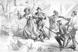
Jeff in Petticoats
Words by Henry Tucker
Music by George Cooper
Jeff Davis was a hero bold,
You've heard of him, I know,
He tried to make himself a king
Where southern breezes blow;
But "Uncle Sam," he laid the youth
Across his mighty knee,
And spanked him well, and that's the end
Of brave old Jeffy D.
CHORUS:
Oh! Jeffy D.! You flow'r of chivalree,
Oh royal Jeffy D.!
Your empire's but a tin-clad skirt,
Oh, charming Jeffy D.
This Davis, he was always full
Of bluster and of brag,
He swore, on all our Northern walls,
He'd plant his Rebel rag;
But when to battle he did go,
He said, "I'm not so green,
To dodge the bullets, I will wear
My tin-clad crinoline."
CHORUS
Now when he saw the game was up,
He started for the woods,
His bandbox hung upon his arm
Quite full of fancy goods;
Said Jeff, "They'll never take me now,
I'm sure I'll not be seen.
They'd never think to look for me
Beneath my crinoline."
CHORUS
Jeff took with him, the people say,
A mine of golden coin,
Which he, from banks and other places,
Had managed to purloin;
But while he ran, like every thief,
He had to drop the spoons.
And maybe that's the reason why
He dropped his pantaloons.
CHORUS
Our Union boys were on his track
For many nights and days,
His palpitating heart it beat,
Enough to burst his stays;
Oh! what a dash he must have cut
With form so tall and lean;
Just fancy now the "What is it?"
Dressed up in crinoline!
CHORUS
The ditch that Jeff was hunting for,
He found was very near;
He tried to shift his base again,
His neck felt rather queer;
Just on the out-skirts of a wood
His dainty shape was seen,
His boots stuck out, and now they'll hang
Old Jeff in crinoline.
CHORUS
This song is available on the album, Songs of the Civil War by The Harmoneion Singers, and also as an individual download.
http://www.amazon.com/gp/product/B004463I5A
Here's the tune as a MIDI file:
http://www.pdmusic.org/tucker/ht65a.mid
Oddities
Author:
Organizational:
Audience Rating:
Taxonomy upgrade extras:
Confirmed!
Author:
Taxonomy upgrade extras:
Mark Morford: San Francisco Newspaper Columnist Extraordinaire
For a light-hearted look at current events through a very slightly twisted mirror.
Fruit Loops
Author:
Blog About:
Taxonomy upgrade extras:
Originally a loop of fabric* at the back yoke of an Brooks Brothers Oxford shirt, especially the OCBD (Oxford Cloth Button-Down — actually an import from Jolly Old England, where the style was supposedly invented by polo players to keep their collars from flapping about untidily during chukkers) — fancifully-designed to allow the natty dresser to neatly hang said garment in the locker of his athletic club without mussing it. Back in those ancient times (The Fifties and early Sixties) the loop was known as a ‘locker loop’ and was almost a Brooks Brothers trademark, to the extent that they began including a ‘locker loop’ on their casual trousers, even though one might be so naíf as to believe that any one of the ‘belt loops’ used to hang the trousers from a leather belt might perfectly suffice.
It was a staple of the "preppie" look in days of yesteryear, and eventually achieved some status as a more-or-less visible signal that a young man was ‘going steady,’ similar in significance to a young lady wearing her boyfriend’s fraternity pin. The lady in question usually marked her ‘territory’ by reaching behind his neck and ripping off the loop entirely, although some fellows took the sensible precaution of neatly snipping the loop off with a pair of scissors, leaving behind short tags to indicate the absence of the loop. Brooks Brothers shirts weren’t inexpensive, even if one was a trust fund baby.
There are two main — and fairly plausible — theories used to explain the crooked path whereby the sturdy ‘locker loop’ became a ‘fruit loop.’
Theory A: A young man with no damage to his ‘locker loop’ had never had a girlfriend, and was thereby ‘proven’ to be a homosexual. One might think of this as the ‘scientific’ theory.
Theory B: The habitual contempt haboured by many Americans for members of the ‘upper classes,’ whom they likely thought of as ‘effete intellectual snobs’ at best, and therefor likely homosexuals, led them to focus on the prima facie evidence of effete intellectualism — the OCBD in whatever condition of ‘locker loop integrity’ as an unmistakeable sign of ‘unmanliness,’ the type of fellow who drank wine coolers instead of manly beer, and was thus at least a ‘pansy,’ if not a flaming ‘fag.’ One might think of this as the ‘œconomic’ theory.
As for the ‘fruit’ portion of the phrase, it likely originates — at least partially — in the Thirties, when the phrase ‘nutty as a fruitcake’ originated meaning simply ‘crazy,’ ‘silly,’ or ‘idiotic.’ At the time, homosexuality was classified as a mental disorder, to be ‘cured’ with ‘treatments’ of almost unbelievable barbarity, including induced convulsions — through electroshock or insulin injections — meant to ‘help’ the afflicted individual, and even lobotomy.
‘Fruit’ is entirely too precious to be wasted on mere mental patients, however, especially since there’s a parallel etymology through words which had previously referred only to female prostitutes, including a great many words which might strike a chord: ‘faggot, fairy, fruit, gay, punk, queen.’
In Polari, a type of cant with uncertain origins, but at least going back to ‘Punch and Judy’ performers in the Nineteenth Century (possibly up to two centuries earlier or more), thence to circus performers, actors, street pedlars, and thieves (not that these professions were or are mutually exclusive) and the ‘gay’ subculture, the word ‘fruit’ also means ‘queen,’ possibly down to the phrase ‘blessed be the fruit of thy womb’ referring to the Queen of Heaven. Queen originally referred to any woman, and is in fact (as kvin) still the Danish word for ‘woman.’ The ‘queen’ originally just referred to the King's ‘woman,’ but almost every word referring to women eventually becomes associated with something nasty, so soon enough became equivalent to ‘doxy.’
So we find two lines of potential etymology, one relatively recent, and another more ancient, all leading to stereotyping of gay men as either crazy or effeminate, maybe both, both views conforming to popular contempt and hostility toward anything not ‘manly,’ cultural misogyny seamlessly blended with knownothing bigotry.
* sometimes attributed to New England sailors who used the loop to hang their shirts to dry sans clothes hangers or clothespins. This seems unlikely, since sailors had very effective methods of hanging clothes to dry which didn’t depend upon fragile loops of cloth. One didn’t, after all, want to see one’s clothing fly off in a sudden squall.
I see today's Skin Horse strip is an homage to Angharad
Author:
Taxonomy upgrade extras:
And how *is* Stella doing these days?
Last we heard, she was still in hospital.
http://www.webcomicsnation.com/shaenongarrity/skinhorse/seri...
Interesting Article on Bat For Lashes
Author:
Taxonomy upgrade extras:
There's an interesting article on Bat For Lashes at the Guardian, a popular British singer and songwriter.
http://www.guardian.co.uk/music/2009/sep/06/bat-for-lashes-m...
Le Proces de Jeanne d'Arc (1962)
Author:
Blog About:
Taxonomy upgrade extras:
I just saw Le Proces de Jeanne d'Arc (1962) (in French with English subtitles that are more or less adequate, as these things go) and was struck that the huge problem for the Holy Church of the time was Jeanne's cross-dressing. Evidently, hearing voices and seeing angels was more-or-less fine, but doing it whilst ‘dressed inappropriately’ was anathema. TMTC,tMTStS.
Mandated Sex Changes in "ObamaCare"
Author:
Taxonomy upgrade extras:
I see that certain parties are telling us that “ObamaCare” will mandate free sex changes, which seems a very positive step.
http://www.aipnews.com/talk/forums/thread-view.asp?tid=6737&...
I think the world would be much improved if certain among our political class were among the first beneficiaries of this new draft, and was wondering if it were too early to start the nomination process.
Oxumaré - Interesting
Author:
Taxonomy upgrade extras:
Resistance is futile...
Author:
Taxonomy upgrade extras:
At last, the secret GLBTQ agenda is revealed to the world! Mwahh-ha-ha-ha-haaaaa.....
If the plan succeeds, everyone will soon be female, or a reasonable facsimile.
http://www.telegraph.co.uk/scienceandtechnology/science/scie...
Not only that, men are doomed to extinction, eventually...
http://www.telegraph.co.uk/scienceandtechnology/science/scie...
Resistance is futile. You will be assimilated.
Puddin'
Shamamism and the Transsexual
Author:
Blog About:
Taxonomy upgrade extras:
In most Shamanic traditions, a religious belief system that pre-dates all the mainstream religions, and appears to be almost universal amongst the peoples from whom most modern cultures drew their inspiration, so might be seen as the authentic root from which all later variations of religious belief sprouted, gender expression is seen as a special power bestowed by the higher powers, and some degree of transsexuality and/or transvestism was and is essential to the role of spiritual advisor to the community, because of course the spiritually-limited, those who weren't able to incorporate the full gamut of human traits and aspirations, were necessarily mundane.
The religious outliers that denied such fluidity were primarily the creatures of warlike cultures that forced ‘conversion’ at the point of a sword, unlike most Shamanic cultures, which were relatively peaceful, so the spread of "organised religions" can be overlaid directly on the map of conquest with very few excursions from the general rule and almost total overlap. Because of this link to violence, almost all the ‘mainstream’ — thus bellicose — religions are relentlessly patriarchal, since male warriors formed the basis of almost every historic army.
In the grand scheme of things, ‘Changing Woman’ the dynamic and ever-fruitful alternative to static (often destructive) masculinity, is a useful antidote to the sexist, masculinist, narrative many have grown up with.
Blessed be,
Puddintane
_________
Auferre, trucidare, rapere, falsis nominibus imperium; atque, ubi solitudinem faciunt, pacem appellant.
-- Tacitus
Slaughter, plunder, usurpation of power they call empire; they make a desolation and call it peace.
-- Tacitus
Swimming Tiger
Author:
Taxonomy upgrade extras:
Now here's a sight you'll rarely see at your local natatorium:
Puddin'
P.S. If you follow the Picture Source link, you'll discover that the tiger's name is Odin and he was six years old when the picture was taken. At the source, you can also enlarge the picture and have a better view.
Here's a Mail story about him with more pictures: Mail Article
Here he is on YouTube: Odin Swimming
The Corollary...
Author:
Blog About:
Taxonomy upgrade extras:
...of course, is this:
Why Men Make Lousy Advice Columnists
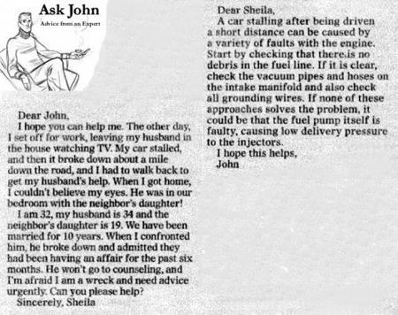
The Eyes of Texas are Upon You...
Author:
Taxonomy upgrade extras:
Although details are sketchy, it seems that the good officers of Texas have decided to raid a gay bar and arrest some patrons for public intoxication while said patrons were seated at the bar drinking, and on the anniversary of the Stonewall riots.
http://blogs.dallasobserver.com/unfairpark/2009/06/on_40th_a...
I don't usually frequent bars, but had always imagined that the primary purpose of going to a bar was to drink intoxicating beverages, and that tea is rarely served, but I reckon I must have been wrong, at least in Texas.
Puddin'
The TG Virgin Mary
Author:
Taxonomy upgrade extras:
I'm sure everyone will be pleased to note that the Virgin Mary seems most likely to have been a feminised man.
I'm sure there's a really great story there as well...
http://www.guardian.co.uk/science/blog/2008/dec/30/virgin-bi...
Transsexual Snails
Author:
Taxonomy upgrade extras:
It turns out that snails, often confused with toads, are also well in advance in many scientific and social science explorations*, are prone to form male/male romantic attachments in which one partner eventually changes sex so they can settle down into normal married life with children.
http://www.guardian.co.uk/science/blog/2009/jun/17/same-sex-...
Cheers,
Puddin'
-----------
* See The Wind in the Willows by Kenneth Grahame
'I wonder,' [Toad] said to himself presently, 'I wonder if this sort of car STARTS easily?'
I would not enter in my list of friends,
Who needlessly sets foot upon a worm.
An inadvertent step may crush the snail
That crawls at evening in the public path,
But he has the humanity, forewarned,
Will tread aside, and let the reptile live.
--- William Cowper
The year's at the spring
And day's at the morn;
Morning's at seven;
The hillside's dew-pearled;
The lark's on the wing;
The snail's on the thorn;
God's in his heaven --
All's right with the world!
--- Robert Browning
(I had to add a quote from Browning,
just because many don't realise that
snails weighed heavily in his notion
of the proper order.)
Yes, Virginia, Summer is British...
Author:
Taxonomy upgrade extras:
Before the British arrived upon the scene, there was only Winter, as detailed in the tiny slice of British history Churchill missed, The Lion, the Witch, and the Wardrobe.
In this holy text, we see that cold, bitchy Winter is personified by femininity, with all the general nastiness this entails, until conquered by The High King, who alone has the right to rule because of his sacred masculinity, and the winter of our discontent is finally made glorious summer by the son of Man, who is the natural ruler of the entire world because he is a British male, even though apparently a mere child, and all the other races (pardon, talking animals) his natural inferiors. Noblesse oblige.
It's quite touching, when one thinks about it...
Cheers,
Puddin'
You know it's over when...
Author:
Blog About:
Taxonomy upgrade extras:
...you see something like this on your daily commute.
